
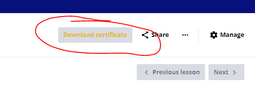
I’ve been trying to change the background of the Download Certificate button but with no luck. There’s no option in the Customize Colors section, and I have tried quite a but of CSS code, but with no luck. i will post some of my unsuccessful code. Any ideas?

.dcb-ui-button-interaction-backdrop {
    background-color: #08107b;
    color: #ffffff; /* Optional: Ensures the text on the button is visible */
    border: none; /* Optional: Removes any border */
    padding: 10px 20px; /* Optional: Adjusts button padding */
    border-radius: 5px; /* Optional: Adds rounded corners */
    cursor: pointer; /* Optional: Adds a pointer cursor for hover effect */
}

/* Add hover effect */
.dcb-ui-button-interaction-backdrop:hover {
    background-color: #0a1ab3; /* Optional: Slightly lighter shade for hover */
    transition: background-color 0.3s ease; /* Smooth transition effect */
}

/* Add active effect */
.dcb-ui-button-interaction-backdrop:active {
    background-color: #05085a; /* Optional: Darker shade when pressed */
}
 

I think you just needed different selectors, this should work:

button.dcb-course-header-download-certificate.dcb-ui-button-focus-ring-positive.dcb-ui-button-theme-accent.dcb-ui-button-shape-squared.dcb-ui-button-size-sm.dcb-ui-ripple.ng-star-inserted {
background-color: #08107b;
color: #ffffff;
/* Optional: Ensures the text on the button is visible */
border: none;
/* Optional: Removes any border */
padding: 10px 20px;
/* Optional: Adjusts button padding */
border-radius: 5px;
/* Optional: Adds rounded corners */
cursor: pointer;
/* Optional: Adds a pointer cursor for hover effect */
}

button.dcb-course-header-download-certificate.dcb-ui-button-focus-ring-positive.dcb-ui-button-theme-accent.dcb-ui-button-shape-squared.dcb-ui-button-size-sm.dcb-ui-ripple.ng-star-inserted:hover {
background-color: #0a1ab3; /* Optional: Slightly lighter shade for hover */
transition: background-color 0.3s ease; /* Smooth transition effect */
}

button.dcb-course-header-download-certificate.dcb-ui-button-focus-ring-positive.dcb-ui-button-theme-accent.dcb-ui-button-shape-squared.dcb-ui-button-size-sm.dcb-ui-ripple.ng-star-inserted:active {
background-color: #05085a; /* Optional: Darker shade when pressed */
}

(It’s possible you don’t need all that, of course, but hey.)


Thank you ​@Ian That worked!


Reply