Has anyone discovered a way to change or hide the SCORM package icon using CSS?

Iconography is so important for UX and the zip file means absolutely nothing to our learners, and even confuses many of them.


I’d also like to remove the “SCORM” label since, again, users have no idea what that means.


I’d also like to remove the “SCORM” label since, again, users have no idea what that means.

@eric.trudeau  I agree, this label is not helpful for users And we have changed it as well, you can make the change using the localization tool.

Not sure about the icon, I wasn't looking into this.


Hey Eric, great question. I’ve had a similar need in the past and there are a few ways to go about changing how these icons and labels display for your learners in the course player.


1️⃣ Changing/Hiding Learning Object Icons

Changing Learning Object Icons (Training Material Thumbnails)

It’s important to note that learning object icons in the course player only display for learning objects that do not have a thumbnail. One way to avoid your learners seeing these icons is to make sure that you add a thumbnail for every learning object in your platform.

You can do this from the Additional Info section when adding or editing Training Material from either a course or the Central Repository. This Knowledge Article has information about adding thumbnails for Training Material.


Hiding Learning Object Icons via CSS

You can also optionally hide Learning Object Icons via CSS. Use the following code to hide these icons.

/*remove LO file-type icons*/
.course-player-elements__navigation .course-navigation__wrapper .file-type {
display: none !important;
}

The above snippet will hide the icon, but ensure that the LO progress tracking bubble will still appear for your learners. Note that this may appear strangely to them since they are meant to display in conjunction. You can avoid this issue by using thumbnails for your training material rather than hiding the icons via CSS. The LO progress tracker appears as an overlay on thumbnails rather than a bubble.

Note: please test this in your sandbox before deploying and understand that any changes you make to your platform may be affected by future Docebo product updates. It’s important to keep track of changes you make in your platform.


2️⃣ Changing/Hiding Learning Object Labels

Changing Learning Object Labels

As @alekwo mentioned, you can update the labels for Learning Objects via Docebo’s Localization Tool. Navigate to ⚙️ Admin Menu > Localization Tool. Navigate to the language you’d like to translate and select the hamburger icon to access translations for that language.
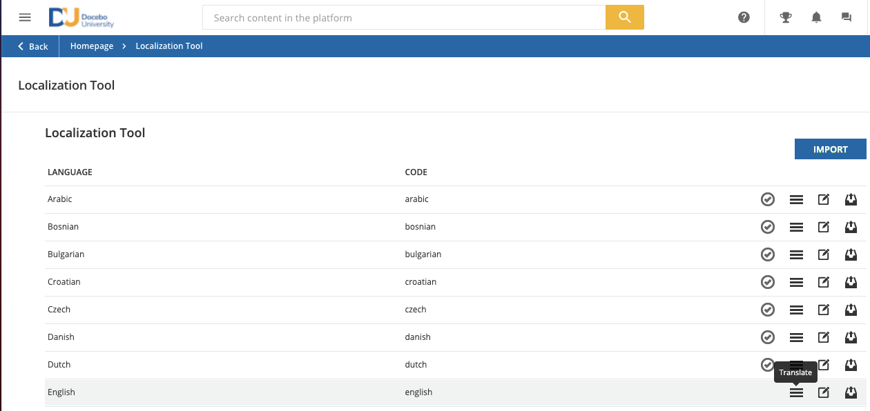
Select the language you’d like to translate within the Localization Tool (English in this case)

The Learning Object labels live under the storage module. To find them quickly, select storage in the Module dropdown at the top of the page, then type _LONAME in the search bar to surface all of the Learning Object labels. Double-click on any word in the Translation column that you’d like to translate, then select Confirm. You can view these updates by refreshing your platform.

Note: Be sure to track these translations somewhere outside of Docebo, as future Docebo updates may impact these translations. @lrnlab shared some great tips on logging changes to your platform in the following post: 


Hiding Learning Object Labels via CSS

You can also optionally hide Learning Object labels via cSS. Use the following code to hide these labels: 

/*remove LO file type label*/
.tree-view .item.chapter .info {
display: none !important;
}

Note: please test this in your sandbox before deploying and understand that any changes you make to your platform may be affected by future Docebo product updates. It’s important to keep track of changes you make in your platform.


It’s important to note that learning object icons in the course player only display for learning objects that do not have a thumbnail. One way to avoid your learners seeing these icons is to make sure that you add a thumbnail for every learning object in your platform.


Hi Adam,


Thank you for your reply. All of our courses have thumbnails associated but still show this icon on the course launch page:


Do you happen to know if there are any updates coming to the learner view of launching a course? Specifically the page discussed in this thread. Localization is obviously an option for removing certain text but in this instance would be quite tedious for every language. It seems that perhaps some UI updates would benefit users?


Hi @JZenker, can you confirm that the Trade Compliance CS SCORM learning object has a thumbnail? You need to add a thumbnail to the training material itself in order for it to replace that icon. Course thumbnails are different from training material thumbnails. The Knowledge Article I linked to in my original reply walks through how to add/edit thumbnails for training materials.


As for updates to the course player view for learners, I can confirm that our teams are working on enhancements but do not have details on what specifically will be delivered, nor when exactly they will be delivered.


Ahh @Adam Ballhaussen I see what you’re talking about. Thanks!


Thanks, all! This has been very helpful. @Adam Ballhaussen please do keep us posted re: the course player view! 


To remove the term SCORM in the course player (and any other object types) try

Try This out in your SANDBOX first !!


/* Remove the object type in the course player view */

div.information.mdl-cell.mdl-cell--10-col.ng-star-inserted > div.info.text-main {

display: none;


Hope this helps :)


Gary


Do you happen to know if there are any updates coming to the learner view of launching a course? Specifically the page discussed in this thread. Localization is obviously an option for removing certain text but in this instance would be quite tedious for every language. It seems that perhaps some UI updates would benefit users?


Hi @JZenker,

I am a Lead UX Engineer at Docebo, and as such I am responsible for Accessibility and for the UI Kit components with which the LMS user interface is made up.

I’m pleased to share that both the Content Overview and Content Player macro-areas are currently undergoing a major renewal of their entire user experience, primarily aimed to make such important features accessible to keyboard and screen reader users.

With this development, which is due early Q2 2022, the following LMS sections are going to be revamped:

  • Learning Plan - Overview Page (both Catalog and Enrolled views)
  • E-learning Course - Overview Page (both Catalog and Enrolled views)
  • ILT Course - Overview Page (both Catalog and Enrolled views)
  • ILT Course - Session Detail Page (Enrolled view)
  • Course Player (for both E-learning and ILT Training Materials)

While designing the new look and feel for the aforementioned areas, we took into great consideration all of the concerns and suggestions that were submitted by many of you during these last years - including those about the wording for SCORM, AICC and TinCan packages, whose highly technical names are indeed difficult to understand for learners.


Also, @eric.trudeau thank you for your hint about the “zip” icon confusing your users; I will forward your reporting to our UI/UX team and we will certainly take it into consideration while finalising the mock-ups for the new Course experience.


@niccolo.servidio Thank you so much, can’t wait!


Hi @Adam Ballhaussen 


The CSS snippets provided above do well to suppress learning object labels (SCORM) from the course information page. Can anything be provided to suppress the labels from display in Search Results?


Hi @Adam Ballhaussen 


The CSS snippets provided above do well to suppress learning object labels (SCORM) from the course information page. Can anything be provided to suppress the labels from display in Search Results?

I found that the localization tool is more effective in managing undesired content labels. 

When available, localization is always the better route, should always be the first thing checked for text changes before going to CSS.


@pat.ev -

Yeah - Localization tool is great.

One of the first changes I made was to make SCORM say Captivate Module since that is what we use.


@pat.ev -

Yeah - Localization tool is great.

One of the first changes I made was to make SCORM say Captivate Module since that is what we use.


@gstager  How did you manage to avoid showing the same string under each learning object in a course? If that’s the case of course. 

We’d like to show “blank” for each learning object instead of SCORM, and then have a similar Captivate name for the upload drop-down and not the same blank. 
Right now I only managed to change the SCORM string to blank across the entire platform - using the following localization tool key: 


All of the places that use the same localization entry will be affected. I don’t have a work-around for that.

It may be possible (if you only have one instance) to use some CSS to add a little content like that but it would require a little digging first. No guarantees. I wouldn’t recommend custom CSS if you had lots of places to edit - too much maintenance - too little ROI


Reply