
Hi folks so I have setup an HTML widget with a flexgrid in it and the elements within seem to be doing the right thing - but the HTML widget container puts a scrollbar along the side instead of resizing when I adjust the browser window size.
This is what it looks like at full-screen:
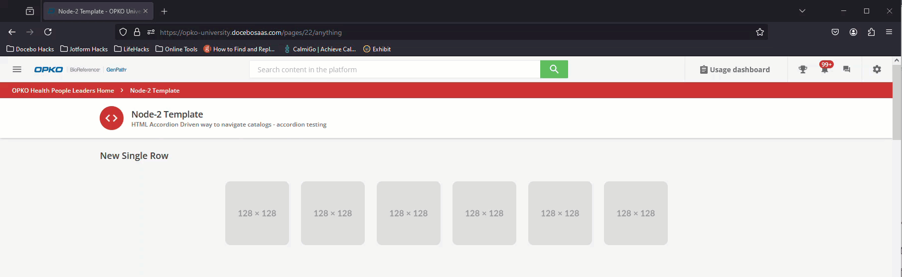
Not too shabby.
But when I pucker the browser window, I cant get the container to scale and so it puts a scrollbar along the side of it…so I land up with something like this.
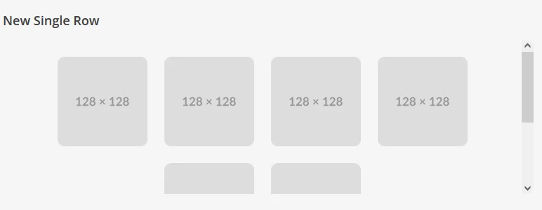
If you can pass along any advice I would appreciate it.
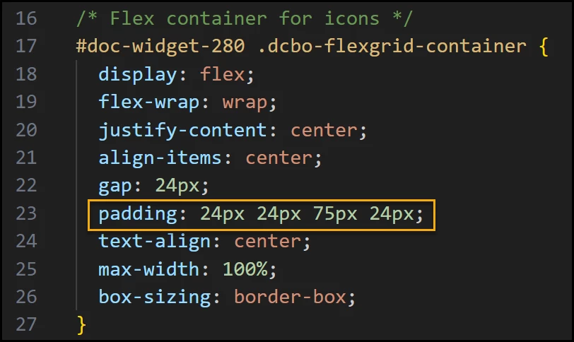
Here is the css snippet:
/* Scope everything to just widget 455 */#doc-widget-455 .htmlwidget.root.wrapper-shadow{ background-color: transparent !important; box-shadow: none !important; border: none !important; overflow-x: hidden !important;}/* Scope: Only apply to widget #doc-widget-455 */#doc-widget-455 { background-color: transparent !important; box-shadow: none !important; border: none !important; overflow-x: hidden !important;}/* Flex container for icons */#doc-widget-455 .dcbo-flexgrid-container { display: flex; flex-wrap: wrap; justify-content: center; align-items: center; gap: 24px; padding: 24px; text-align: center; max-width: 100%; box-sizing: border-box;}/* Wrapper around each icon + tooltip */#doc-widget-455 .dcbo-tooltip { position: relative; display: inline-block; text-align: center;}/* Icon image settings with hover effect */#doc-widget-455 .dcbo-flexgrid-icon { width: 128px; height: 128px; max-width: 100%; object-fit: contain; display: block; margin: 0 auto; transition: transform 0.3s ease, box-shadow 0.3s ease;}/* Tooltip bubble under the icon */#doc-widget-455 .dcbo-tooltiptext { visibility: hidden; width: 140px; background-color: #555; color: #fff; text-align: center; padding: 8px; border-radius: 6px; position: absolute; z-index: 1; top: 110%; left: 50%; transform: translateX(-50%); opacity: 0; transition: opacity 0.3s;}/* Tooltip arrow pointing upward */#doc-widget-455 .dcbo-tooltiptext::after { content: ""; position: absolute; bottom: 100%; left: 50%; transform: translateX(-50%); border-width: 5px; border-style: solid; border-color: transparent transparent #555 transparent;}/* Show tooltip and animate icon on hover */#doc-widget-455 .dcbo-tooltip:hover .dcbo-tooltiptext { visibility: visible; opacity: 1;}#doc-widget-455 .dcbo-tooltip:hover .dcbo-flexgrid-icon { transform: scale(1.05); box-shadow: 0 4px 12px rgba(0, 0, 0, 0.2);}