Answer

Course card status

  • January 2, 2024
  • 6 replies
  • 367 views

Forum|alt.badge.img

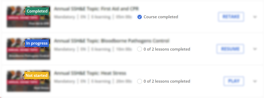
Hi I’m quite new to the Docebo platform and would to change the rectangle label colour on the course cards for the status of the courses. We currently have blue for not started, which changes to black for courses In Progress or Completed, but we would like to have this as the following:

Red - Not Started
Amber - In Progress
Green - Completed

Any help on this would be very much appreciated. Thanks

Best answer by Stephen.Barton

Hi @ChristineW 

I’m not sure if there is a way to change the colour of all 3. The closest I’ve got is to have the same colour for In progress and Completed and a different colour for Not Started. Someone may be able to improve upon this. 


/*Change label colours on course cards in Courses and Learning plans widgets*/

.ui-badge-status-success {

    background-color: red !important;

}

.ui-badge-status-neutral {

    background-color: green !important;

}

.ui-badge-status-light {

    background-color: aqua !important;

}

6 replies

Stephen.Barton
Guide II
Forum|alt.badge.img+2

Hi @ChristineW 

I’m not sure if there is a way to change the colour of all 3. The closest I’ve got is to have the same colour for In progress and Completed and a different colour for Not Started. Someone may be able to improve upon this. 


/*Change label colours on course cards in Courses and Learning plans widgets*/

.ui-badge-status-success {

    background-color: red !important;

}

.ui-badge-status-neutral {

    background-color: green !important;

}

.ui-badge-status-light {

    background-color: aqua !important;

}


Forum|alt.badge.img
  • Author
  • Contributor I
  • January 2, 2024

@Stephen.Barton thanks for your reply, this is really helpful, thanks I’ll try this.


Bfarkas
Hero III
Forum|alt.badge.img+6
  • Hero III
  • January 17, 2024

Can confirm @Stephen.Barton is right, there’s no way to distinguish the two apart from each other on current setup, it is unfortunate, but thats the best you can do in this scenario.


  • Newcomer
  • October 4, 2024

@Stephen.Barton I’m testing out some CSS to do just this.

So far, I can get it to work within a Learning Plan, but not a Catalog.


/* Not Started Label Color */

.ui-badge-status-success {

    background-color: #f7b500 !important;

}

/* In Progress Label Color */

.ui-badge-status-neutral {

    background-color: #0068D9 !important;

}


/* Completed Label Color */

.ui-card-header:has(+ .ui-card-content span.color-accent-tertiary) .ui-badge-status-neutral{

    background-color: #008767 !important;

}


Forum|alt.badge.img
  • Author
  • Contributor I
  • October 7, 2024

Thanks for sharing @Stephen.Barton. This looks like great progress and could be really useful, much appreciated.


  • Newcomer
  • October 7, 2024

@ChristineW Below is CSS to target the course status labels in both Learning Plans and Catalogs.
 

/* Not Started Color Label*/

.ui-badge-status-success {

    background-color: #f7b500 !important;

}

/* In Progress Color Label*/

.ui-badge-status-neutral {

    background-color: #0068D9 !important;

}


/* In Progress Color Label - in Catalog*/

.ui-card-status-in_progress .ui-badge-status-neutral{

    background-color: #0068D9 !important;

}


/* Completed Color Label */

.ui-card-header:has(+ ui-card-content span.color-accent-tertiary) .ui-badge-status-neutral{

    background-color: #008767 !important;

}


/* Completed Color Label - in Catalog*/

.ui-card-status-completed .ui-badge-status-neutral{

    background-color: #008767 !important;

}