Creating a Horizontal Navigation Menu for Novices

  • 11 November 2022
  • 13 replies
  • 426 views

Userlevel 2

Hi. I was wondering if anyone had more of a step-by-step guide on creating a simple horizontal navigation menu (with drop-down/cascading links) for people with a very basic understanding of html/css (i.e, myself)? 


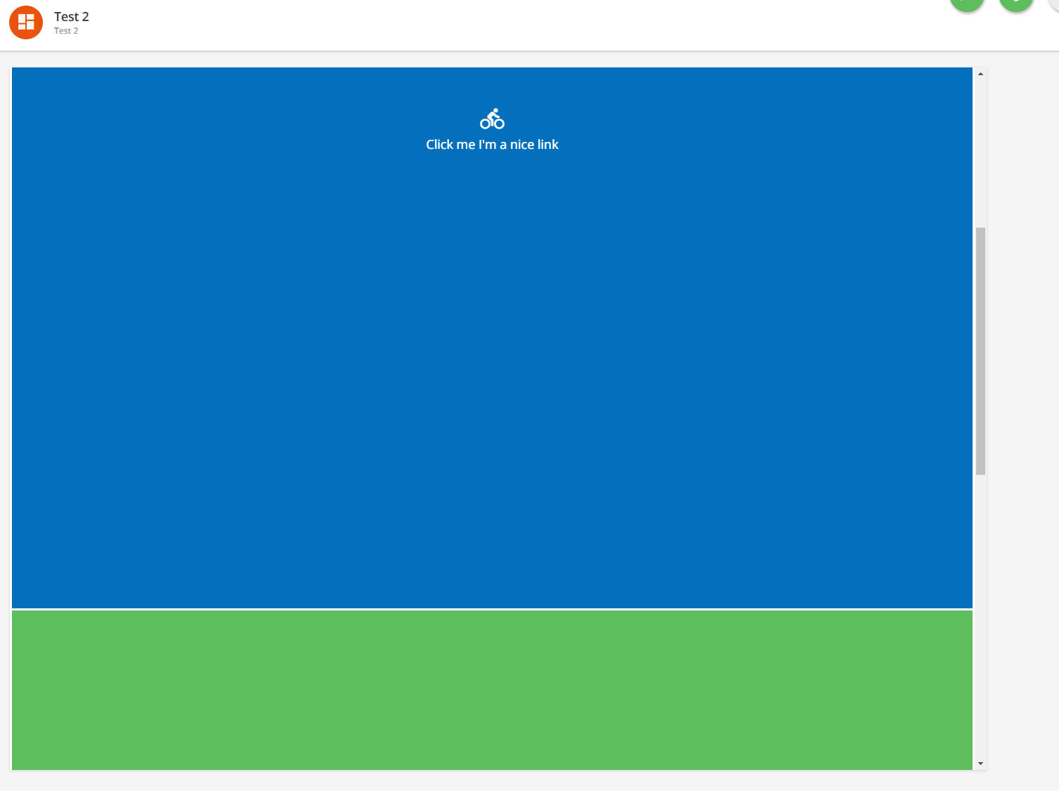
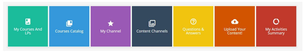
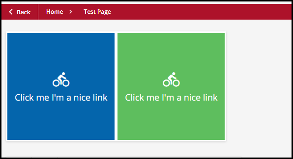
I’m assuming all code has to sit within the CSS Custom Styles section of the branding page? In which case, does the page that will have the menu need to contain a widget (such as a full-width row) at the top in order to ‘house’ the navigation menu within? If so, how do you ID the widget itself? A full, working example, clearly labelling any widget or page referencing would be greatly appreciated as I’d like to condense using boxes/images as quicklinks to other pages on the platform.


Thanks in advance to any responses!


13 replies

Userlevel 7
Badge +3

You are on the right path for the most part, yes most of your CSS would go in that area,and then you need to put a widget on the page to hold the HTML.  All widget’s are automatically ID’d but vary by page as it is a unique ID (see here for more information on that). 

With a menu, I wouldn’t use an ID though otherwise you will need to add ALL the id’s of the widgets form all your pages. Would just stay with classes, and you can decide those within your HTML.

As far as a detailed setup, it doesn’t have a horizontal, but does have a vertical and goes into great detail of the concepts and how to go about it so you should be able to take and grab any horizontal menu you want and swap in, there is a great session on DOcebo University on several of these: https://university.docebo.com/share/asset/view/69

Also, keep in mind, none of the custom CSS will work in the mobile app, so make sure to deisgn with that in mind, or in a way that it degrades gracefully (i.e. turns into a simple bullet list of links, or similar).

Userlevel 2

@Bfarkas This has been a great help - thank you for pointing me in the direction of the DU resources and apologies for the delayed response.


What would be perfect for the page I’m trying to create are the “Custom Icon Boxes” - detailed in the course link you provided above. However, whilst I understand the example html and css files that can be downloaded as part of the article (including how to customise them) I’m still struggling with how I implement them on a specific page. 


Do I need to create an html widget and enter the html code in the widget editor and then enter the css code in the “css custom styles” part of the platform? i.e, all html code such as:

“<div id="custom_icon_boxes">
  <a href="#link1" target="_new" class="box_1_1 custom_box custom_style1"><span class="ibox_inner"><i class="zmdi zmdi-bike"></i><br/>Click me I'm a nice link</span></a></div> 

goes in the html widget editor (with my edits) and all css code in the “css custom styles” editor?


If I have the above correct, to then target a specific page to host the “custom icon boxes” on, is it simply a case of using the page id tag “#doc-page-{page_id}” underneath which, all of my css code is entered? If I wanted a separate page to have other CSS changes, do I simply demarcate the css code with the page id tag and anything underneath the tag will be applied to that relevant page? My worry is any CSS changes affecting the whole platform if I have separate CSS code for multiple pages.


These are probably really simple questions to answer, but despite the resources on the Docebo University site being excellent, there aren’t any ‘working’ examples of the code in use across individual or multiple pages (unless I haven’t searched hard enough). Any real examples of how both the css and html code is applied to an actual page and widget (using the custom icon boxes in the resource above as an example) would be extremely helpful.


Thanks again.

Userlevel 7
Badge +3

Yup, what you described is right, if you put the CSS in the platform wide area it will by default apply to every page, if you want to limit it or change it on a per page basis then yes use the page-id’s to control that.

The html goes into a html widget.

Should be set.

There are a bunch of community members/posts who have posted full examples (not of the specific menu thing you are looking for, but of generally how to add things like this), Greg is always good for a few examples:


Userlevel 2

@Bfarkas - thanks again for the swift response and also @gstager for his previous posts showcasing how the html widget and custom css section work together to improve the usability of the platform.


This has been a huge help and opened the door to do far more exciting things with our pages now I finally understand where everything sits!


Userlevel 7
Badge +5

Thanks for chiming in on this @Bfarkas - and the shout out - I’ve had a really tight teaching schedule the last couple weeks and haven’t had as much time to browse the community.

@James A - I have not attempted to build out a nav menu such as what you describe but a few others have given it a go. I find things like this to be quite simple outside of Docebo but find there are lots of snags when trying to implement them inside the platform.

Here is a post from not too long ago that may help if you haven’t seen it already. You’ll see one of those snags appear as the discussion moves forward. It might give you a good start on some code.


Userlevel 2

@gstager - thank you for the link; definitely a useful resource!


I’m getting closer to implementing the icon bar in the example given on the Docebo University site (pdf attached). However, the only element not working is the sizing of the icon boxes - they seem to be full-width and stack vertically, rather than horizontally. This is what I’m currently seeing:


Rather than:


Having spent almost two hours troubleshooting I figured I could probably enlist some help.


My html for the two HUGE boxes is as follows:


<div id="custom_icon_boxes">
  <a href="#link1" class="box_1_1 custom_box custom_style1"><span class="ibox_inner"><i class="zmdi zmdi-bike"></i><br />Click me I'm a nice link</span></a>
<a href="#link2" class="box_1_1 custom_box custom_style3"><span class="ibox_inner"><i class="zmdi zmdi-bike"></i><br />Click me I'm a nice link</span></a>
 </div> 


...and my CSS is:


  #doc-page-108

#custom_icon_boxes{display:flex; flex-wrap:wrap; }

.custom_box:after{content:''; display:block; padding-bottom:100%;}

.ibox_inner{text-align:center; padding:15px;}

.custom_box{margin:3px; display:flex; align-items:center; justify-content:center; text-decoration:none;}


.ibox_inner i{font-size:34px; margin-bottom: 10px;}

.custom_box:hover{filter:brightness(110%); text-decoration:none;}

.custom_style1{background:#0465ac; color:#ffffff;}

.custom_style2{background:#ecf0f1; color:#333333;}

.custom_style3{background:#5ebe5e; color:#ffffff;}

.custom_style4{background:#2c3e50; color:#ffffff;}

.custom_style5{background:#ecf0f1; color:#333333;}


.flat-turquoise{color:#fff; background-color:#1abc9c}

.flat-emerald{color:#fff; background-color:#2ecc71}

.flat-peter-river{color:#fff; background-color:#3498db}

.flat-amethyst{color:#fff; background-color:#9b59b6}

.flat-wet-asphalt{color:#fff; background-color:#34495e}

.flat-green-sea{color:#fff; background-color:#16a085}

.flat-nephritis{color:#fff; background-color:#27ae60}

.flat-belize-hole{color:#fff; background-color:#2980b9}

.flat-wisteria{color:#fff; background-color:#8e44ad}

.flat-midnight-blue{color:#fff; background-color:#2c3e50}

.flat-sun-flower{color:#fff; background-color:#f1c40f}

.flat-carrot{color:#fff; background-color:#e67e22}

.flat-alizarin{color:#fff; background-color:#e74c3c}

.flat-clouds{color:#000; background-color:#ecf0f1}

.flat-concrete{color:#fff; background-color:#95a5a6}

.flat-orange{color:#fff; background-color:#f39c12}

.flat-pumpkin{color:#fff; background-color:#d35400}

.flat-pomegranate{color:#fff; background-color:#c0392b}

.flat-silver{color:#000; background-color:#bdc3c7}

.flat-asbestos{color:#fff; background-color:#7f8c8d}


.box_1_3{flex:1 0 calc(30% - 10px); font-size:14px;}

.box_1_2{flex:1 0 calc(30% - 10px); font-size:16px;}

.box_2_3{flex:1 0 calc(17% - 10px); font-size:14px;}

.box_1_1{flex:1 0 calc(13% - 10px); font-size:18px;}


This is all ‘off-the-shelf’ code from the DU resource, however, the issue seems to be the ‘display’ and ‘flex’ tags. I know my html is applying the relevant style for “box_1_1” because when I change the font size from 18px (highlighted in yellow), the text size changes inside the icon boxes. However, when troubleshooting the box sizes, nothing changes when playing around with the flex values or removing the flex tag altogether from the “box_1_1” class. It appears to not apply any of the detailed flex settings from the line in yellow at all.


Do I need to further edit the tags in the “custom_icon_boxes” line (highlighted in green) to achieve the relevant flex settings? I have tried directly copying the relevant “box_1_1 flex settings into the CSS line at the top but again, this didn’t seem to work:

#custom_icon_boxes{flex:1 0 calc(13% - 10px); flex-wrap:wrap; }


Any suggestions would be greatly appreciated!


Userlevel 7
Badge +5

I tried to recreate this.

I used an HTML/WYSIWYG Widget.

I added display:flex; to the widget ID

#doc-widget-260 {

     display: flex;

}

That got the boxes going side by side.


Userlevel 2

Thank you @gstager  - would you recommend using the widget ID as standard practice when applying style changes to an html widget? There isn’t a mention of this in the supporting tech document (I had assumed by the html code existing within the widget itself, it would’ve been enough to contain the boxes/apply the flex settings appropriately).


Greatly appreciative of the help - thanks again.

Userlevel 7
Badge +5

Thank you @gstager  - would you recommend using the widget ID as standard practice when applying style changes to an html widget? There isn’t a mention of this in the supporting tech document (I had assumed by the html code existing within the widget itself, it would’ve been enough to contain the boxes/apply the flex settings appropriately).


Greatly appreciative of the help - thanks again.

If the only scope the CSS needs to affect is that widget - yes - I like to use the widget IDs so that I don’t impact other areas of the platform

Userlevel 2

I’m now at a point where I’m almost there with my horizontal navbar (pretty pleased with how it’s looking) - I went down a slightly different route of adapting a simple hover and drop-down menu and introduced a separate class for the icons so that I could scale them independently of the text. Below is the following result:


The final step I seem to be struggling with, is ensuring all the menu blocks items are of equal width (text wrapping) and fill the entire navbar. This seems fairly easy to do with a non-responsive navbar (using examples on w3schools.com) but I can’t find any examples that relate to what I’m trying to achieve above (i.e, retain the drop down and independent icon scaling).  If @Bfarkas or @gstager have any time to suggest the appropriate edits to my code that would be greatly appreciated - I think this style menu would appeal to a lot of users. Relevant code for the current navbar below:


HTML Widget (for one of the menu items):


<div class="navbarx">

  <div class="dropdownx">
<button class="dropbtnx"><span class="navibox_inner"><i class="zmdi zmdi-rss"></i></span>
<br />News &amp; Events</button>

<div class="dropdown-contentx">
      <a href="#">Link 1</a>
      <a href="#">Link 2</a>
      <a href="#">Link 3</a>
    </div>
  </div>

</div>


CSS for the Navbar and Icon Sizing:


 /* Navbar container */
.navbarx {
  overflow: hidden;
  background: linear-gradient(70deg, #0258fe, #96288a, #ff381b, #ff7e00);
  font-family: helvetica; }


  /* Links inside the navbar */
.navbarx a {
  float: left;
  font-size: 16px;
  color: white;
  text-align: center;
  padding: 14px 16px;
  text-decoration: none;
}


/* The dropdown container */
.dropdownx {
  float: left;
  overflow: hidden;
}


/* Dropdown button */
.dropdownx .dropbtnx {
  font-size: 16px;
  border: none;
  outline: none;
  color: white;
  padding: 20px 22px;
  background-color: inherit;
  font-family: inherit; /* Important for vertical align on mobile phones */
  margin: 0; /* Important for vertical align on mobile phones */
}


.navibox_inner{text-align:center; padding:10px;}
.navibox_inner i{font-size:34px; margin-bottom: 10px;}


/* Add a blue background color to navbar links on hover */
.navbarx a:hover, .dropdownx:hover .dropbtnx {
  background-color: #0258fe;
}


/* Dropdown content (hidden by default) */
.dropdown-contentx {
  display: none;
  position: absolute;
  background-color: #f9f9f9;
  min-width: 160px;
  box-shadow: 0px 8px 16px 0px rgba(0,0,0,0.2);
  z-index: 1;
}


/* Links inside the dropdown */
.dropdown-contentx a {
  float: none;
  color: black;
  padding: 12px 16px;
  text-decoration: none;
  display: block;
  text-align: left;
}


/* Add a grey background color to dropdown links on hover */
.dropdown-contentx a:hover {
  background-color: #ddd;
}


/* Show the dropdown menu on hover */
.dropdownx:hover .dropdown-contentx {
  display: block;
}

Userlevel 7
Badge +5

I think this brings us full circle to the situation found in the thread I shared above.

The end solution was to craft an image for the background of the navbar that had a height at least as much as it took to stay under the longest dropdown menu.

If you haven’t discovered yet - as you add widgets to the page - your dropdowns will stay behind them. If you change the display to relative, it will move the widgets down but expand your navbar which is just simply a strange look.

By designing the navbar taller - you eliminate that strange expansion but sacrifice some real estate on the page in the process. If it were a blank canvas, it would be less complicated but we have a lot of code in the Docebo background that makes some things tougher than they might otherwise be.

It is what it is.

Userlevel 7
Badge +3

Thank you @gstager  - would you recommend using the widget ID as standard practice when applying style changes to an html widget? There isn’t a mention of this in the supporting tech document (I had assumed by the html code existing within the widget itself, it would’ve been enough to contain the boxes/apply the flex settings appropriately).


Greatly appreciative of the help - thanks again.

If the only scope the CSS needs to affect is that widget - yes - I like to use the widget IDs so that I don’t impact other areas of the platform

Just be careful as widget-id’s aren’t perm and can change at things like moving the widget to a different column order on the same page.

Userlevel 7
Badge +3

I think this brings us full circle to the situation found in the thread I shared above.

The end solution was to craft an image for the background of the navbar that had a height at least as much as it took to stay under the longest dropdown menu.

If you haven’t discovered yet - as you add widgets to the page - your dropdowns will stay behind them. If you change the display to relative, it will move the widgets down but expand your navbar which is just simply a strange look.

By designing the navbar taller - you eliminate that strange expansion but sacrifice some real estate on the page in the process. If it were a blank canvas, it would be less complicated but we have a lot of code in the Docebo background that makes some things tougher than they might otherwise be.

It is what it is.

Tag on things like not quite as responsive s it should e and not usable in the mobile app so you are inherently building two user experiences, does limit these types of things actual usage.

Reply