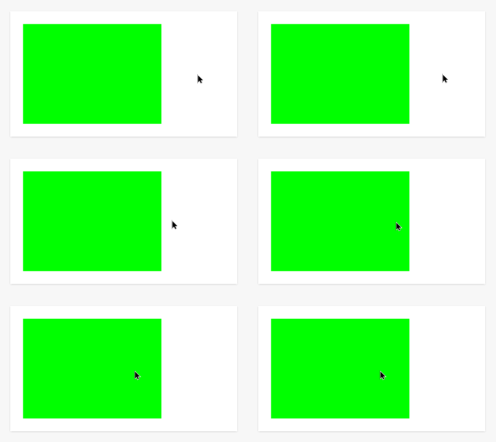
In this example, I wanted to start developing some more interactivity as opposed to passive effects.
This requires the user to click on the box. When you click on it, the background color changes so that the text can be read. Of course, the trick here is to start with a background color that matches the text color so that it blends in and cannot be read.

Here is the CSS to make the above.
/* Click to Reveal */
/* This is the CSS for the Branding and Look section */

#card {
    width: 250px;
    height: 175px;
    background-color: #00ff00;
    margin: 25px;
    padding: 10px;
    font-family: 'Courier New', Courier, monospace;
    font-size: 24px;
    color: #00ff00;
}

#card:active {
    background-color: #000000;
}
Here is the HTML for the widget.
<!-- Here is the HTML for your widget -->

<div id="card">
This is the revealed text when you click on the box.
</div>
I would love to hear some ways that you could use this in your learning spaces.


