

Hello,
I’m looking for ideas or tips with CSS and exam color selection. We’ve settled on branding colors, but the red confuses some people while taking exams. There was another post that was very helpful, but now facing a new problem. Our multi-select questions are not amended satisfactorily. Does any know what code I need to add to fix this? Or tips to find the necessary code to remedy the issue?
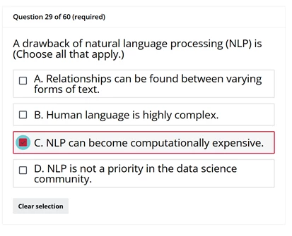
The code I’ve implemented in Staging so far. Also, I’m learning the basics of CSS & HTML, does anyone have recommendations for courses/learning that would promote better understanding and maintenance in the future? I thought I would ask. There’s a lot of talented people in here :) Thanks!!
/** Single Choice **/
lmn-input-radio input[type=radio]:checked {
border: 2px solid #323e48 !important; /* Targets the border colour when selected */
background-color: #dde0e4 !important; /* Targets the inner colour of the above when selected */
}
lmn-input-radio input[type=radio]:checked:before {
background-color: #323e48 !important /*Targets inner colour when selected */
}
dcb-sh-answer-single-selection lmn-input-radio:has(:checked) {
border-color: #323e48 !important; /* Change to your desired border color when selected */
background-color: #6dcbd1 !important; /* Changes the background when selected*/
}
/** Multi Choice **/
lmn-input-checkbox input[type=checked]:checked {
border: 2px solid #323e48 !important; /* Targets the border colour when selected */
background-color: #dde0e4 !important; /* Targets the inner colour of the above when selected */
}
lmn-input-checkbox .lmn-input-checkbox svg {
fill: #323e48 !important; /* Targets tick colour when selected */
}
dcb-sh-answer-multiple-selection .lmn-input-checkbox:has(:checked) {
border-color: #323e48 !important; /* Change to your desired border color when selected */
background-color: #6dcbd1 !important; /* Changes the background when selected */
}
/** Association **/
lmn-input-select input[type=combobox]:filled {
border: 2px solid #6dcbd1 !important; /* Targets the border colour when selected */
background-color: #6dcbd1 !important; /* Targets the inner colour of the above when selected */
color:#6dcbd1 !important; /* Targets the colour when selected */
}
lmn-input-select input[type=select]:filled:before {
background-color: #6dcbd1 !important; /* Targets tick colour when selected */
}
dcb-sh-answer-associations lmn-input-combobox:has(:filled) {
border-color: #6dcbd1 !important; /* Change to your desired border color when selected */
background-color: #6dcbd1 !important; /* Changes the background when selected */
color: #6dcbd1 !important; /* Targets the colour when selected */
}
/** Inline **/
lmn-input-select.lmn-input-select-active .lmn-input-select-wrapper,
lmn-input-combobox.lmn-input-select-active .lmn-input-select-wrapper,
lmn-input-autocomplete.lmn-input-select-active .lmn-input-select-wrapper {
outline: 2px solid #323e48 !important; /* Change to your desired border color when selected */
background-color: #6dcbd1 !important; /* Changes the background when selected */
}
lmn-input-select.lmn-input-select-filled .lmn-input-select-wrapper,
lmn-input-combobox.lmn-input-select-active .lmn-input-select-wrapper,
lmn-input-autocomplete.lmn-input-select-active .lmn-input-select-wrapper {
outline: 2px solid #323e48 !important; /* Change to your desired border color when selected */
background-color: #6dcbd1 !important; /* Changes the background when selected */
}