Hi everyone!
Inspired by
HTML: hopefully a simple structure. Each <div> within the <section> corresponds to each carousel item. Each item is made up of a content and image <div> with the relevant content inside.
<section class="ab-carousel">

  <div>
      <div class="content">
          <h2>Heading 1</h2>
          <p>Caption text can go here</p>
          <p><a href="#">Link</a></p>
      </div>
      <div class="img">
          <img src="/path/to/image" alt="">
      </div>
  </div>

  <!-- add the scroll-start class to highlight this item by default -->
  <div class="scroll-start">
      <div class="content">
          <h2>Heading 2</h2>
          <p><a href="#">Link</a></p>
      </div>
      <div class="img">
          <img src="/path/to/image" alt="">
      </div>
  </div>

  <div>
      <div class="content">
          <h2>Heading 3</h2>
          <p><a href="#">Link</a></p>
      </div>
      <div class="img">
          <img src="/path/to/image" alt="">
      </div>
  </div>

</section>
CSS. based on Chris Bolson’s slider demo. It’s all contained within the .ab-carousel class, so rules are scoped to this (so hopefully won't interfere with other styles on your site.) CSS nesting and container queries are supported in all modem browsers. Unfortunately, Firefox doesn't support anchor positioning (yet), but these can be changed to absolute values easily enough.
.ab-carousel {
/** SETTINGS **/
/* prev & next buttons */
--nav-btn-size: 40px;
--nav-btn-bg: rgb(11, 15, 26);
--nav-btn-txt: white;
/* navigation markers */
--nav-marker-bg: 20px;
--nav-marker-bg: rgb(197, 201, 210);
/* content colours */
--content-text-color: rgb(255, 255, 255);
--cta-btn-text-color: rgb(83, 86, 90);
--cta-btn-bg: rgb(255, 255, 255);
/* layout */
width: min(calc(100% - 2rem), 1440px); /* specify the smallest size */
--img-aspect-ratio: 16/9; /* image aspect ratio */
display: grid;
grid-auto-flow: column;
grid-auto-columns: 95%;
gap: 0;
padding-bottom: 1.2rem; /* this allows the border shadow to appear - if you don't want a box shadow, remove from the img selector, and change this value.*/
anchor-name: --carousel;
overflow-x: auto;
scroll-snap-type: x mandatory;
overscroll-behaviour-x: contain;
scroll-behavior: smooth;
scrollbar-width: none;
/* Secret sauce - empty the befor and after pseudo elements to push first and last items to the middle (ie. no left or right gap) */
&::before, &::after {
content: '';
}
/** Navigation marker group - control the layout and position of the scroll marker buttons **/
scroll-marker-group: after;
&::scroll-marker-group {
position: absolute;
position-anchor: --carousel;
display: flex;
align-items: center;
justify-content: center;
justify-self: center;
gap: .25rem;
top: calc(anchor(bottom) - 4.5rem);
left: calc(anchor(left) + 10%);
right: calc(anchor(right) + 10%);
}
/** carousel item **/
> div {
position: relative;
scroll-snap-align: center; /* centers snap */
scroll-snap-stop: always; /* ensures that the scroll stops at each element */
container-type: scroll-state;
display: flex;
/* scroll to this item on load: add this class to one ab-carousel > div */
&.scroll-start {
scroll-initial-target: nearest;
}
/* item title/name */
> .content {
position: absolute;
top: 0;
left: 0;
display: flex;
flex-direction: column;
justify-content: center;
justify-items: center;
align-items: flex-start;
text-align: left;
width: 100%;
height: 100%;
transition: all 300ms ease-in-out;
border-radius: 20px;
/* Add a touch of black so the text pops*/
background: linear-gradient(125deg,rgba(0, 0, 0, 0.5) 0%, rgba(0, 0, 0, 0) 50%);
/* When not current item, scale down - makes the animation more interesting*/
@container not scroll-state(snapped: inline) {
scale: .5;
opacity: 0;
translate: 0 -100px;
}
}
> .content > * {
padding-bottom: 2rem;
padding-left: 4rem;
}
> .content > h2 {
margin: 1rem 0 0 0;
font-size: 2.3rem;
white-space: nowrap;
color: var(--content-text-color);
transition: all 300ms ease-in-out;
/* When not current item */
@container not scroll-state(snapped: inline) {
scale: .5;
opacity: .5;
translate: 0 -100px;
}
}
> .content > p {
margin: 0;
white-space: nowrap;
transition: all 300ms ease-in-out;
color: var(--content-text-color);
@container not scroll-state(snapped: inline) {
scale: .5;
opacity: 0;
}
}
/* Call to action button */
> .content > p > a {
display: inline-block;
height: 32px;
min-width: 64px;
padding: 6px 16px;
font-size: 16px;
border-radius: 25px;
background-color: var(--cta-btn-bg);
color:var(--cta-btn-text-color);
text-align: center;
line-height: 30px;
text-decoration: none;
}
> .content > p > a:hover {
box-shadow: 0 4px 8px 0 rgba(0 0 0 /.25);
transition: box-shadow .1s ease-in;
}
/* image */
> .img {
width: 100%;
height: 100%;
aspect-ratio: var(--img-aspect-ratio);
transition: all 300ms ease-in-out;
transform-origin: center center;
/*When not current item */
@container not scroll-state(snapped: inline) {
scale: .5;
opacity: .5;
}
& > img{
width:100%;
height: 100%;
object-fit:cover;
border-radius: 20px;
box-shadow: 0px 12px 12px -4px rgba(0,0,0,0.49);
}
}
/** Style the navigation markers **/
&::scroll-marker {
content: ' ';
height:20px;
aspect-ratio: 1;
background-color: var(--nav-marker-bg);
border-radius:50%;
transition: 150ms ease-in-out;
scale: .75;
opacity: .8;
}
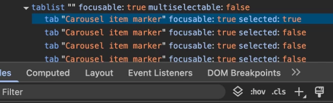
/* current item marker */
&::scroll-marker:target-current {
opacity: 1;
scale: 1;
}
/* hover and keyboard focus */
&::scroll-marker:where(:hover,:focus-visible) {
opacity: 1;
}
/* keybaord focus */
&::scroll-marker:focus-visible {
outline: 1px solid var(--nav-marker-bg);
outline-offset: 4px;
}
}
/** Style the Navigation Previous / next buttons **/
&::scroll-button(*) {
position: absolute;
position-anchor: --carousel;
width: var(--nav-btn-size);
aspect-ratio: 1/1;
background-color: var(--nav-btn-bg);
display: grid;
place-content: center;
color: var(--nav-btn-txt);
border:none;
border-radius: 50%;
opacity: 1;
cursor: pointer;
transition: all 150ms ease-in-out;
}
/* button - prev */
&::scroll-button(inline-start) {
content: '\276E';
left: calc(anchor(left) + 3rem);
bottom: calc(anchor(bottom) + var(--nav-btn-size));
}
/* button - next */
&::scroll-button(inline-end) {
content: '\276F';
right: calc(anchor(right) + 3rem);
bottom: calc(anchor(bottom) + var(--nav-btn-size));
}
/* hover and keyboard focus */
&::scroll-button(*):not(:disabled):where(:hover,:focus-visible) {
opacity: 1;
scale: 1.1;
}
/* keyboard focus*/
&::scroll-button(*):focus-visible {
outline: 1px solid var(--nav-btn-bg);
outline-offset: 4px;
}
/* disabled */
&::scroll-button(*):disabled {
opacity: .25;
cursor: unset;
}
}
DEMO:
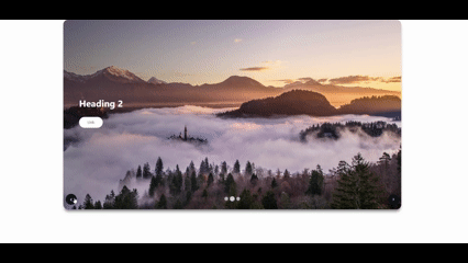
The next job is to adapt to include keyframes to have it carousel automatically...
