Question

Hide table of content toggle


Userlevel 2

Hey, i wish to hide the table of content toggle for all users so they only have the default view, how can i do this?


15 replies

Userlevel 7
Badge +5

Hmm…

Try this.

/** Table of Contents Mod **/
#undefined {
display: none;
}

Makes me raise an eyebrow… LOL

Userlevel 7
Badge +5

OK - 

That will probably not work.

Looks like the undefined ID is also tied to the active users dropdown so I will expand a bit.

/** Table of Contents Mod **/
#undefined.button-wrap {
display: none;
}

I will continue to look and see if that affects anything else.

Userlevel 2

Our developer tried removing it and it ended up removing the plus buttons on the admin menus, this is why im here

Userlevel 7
Badge +5

Our developer tried removing it and it ended up removing the plus buttons on the admin menus, this is why im here

I guess I am not sure what you are referring to.

Where are these “plus buttons”? I don’t recall any plus buttons in the admin menu.

Userlevel 2

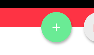
these, that appear on any kind of management panel

Userlevel 7
Badge +5

Ahh…

I was looking under the gear icon …

But I see - that is targeting all buttons along that strip.

New strategy then…

Try this…

/** Table of Contents Mod **/
[aria-label="Table of Contents"] {
display: none;
}


Userlevel 7
Badge +3

Ahh…

I was looking under the gear icon …

But I see - that is targeting all buttons along that strip.

New strategy then…

Try this…

/** Table of Contents Mod **/
[aria-label="Table of Contents"] {
display: none;
}


eek the accessibility person in me frowns seeing this, but you do what ya gotta do...

Userlevel 7
Badge +5

eek the accessibility person in me frowns seeing this, but you do what ya gotta do...


Are you concerned about not having a table of contents or the use of the aria-label as a CSS selector to hide it?

Userlevel 7
Badge +3

eek the accessibility person in me frowns seeing this, but you do what ya gotta do...


Are you concerned about not having a table of contents or the use of the aria-label as a CSS selector to hide it?

More just using an aria selector to hide things, since the goal of aria selectors is to help navigation. In general I have a hard time with hiding entire navigation sections without being able to adjust the page completely as it does tend to leave gaps and loopholes for how people navigate through non-visual based methods. In docebo’s particular case I also play the balance card of, if you are offering the mobile experience, the css mod’s from style sheets don’t apply there so you then have two very different navigation experiences on browser vs. app which is generally not great. I get it, the way the platform is architected, there’s not a lot of choice sometimes, but I also think a lot of people try to solve problems by just hiding without thinking through the complete ramifications, not saying this particular case, just in general it is a pretty common question on here “how do I hide x” and css display:none works, but should be the exception and not the rule in my mind. I try to stick to enhancements using these types of things, so that they follow graceful degradation ideals, and if something doesn’t load right because no one customized it at its viewport or interaction model, or whatever, the built in still works as a fallback which has a team of people testing such things. Lastly, when getting that specific, ties you to constant breakage/updates of the platform which gets tricky and can cause “emergencies” during updates since we don’t control the platform changes underlying.

It’s the ol’ spiderman thing, with great power comes great responsibility, and sometimes just knowing how to do something is not as important as knowing whether you should or shouldn’t do it.

end rant. :)

Userlevel 7
Badge +5

I like my code to be short and sweet as much as possible and I like to be able to target specific items. without having to use a selector that’s a mile long.

It is tough when multiple items are lumped together under a div with an ID of “undefined” and then the individual elements in the div do not have IDs making you have to do weird nth-child stuff or in this case I resorted to trying to find something unique about that element and the aria-label stood out as a possible option.

It certainly helps reinforce the idea of checking out the rest of your platform to make sure any customizations don’t break other things.

So far - I haven’t noticed anything by using the aria-label - but I get what you’re saying.

That said - in some cases it has been weeks before I noticed some collateral damage from a CSS Mod.

Userlevel 7
Badge +3

So at least you’re checking, that’s great. The problem becomes when people don’t or the checking is only from certain viewpoints/methodologies which is why I brought in the accessibility angles. The number of times someone tells me they customized any platform and they checked and they only checked in one browser on their one or two screen sizes and using one interaction method and then the page is unusable to a large group of users, is countless. That’s where the unintended consequences don’t show in other areas of the platform, but right on the “checked” page itself or due to a user interaction/flow that has not been considered. 

Userlevel 7
Badge +5

As a side note, I personally like the table of contents because we allow our learners to freely navigate to the various training materials and the TOC provides a quick way to jump to the desired content.

When it is hidden and all you have are the Next and Previous buttons underneath, you lose that ability and are stuck with linear navigation. Meh...

My issue is the sizing. Right now the player and TOC are 66.67% and 33.33% respectively but I would prefer to tweak that so it is more like 75% and 25% because it would better function with our existing content without the need to bump the navigation to the bottom.

We are still going through our onboarding phase so I have a few internal folks that help me run tests for changes we make. They’re pretty good at letting me know what doesn’t work or what they don’t like. LOL

I have enjoyed playing around with the CSS and tailoring things to our specific needs. I’ve learned a lot. Having spent more time in JavaScript with my authoring tool - this was a good way to force me to hone my CSS and HTML skills - I enjoy the “puzzles”. The whetstone known as Docebo…

My apologies for coming across a bit like an orc with my approach at times. I sometimes leave others to decide what they want to do with the information after I’ve done some grunt work. :) 

Userlevel 7
Badge +3

As a side note, I personally like the table of contents because we allow our learners to freely navigate to the various training materials and the TOC provides a quick way to jump to the desired content.

When it is hidden and all you have are the Next and Previous buttons underneath, you lose that ability and are stuck with linear navigation. Meh...

My issue is the sizing. Right now the player and TOC are 66.67% and 33.33% respectively but I would prefer to tweak that so it is more like 75% and 25% because it would better function with our existing content without the need to bump the navigation to the bottom.

We are still going through our onboarding phase so I have a few internal folks that help me run tests for changes we make. They’re pretty good at letting me know what doesn’t work or what they don’t like. LOL

I have enjoyed playing around with the CSS and tailoring things to our specific needs. I’ve learned a lot. Having spent more time in JavaScript with my authoring tool - this was a good way to force me to hone my CSS and HTML skills - I enjoy the “puzzles”. The whetstone known as Docebo…

My apologies for coming across a bit like an orc with my approach at times. I sometimes leave others to decide what they want to do with the information after I’ve done some grunt work. :) 

Totally agree on your TOC take. I’ve been thinking more broadly of some simple admin “platform” choices that could be interesting for things like this and avoid some overwrites. 
 

welcome to the css side! I love JavaScript too and miss having it here sometimes but it is good to know sometimes it’s overkill and can do the same without scripts which is generally better. 
 

no need to apologize, I apologize for getting you to that point, I just think it’s important to think broadly of implications to changes which a lot focus on the end product a lot and not the ramifications. 
there are definitely some weird platform choices that limit good choices for some customization, so As I’ve said, ya gotta do what ya gotta do. 
 

Userlevel 7
Badge +3

Hi everyone! 👋


I just made it through this thread and have a few thoughts.


First for @gstager and @Bfarkas:

  1. I’ve learned so much from both of you in the community. Thank you for being quick to respond to others and generous with your knowledge/talents
  2. I love the thoughtfulness and respect you show one another in the community; it’s especially apparent in your correspondence in this thread. Thanks for upholding our community guidelines
  3. I would love to capture the whole conversation you had in this thread in a separate post so that others could chime in as well. There are some great nuggets around governance & decision-making when it comes to customizing your platforms. Would y’all be willing to start a new conversation thread that shares your back & forth and leaves room for others to continue the conversation in either Let’s Talk Shop or in the HTML & CSS category?

Next for @adam-guts:

  1. Did @gstager’s last recommendation help you? I want to make sure your question gets answered and don’t want to lose it among the wonderful additional convo that resulted in this thread 🙂
Userlevel 7
Badge +5

@Adam Ballhaussen - I am flexible with whatever you think is best.

Reply