Is there any way to hide the option on the course mini-menus to “Mark as Outdated”? Client either wants a text entry for the user to enter (already upvoted that idea) or for it to go away.
- Community
- Learn & Share
- HTML & CSS
- Hiding Outdated option
Hiding Outdated option
- February 22, 2023
- 28 replies
- 1111 views
28 replies
- Hero III
- March 6, 2023
Theres no system setting for this unfortunately, and I just looked at a few spots where it appears to see if there are clean classes/id’s or something to do it with CSS and did not see a good approach to it.
- Novice II
- May 2, 2023
Theres no system setting for this unfortunately, and I just looked at a few spots where it appears to see if there are clean classes/id’s or something to do it with CSS and did not see a good approach to it.
Thanks for this. I am no CSS whiz so, I am asking my question based on limited knowledge.
I see that the div “ui-card-button-actions ng-star-inserted” is for the 3 dots in the Course card and I can hide this using CSS.
Based on your review, do you believe that this div will be changed in other parts of the platform and therefore is “not clean”?
Or was your advice more directed to hiding one menu option, but not the entire menu itself?
Appreciate your help.
- Guide II
- May 2, 2023
Theres no system setting for this unfortunately, and I just looked at a few spots where it appears to see if there are clean classes/id’s or something to do it with CSS and did not see a good approach to it.
Thanks for this. I am no CSS whiz so, I am asking my question based on limited knowledge.
I see that the div “ui-card-button-actions ng-star-inserted” is for the 3 dots in the Course card and I can hide this using CSS.
Based on your review, do you believe that this div will be changed in other parts of the platform and therefore is “not clean”?
Or was your advice more directed to hiding one menu option, but not the entire menu itself?
Appreciate your help.
I think Bfarkas is saying that it would impact other areas of the platform - and eliminate menus, not that one item. I suspect that using “nth child” css tags you might be able to restrict to just the one item.
I’ve had a few such issues and was usually able to handle it by restricting the CSS changes to certain pages. Which pages are you trying to hide this item on? If you can limit your scope appropriately AND get lucky to some extent with how Docebo programmed those specific pages, your request may be doable.
- Novice II
- May 2, 2023
Theres no system setting for this unfortunately, and I just looked at a few spots where it appears to see if there are clean classes/id’s or something to do it with CSS and did not see a good approach to it.
Thanks for this. I am no CSS whiz so, I am asking my question based on limited knowledge.
I see that the div “ui-card-button-actions ng-star-inserted” is for the 3 dots in the Course card and I can hide this using CSS.
Based on your review, do you believe that this div will be changed in other parts of the platform and therefore is “not clean”?
Or was your advice more directed to hiding one menu option, but not the entire menu itself?
Appreciate your help.
I think Bfarkas is saying that it would impact other areas of the platform - and eliminate menus, not that one item. I suspect that using “nth child” css tags you might be able to restrict to just the one item.
I’ve had a few such issues and was usually able to handle it by restricting the CSS changes to certain pages. Which pages are you trying to hide this item on? If you can limit your scope appropriately AND get lucky to some extent with how Docebo programmed those specific pages, your request may be doable.
Thanks for the response, lrodman.
I’m not sure about the user who started this thread but, I want to hide the whole menu at every occurrence. Fully agree on the nth child recommendation for menu items.
I can look around the platform to see if hiding, “ui-card-button-actions ng-star-inserted” affects anything else. If you have any thoughts about where/what else this might affect, I would love to hear them. :)
- Novice II
- May 18, 2023
/* hide 3 dot button on course cards in homepage view */
.ui-carousel-items-track .ui-ripple {
display: none;

}

/* hide 3 dot button on course cards in mycourses + catalog view */
.my-courses-and-learning-plans-content-wrapper .ui-card-wrapper  .ui-ripple {
display: none;

}
This will remove the 3 dot menu from course cards on pages and in the “my courses” and “course catalog” views (do test on your side 😉)
- Helper I
- June 9, 2023
This will remove the 3 dot menu from course cards on pages and in the “my courses” and “course catalog” views (do test on your side 😉)
Thank you! I was stumped and trying to work with the CSS for the ui-card-header-badges. But that removes all the flags (Enrolled status, Instructor, etc.)
Your code solves issue of users marking the items Outdated in the first place. We don’t use Playlists and no reason for our users to Hide items, so we are comfortable with hiding the dot options completely!
- Helper I
- June 14, 2023
- Novice II
- June 20, 2023

- Hero III
- June 20, 2023

Yup, basically if you have any custom CSS going for the course player area, it most likely will be impacted, and with all the changes they are still fixing/pushing out, not really worth the struggle of figuring those out quite yet.
- Helper I
- June 20, 2023
- Novice II
- September 7, 2023
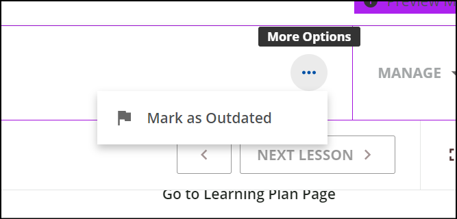
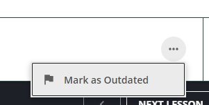
Have there been any updates to the CSS with the new course player? It is so prominent and literally any user can mark a course outdated
- Helper I
- September 15, 2023
This is crazy and a really silly thing to have in the platform with no mitigation. We should be able to opt out of these kinds of things. I have 80,000 registered users. This Mark Outdated thing is really time consuming to try to manage. I’ve got users that mark it “outdated” thinking that’s how they’re supposed to check off that they read it. Sigh. Things get marked outdated as soon as I post them. Really, only certain roles should be able to decide and flag that something is outdated.
- Helper III
- April 10, 2024
/* hide 3 dot button on course cards in homepage view */
.ui-carousel-items-track .ui-ripple {
display: none;

}

/* hide 3 dot button on course cards in mycourses + catalog view */
.my-courses-and-learning-plans-content-wrapper .ui-card-wrapper  .ui-ripple {
display: none;

}
This will remove the 3 dot menu from course cards on pages and in the “my courses” and “course catalog” views (do test on your side 😉)
I just tried these and wanted to add.
The first option likely works if you have the “Card” option listed, but if you have the widget displayed as a “list” instead, you need different code. This seems to have worked.
/* hide 3 dot button on course list in homepage view */

.ui-list-item-wrapper .ui-ripple {

display: none;

}
- Newcomer
- August 20, 2024
- Helper III
- August 20, 2024
The code is in the Custom Styles area of Configure Branding Look and Feel.
Keep in mind that the code I referenced is specifically for the List View courses widget that can be applied to pages. This code is not for the New Course Player, and there is a different code that has to be used depending on if the widget display is Card or List.
- Hero III
- August 26, 2024
has anyone found a way to remove this option only from the new course player? It’s quite annoying and not very useful.
- Hero III
- September 24, 2024

- Hero III
- September 24, 2024
Hmm…
This removed the three dot menu - only had the one option in there anyway for me.
No point having an empty menu so I cleared the whole thing.
/** Remove Mark as Outdated Menu **/

div.lrn-widget-course-header-slot:nth-child(2) {
    display: none;
}

/** End Remove Mark as Outdated Menu **/
I admit that I am struggling to achieve the same view as you have above.
As such - not sure I can investigate that until I do.
Perhaps we are displaying our things differently as a whole.
At any rate - please test as always to ensure this does not adversely affect other parts of your platform.
- Novice I
- October 10, 2024

- Hero III
- October 10, 2024
I had some success hiding on a course however this button and other spots it appears in in a menu that grows depending on the course settings and options so while I could find the code to remove from a specific course, when either listed other courses, it reappeared. + the dropdown option when in the course content (under the 3 dot menu) it yet another challenge…
Here’s what I used on the overview page so if you find a better way to hide this for all courses, please let me know…the last one dissent seem to do anything...
* Hide Mark as Outdated - New Course Player - Overview Page */
button[aria-label="Mark as outdated"] {
display: none;
}
/* Hide Mark as Outdated - New Course Player - in Course dropdown */
#dcb-ui-menu-0-2 {
display: none;
}
/* Hide Mark as Outdated - Course Cards - My Courses */
div.dcb-ui-list-item-wrapper[aria-disabled="true"] {
pointer-events: none;
opacity: 0.5;
cursor: not-allowed;
}
- Hero III
- October 10, 2024
Thanks for helping find that. I was not using that at all so did need to turn it on.
You could play with these - kinda ugly - I know…
For the individual thing - you might need to adjust the number value for the nth-child depending on how many items you have on that bar.
Not sure how it affects other courses. Do test...
/** Begin Remove only the Mark as Outdated **/

#doc-layout-page-content > lrn-content-overview > lrn-widget-content-overview-header > dcb-te-content-overview-header > section > div > div > div.dcb-te-content-overview-header-action-buttons.ng-star-inserted > dcb-ui-button-outlined:nth-child(3) {
	display: none;
}

/** End Remove only the Mark as Outdated **/

/** Begin Remove entire Mark as Outdated Bar **/

#doc-layout-page-content > lrn-content-overview > lrn-widget-content-overview-header > dcb-te-content-overview-header > section > div > div > div.dcb-te-content-overview-header-action-buttons.ng-star-inserted {
	display: none;
}

/** Begin Remove entire Mark as Outdated Bar **/
- Novice I
- October 10, 2024
/* Hide Mark as Outdated - New Course Player - Overview Page */
button[aria-label="Mark as outdated"] {
display: none;
}
/* Hide Add to playlist - New Course Player - Overview Page */
button[aria-label="Add to playlist"] {
display: none;
}
- Hero III
- October 10, 2024
- Novice II
- November 13, 2024
Hi all! Did anyone get this to work in a Chrome browser? I have tried everything suggested above to remove the three buttons from the new course player, along with some other strategies. I tried:
hiding all button in the action buttons container:
.dcb-te-content-overview-header-action-buttons {
display: none !important;
}
hiding specifically the Share button using the aria-label:
button[aria-label="Share"] {
display: none !important;
}
targeting the button with class hierarchy:
.dcb-te-content-overview-header-action-buttons .dcb-content-overview-header-share {
display: none !important;
}
and simply disabling the button interactions without hiding them:
.dcb-te-content-overview-header-action-buttons button {
pointer-events: none !important;
cursor: default !important;
}
Is there some kind of JavaScript overriding my ability to hide these buttons? I’m kind of at my wits end since I’m not an amazing coder to begin with! Any help or suggestions would be appreciated.
Log in to Docebo Community
Enter your email address or username and password below to log in to Docebo Community. No account yet? Create an account
Docebo Employee Login
Enter your E-mail address. We'll send you an e-mail with instructions to reset your password.
Scanning file for viruses.
Sorry, we're still checking this file's contents to make sure it's safe to download. Please try again in a few minutes.
OKThis file cannot be downloaded
Sorry, our virus scanner detected that this file isn't safe to download.
OK


