Best Answer

Make the course card header/ui.wrapper change colour depend on the type

  • January 22, 2026
  • 4 replies
  • 61 views

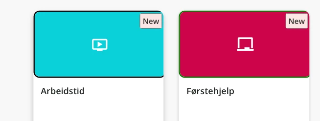
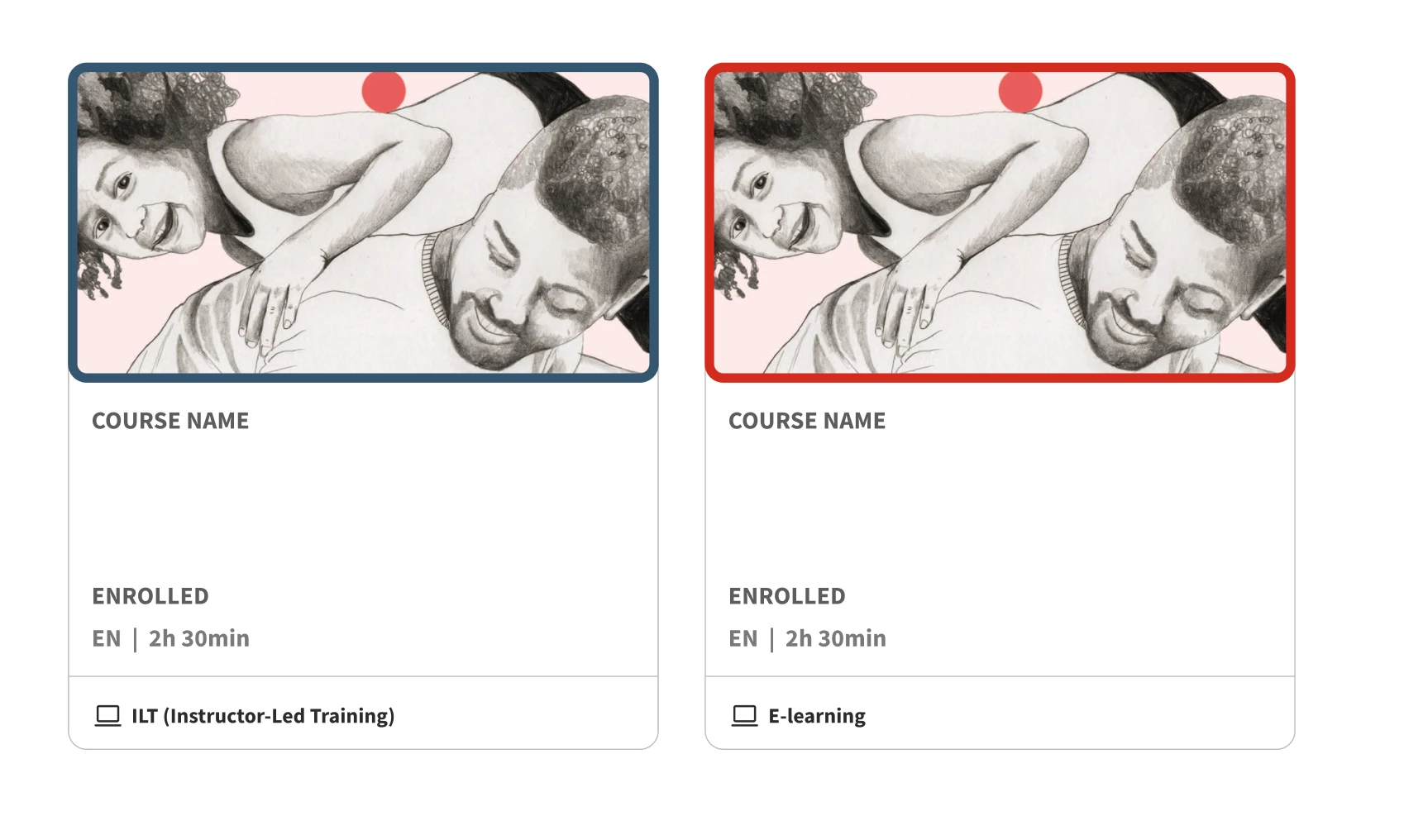
When looking at the course cards at the course catalog, I’d like to add a border around the image/thumbnail on the course cards. Another important aspect, is that the colour of the border depends on of it is an ILT class or e-learning. Lets say the border around E-learning cards are red and the ILT ones blue. (As shown from a figma sketch(image underneath this text))


I got a code snippet from employees at Docebo, but it didn’t work or change anything. 
Here’s the code snippet I got:
 

/* Specific border color for E-learning courses (Course codes starting with "EL") */

/* Note: Docebo uses dcb-ui-card or ui-card, check your specific platform structure */


[dcb-course-code^="EL"] .ui-card-wrapper, [course-code^="EL"] .ui-card-wrapper {

border-color: #FF0000 !important; /* Red border for E-learning */

}


/* Specific border color for ILT courses (Course codes starting with "ILT") */

[dcb-course-code^="ILT"] .ui-card-wrapper, [course-code^="ILT"] .ui-card-wrapper {

border-color: #0000FF !important; /* Blue border for ILT */

}

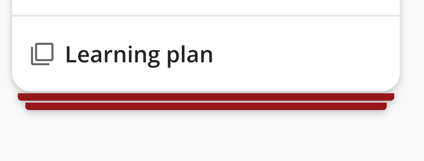
I did check if another code snippet that I had already added made the result of the code snippet above not appear or were overwriting anything, but after commenting it out/removing that particular code snippet, there were still no change. This is the other code snippet I’m talking about (for the additional “cards” under learning plans) + image of what it does:
 

/** Stacked UI cards on learning plans **/

ui-card.ui-card-stacked div.ui-card-wrapper::before {

background-color: #96171a;

}

ui-card.ui-card-stacked div.ui-card-wrapper::after {

background-color: #96171a;

}


Does anyone of you out here in the community know how to solve this?
Help is much appreciated.

Best answer by jasminekkochar

I’d be so thrilled if they added a course type attribute, but I also haven’t seen it. We leverage the fact that E-learnings, ILTs and Learning Plans all have their own icon (laptop, tv, etc) with a different name at the bottom:

So to make a border around the image/header content you’d use:
.ui-card-wrapper:has(g[data-icon-name="elearning"]) .ui-card-header{}


(The ui-card-wrapper is the whole card, and the header is just the image/tags/top part of it)

You’d then replace data-icon-name with “classroom” for ILTs, and “learningplan” for learning plans.

Hope this helps!
 

4 replies

  • Novice III
  • January 23, 2026

I’ve not been able to find any dcb-course-code attribute, let alone one that contains an EL or ILT string. :(


  • Novice III
  • Answer
  • January 26, 2026

I’d be so thrilled if they added a course type attribute, but I also haven’t seen it. We leverage the fact that E-learnings, ILTs and Learning Plans all have their own icon (laptop, tv, etc) with a different name at the bottom:

So to make a border around the image/header content you’d use:
.ui-card-wrapper:has(g[data-icon-name="elearning"]) .ui-card-header{}


(The ui-card-wrapper is the whole card, and the header is just the image/tags/top part of it)

You’d then replace data-icon-name with “classroom” for ILTs, and “learningplan” for learning plans.

Hope this helps!


  • Author
  • Newcomer
  • January 28, 2026

Hi ​@jasminekkochar! Thank you so much, it works!

Just have another question. When its added, it is kinda pushed to the right, so that you kan see the entire border. Any way to you know of to solve that?

It would be cool to add it to the footer as you did, if you have some tips for code for that too :)


  • Author
  • Newcomer
  • January 28, 2026

@jasminekkochar Never mind about the footer. I figured it out, but if you still have a clue why the border pushed to the right happens, help/advice is much appreciated!