
Hi - I’m looking for some help with customizing a catalog widget I’m using to serve up some learning plans on a page.
I’m trying to reduce the overall vertical height between the “Enroll in Partner Onboarding” title and the green learning plan cards below it - probably by about 10 pixels.

I’ve already the search bar that’s built into the widget and the resource count label with the following CSS:
/* removes the categories filters and search bar from the partner onboarding plan widget */
#doc-widget-1621 .ui-data-browser-controls-bar {
    display:none !important;
}

/* removes text showing number of resources in the widget */
#doc-widget-1621 .course-catalog-total-count {
display: none;
}
When I inspect the element in the browser console, I’m able to reduce this space by deactivating the padding-top shown here.
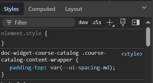
I’ve tried several variations of this CSS to duplicate the effect, but without any luck.
/* adjusts position of cards in partner onboarding catalog to remove gap between cards and title */
#doc-widget-1621 .doc-widget-course-catalog .course-catalog-content-wrapper {
	padding-top: none;
}
I appreciate any help you’re able to prove.
Thanks
