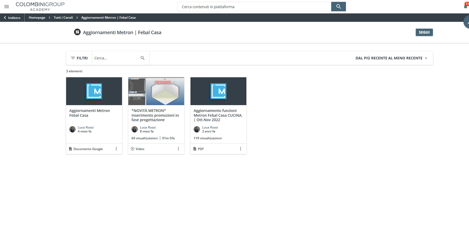
Complete CSS beginner over here but I’m loving reading all the posts about how to customise your platform using CSS. I’ve rounded all the edges of our widgets which looks awesome and now I’m looking for how I can round the edges of the course icons (screenshot of what I mean attached)?! I know it’s possible but I can’t quite work out how to do it. Could someone help?
Thanks
Sarah
Page 1 / 1
@sparker It looks like you forgot to attach the screenshot. Could you please send the screenshot so that we can take a look at it?
Ahh my mistake. Screenshots attached. The course icons are the ones I want to make rounded as per the rounded widgets screenshot. Thank you so much
@sparker Thank you for sharing the screenshots. I attempted to use CSS to round the course cards, but it seems to only round the bottom edges and not the upper portion where the thumbnail is displayed.
You might want to adjust the corner radius though if it’s too rounded for you.
Could someone help me to move the gear Icon? I am new at testing CSS and I would like to center my gear Icon as it is place very high. Do you know how to?