Hello all.
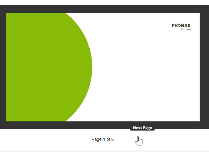
I’m having a weird issue wherein the Course Player seems to be hiding the navigation controls. Users cannot see the navigation buttons - either they are fully transparent or they are the same color as the surrounding elements. The screenshot below demonstrates how there is a ‘Next Page’ button but it is not visible unless hovered over:

My fear is someone will tell me this is a CSS issue, b/c that really pushes the boundaries of my knowledge & the only person who could fix this is about halfway through their holidays. but in any case, any feedback is welcome, even if I don’t want to hear it.
Regards,
Nate


