You could heavily modify the widget with custom css to do what you are asking, but then won’t work on mobile, generally what you are asking for is an image with a link wrapped around it in an html widget instead. Remeber, not great to include the text in the image, if you must make sure to have alt text added to the image for accessibility.
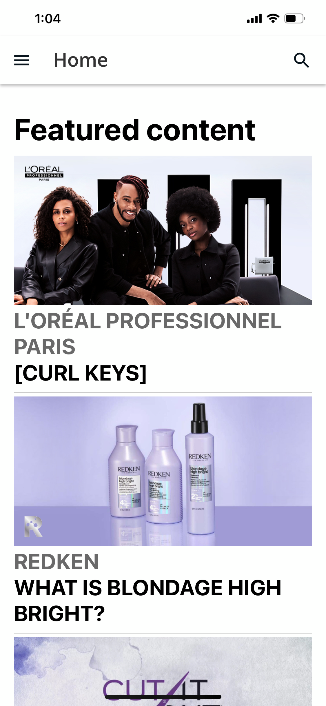
Any clue how they did what’s in the sshot?
by “all button” I mean all clickable, I still would want font based text instead of text burned into an image as per @Bfarkas
I mean that looks like a html widget with:
Image
Text
Image
Text
Image
And then all the items get wrapped in a link, and possibly customized to not look like links. (Although I’d also guess from picture that they just made one large image and linked it and called it a day, which is not great)
Why don’t you use the Image widget? It allows you to add a URL making the whole thing clickable. We use it a lot and it makes the pages look great. Plus you have more control over sizing with images over a custom content widget
Just be careful with text in it, forgot about this cuz of the multiple nature of the example given.
I regularly use powerpoint to create the artwork so I can maintain text sizes and image sizes...in PPT you can opt to save as JPEG or snap a screen shot of your artwork...just make sure you take note of the zoom percentage of your screen and hopefully your screen capture tool can also show you pixel sizes when you capture an area so you can make them all the same size...I also use the default shapes to create the illusion of a button or add something that looks like it’s clickable even though the entire image is clickable. You can get very creative.
Love the PPT setup, I tell people all the time to just use as it makes it easier to share and keep things updated, you can produce png’s too which are cleaner usually, and often make short easy tutorial videos since you can export to mp4 too.
Text concern is that if the text is only in the image, it is not accessible so anyone using a screen reader or similar technology will not see or hear it. Because you can get so creative, people tend to forgot often and quickly, and it is a detriment to the variety of learners.
Agree but then the image widget in itself is not accessible either. ALT tags are needed in part to remedy this for users with disabilities.
Yup, that’s all I keep trying to point out and above :)
People forget that step WAY too often.