Hello everyone,

We’re revamping out badges this year and I was wondering if there is a way to display the badges bigger inside the widget used on the dashboard? Currently, the badges are displaying very small. Any writing that may be on them is essentially not visible. We were hoping to be able to label the badges so it is not just a generic icon. ie. A First Aid Certificate badge would have an icon but it would also say First Aid on it visibly. 

Any help would be greatly appreciated. 

This is exactly what me and my team have been discussing this week.  It would be great to be able to either have them larger, or a zoom function where a user can enlarge them.  I was trying to work out a way of doing it.  Potentially via CSS?


@Neil Patterson It really would be great. We’re hoping to have all of our badges labeled (on the badge itself) going forward, so that it’s clearer what they are for when shared to LinkedIn, etc. But that means they look very small and not legible on our actual platform currently. 


If you find a way to do it, I would be very interested in how to do it on our end also. 


Should def be able to be accomplished via css just a matter of hunting down the right classes, can take a look when I get home or if any of the css gurus on here wanna take a look :)


@Neil Patterson It really would be great. We’re hoping to have all of our badges labeled (on the badge itself) going forward, so that it’s clearer what they are for when shared to LinkedIn, etc. But that means they look very small and not legible on our actual platform currently. 


If you find a way to do it, I would be very interested in how to do it on our end also. 

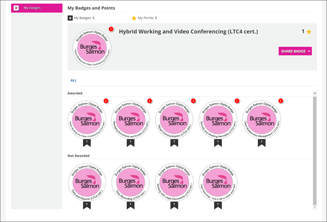
This is exactly what we do!  The writing is illegible in Docebo however:

I did have a play around just using the Inspect feature of Edge and got the badge bigger, but nothing else grew with it.  I fear there is a lot of CSS that may need changing to achieve it


@Ahebert - there is now an idea live that another member has put up.  Get voting! 😁


Thank you for the heads up @Neil Patterson 


Here is my attempt at this

There was definitely a lot to adjust. I think I got it.

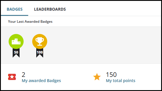
Before: Default 52x52


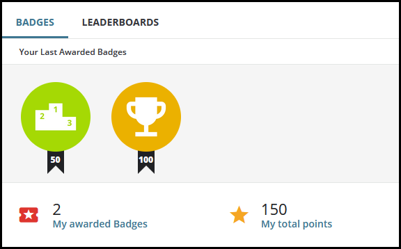
After: 100x100


Here is what I did


/** Bigger Badges **/

/** For Expansion of the Badge Widget **/
div.badges-tab__wrapper ul.list-badges-content {
height: 100% !important;
}

/** For Expansion of individual badges **/
ul.list-badges-content li {
min-width: auto !important;
}

/** For the little black banner with points **/
/** This was based on badge size of 100x100 **/
/** You may need to resize if you choose a different size. **/
ul.list-badges-content li::before {
top: 95px !important;
}

/** Set the desired dimensions of your badges **/
/** Affects all badges **/
ul li avatar div.avatar__image {
width: 100px !important;
height: 100px !important;
}

/** For invisible spacing element **/
avatar.badge-thumb {
width: 100px ;
height: 100px;
}

/** For invisible spacing element **/
avatar div.avatar-clip {
width: 100px !important;
height: 100px !important;
}

/** To bump the numeric point value to match badge dimensions **/
/** Adjust this to match your badge dimensions **/
span.badge-score {
width: 100px !important;
}

As always - test - and hopefully this is helpful.


I only tested with two badges, though.

So I would be curious to know if this still works with several more badges in a widget.


@gstager - you are a star!  This works in the widget, but has made no difference to the My Badges page 

/legacy/lms/index.php%3Fr%3DGamificationApp/GamificationApp/MyBadges 


Unfortunately for us, this is where our users go.  I don’t have time this afternoon, but Monday I will play around with your CSS as a starting block and see where I get to.

Thank you!!


Oooh - the legacy page is another beast.

Some of the rules on that page are shared by the admin side pages. I was able to resize the MyBadges page but it broke the New Badges part of admin menu and would require working between both pages to see changes.

On that token - I did notice that my above code does adjust the points text in the little banner on the New Badges page.


You can apply this snippet to bring that back in line.


.preview_badge.wide {
width: 50px;
}


OK - I think I managed to figure out the admin pages with the My Badges page so let’s put all of this together in one big set of CSS.

This CSS should resize badges to 100x100 on the MyBadges Legacy page, the dashboard widget, and will increase the size of the preview icon on the New Badge admin screen.

Remember to test. Let me know if something else pops up.

/** Legacy My Badge Page **/

/** Sizes the container for the newly awarded badge at the top **/
/** Adjust values based on your desired badge dimensions **/
/** These values were based on a new badge size of 100x100 **/
.gamification-mybadges-tabs .badge-spotlight .inner {
margin-left: 120px;
min-height: 100px;
}

/** Size the container for the badge **/
/** Change values to your desired badge dimensions **/
.preview_badge {
height: 100px;
width: 100px;
}

/** Size the badge itself **/
/** Change values to your desired badge dimensions **/
.preview_badge img:first-child {
height: 100px;
width: 100px;
}

/** Adjustment for the little black banner **/
/** The left value should be 15px less than 50% of your width **/
.preview_badge img.flag {
position: relative;
left: 35px;
top: 0px;
width: 30px;
}

/** Adjustment for the point text inside the little black banner **/
/** Good start is to match the height of your badge **/
div.preview_badge span.flag_text {
top: 100px;
}

/** End of Legacy My Badge Page **/

/** Admin Page Corrections **/

/** Sizes the preview icon **/
/** This should match your desired dimensions **/
#preview_icon {
width: 100px !important;
height: 100px;
}

/** This should match your desired badge width **/
.preview_badge.wide {
width: 100px;
}

/** End of Admin Page Corrections **/


/** Dashboard Widget **/

/** For expansion of the badge widget height **/
div.badges-tab__wrapper ul.list-badges-content {
height: 100% !important;
}

/** For expansion of individual badges **/
ul.list-badges-content li {
min-width: auto !important;
}

/** For the little black banner with points **/
/** This was based on badge size of 100x100 **/
/** You may need to resize if you choose a different size. **/
ul.list-badges-content li::before {
top: 95px !important;
}

/** Set the desired dimensions of your badges **/
/** Affects all badges **/
ul li avatar div.avatar__image {
width: 100px !important;
height: 100px !important;
}

/** For invisible spacing element **/
avatar.badge-thumb {
width: 100px ;
height: 100px;
}

/** For invisible spacing element **/
avatar div.avatar-clip {
width: 100px !important;
height: 100px !important;
}

/** To bump the numeric point value to match badge dimensions **/
/** Adjust this to match your badge dimensions **/
span.badge-score {
width: 100px !important;
}

/** End of Dashboard Widget **/


@gstager - you sir have most definitely won the internet today!!  Thank you so much for looking into this and spending your time helping me.  As you can see from the below, it has worked a treat.  What a great way to start a Monday morning!

 I really do need to brush up on my CSS skills - I can do the very basics, but it would have taken me forever to come up with this.  Thank you again!


@Ahebert - @gstager has created a great workaround until (hopefully) Docebo will put a permanent solution in place!


@Neil Patterson - glad to hear this is working for you


@gstager You are amazing, sir. This worked beautifully on our end also!


@Ahebert - Glad to hear it is working for you.


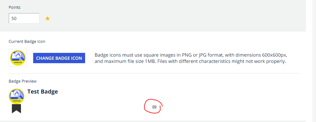
I had a question about the code, I’m getting weird effects in the preview (see image below) where the points shift drastically. I’m wondering if this is due to my Custom CSS boxes being limited to 6.9 and 7.0? or am I splitting the CSS incorrectly?
Please advise, thank you!


I had a question about the code, I’m getting weird effects in the preview (see image below) where the points shift drastically. I’m wondering if this is due to my Custom CSS boxes being limited to 6.9 and 7.0? or am I splitting the CSS incorrectly?
Please advise, thank you!

I posted ALL of the most recent solution in the 7.0 box.

I have literally no text whatsoever in the 6.9 box.


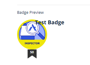
Interesting, when I post all of the most recent solution in 7.0 I still get a weird alignment with the badge Title. I’ll keep troubleshooting, thanks! Title: 


Interesting, when I post all of the most recent solution in 7.0 I still get a weird alignment with the badge Title. I’ll keep troubleshooting, thanks! Title: 


Try this…

/** Adjust the badge title in Admin view **/
/** Set the left value to at least the same as the width of your badge **/
/** Anything over your badge width will be the space between **/
/** In this example I have a 100px badge. **/
/** Setting left to 110px gives it a little padding. **/

.preview_badge .badge_title {
left: 110px;
}


@gstager You are awesome, thank you for providing the solution to this. This worked well on our end too! Super appreciative!


Hi everyone, some code worth sharing. If anyone sees any errors or suggested modifications let me know. The last line also removes the little black flag and number if your team doesn’t use points (we don’t) 


/*Badge Size Adjustement Site Wide */

.myactivities-badge-column{
width:110px;
}

.myactivities-badge-column img{
height: 100px;
width: 100px;
}

/* Increases Text Size in "My Activities" Certifications and Badges Screen to match bage size */

.myactivities-sidebar .grid-view table.items th, .myactivities-sidebar .grid-view table.items td{
font-size: 12pt !important;
text-align: left;
padding-right: 14px;
}

.myactivities-sidebar .grid-view table.items th, .myactivities-sidebar .grid-view table.items th a{
font-size: 12pt;
text-align: left;
padding-right: 14px;
}

.gamification-panel-recent-badges .ui-avatar-wrapper{
width: 110px !important;
height: 110px !important

}

.gamification-panel-recent-badges .dcb-ui-avatar .ui-avatar-body, ui-avatar .ui-avatar-body element.style img{
width: 100px !important;
height: 100px !important
}

.gamification-panel-recent-badges dcb-ui-avatar.ui-avatar-size-lg, ui-avatar.ui-avatar-size-lg{
width: 80px !important;
height: 100px !important;
}

.preview_badge{
width: 100px !important;
height: 100px !important;
}

.preview_badge img:first-child, #preview_icon, #current_badge_icon{
width: 100px !important;
height: 100px !important;
}

.gamification-mybadges-tabs .badge-spotlight .inner{
margin-left: 120px;
margin-top: 10px;
}
/* Hides the little black flags and numbers for points for badges */

.badge-list .flag, .flag_text{
display: none !important;
}


OK - I think I managed to figure out the admin pages with the My Badges page so let’s put all of this together in one big set of CSS.

This CSS should resize badges to 100x100 on the MyBadges Legacy page, the dashboard widget, and will increase the size of the preview icon on the New Badge admin screen.

Remember to test. Let me know if something else pops up.

/** Legacy My Badge Page **/

/** Sizes the container for the newly awarded badge at the top **/
/** Adjust values based on your desired badge dimensions **/
/** These values were based on a new badge size of 100x100 **/
.gamification-mybadges-tabs .badge-spotlight .inner {
margin-left: 120px;
min-height: 100px;
}

/** Size the container for the badge **/
/** Change values to your desired badge dimensions **/
.preview_badge {
height: 100px;
width: 100px;
}

/** Size the badge itself **/
/** Change values to your desired badge dimensions **/
.preview_badge img:first-child {
height: 100px;
width: 100px;
}

/** Adjustment for the little black banner **/
/** The left value should be 15px less than 50% of your width **/
.preview_badge img.flag {
position: relative;
left: 35px;
top: 0px;
width: 30px;
}

/** Adjustment for the point text inside the little black banner **/
/** Good start is to match the height of your badge **/
div.preview_badge span.flag_text {
top: 100px;
}

/** End of Legacy My Badge Page **/

/** Admin Page Corrections **/

/** Sizes the preview icon **/
/** This should match your desired dimensions **/
#preview_icon {
width: 100px !important;
height: 100px;
}

/** This should match your desired badge width **/
.preview_badge.wide {
width: 100px;
}

/** End of Admin Page Corrections **/


/** Dashboard Widget **/

/** For expansion of the badge widget height **/
div.badges-tab__wrapper ul.list-badges-content {
height: 100% !important;
}

/** For expansion of individual badges **/
ul.list-badges-content li {
min-width: auto !important;
}

/** For the little black banner with points **/
/** This was based on badge size of 100x100 **/
/** You may need to resize if you choose a different size. **/
ul.list-badges-content li::before {
top: 95px !important;
}

/** Set the desired dimensions of your badges **/
/** Affects all badges **/
ul li avatar div.avatar__image {
width: 100px !important;
height: 100px !important;
}

/** For invisible spacing element **/
avatar.badge-thumb {
width: 100px ;
height: 100px;
}

/** For invisible spacing element **/
avatar div.avatar-clip {
width: 100px !important;
height: 100px !important;
}

/** To bump the numeric point value to match badge dimensions **/
/** Adjust this to match your badge dimensions **/
span.badge-score {
width: 100px !important;
}

/** End of Dashboard Widget **/


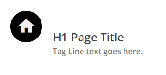
@gstager - Just an FYI - I found a weird effect on the page title banner when the avatar div.avatar-clip was coded. It forces the page title and tag to push out. Doesn’t apply if your site hides this. :)

/** For invisible spacing element **/
avatar div.avatar-clip {
    width: 99px !important;
    height: 99px !important;
}
See comparisons:


Reply