In the new Course Player configuration, I cannot seem to figure out how to go to the next course in a learning plan with out having to leave my current course, go to the learning plan, and enter back in to the next course. I think this will confuse my learners and be very frustrating. As a Docebo admin, I even got confused trying to figure out what my next step was. Is there a button or feature I am missing? I would love for a pop-up to appear saying “take me to (next course in learning plan’s name)” Is this possible?

Hi @agreen3225 

You can use then button above the training materials. Or when you finalize one of the training materials appears the “Go next course” button 
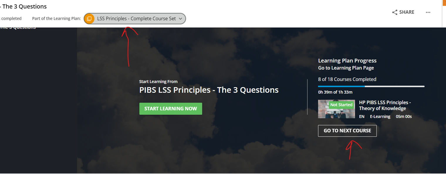


Ok so for some reason that was not popping up for me. I think I know what my issue is. We have some of our courses embedded as an iframe, and so it is marking me as complete and telling me to go on to the next course before I actually complete the current training. So I need to clear away that message before I move on to the actual course material. Once I clear that, it is hard to get it back. It is an issue we will have to figure out, if anyone has any suggestions, please let me know!


Hi @agreen3225,

Unfortunately, learning plans are treated very step-motherly by Docebo. This applies to the admin side of the learning plans as well as to the user experience. It seems that this has not really been improved with the new course player.

What I expect from a learning plan is that it guides you through a series of related courses without having to search for them. The new course player, which I actually like very much, has missed an opportunity here. In learning plans, the "Syllabus" column unfortunately only contains one course at a time, which is very confusing for the user. This would be the perfect place to display the other lessons in the learning plan, as is done within courses. For this reason, we are currently investigating whether to replace the learning plans with courses having several lessons. Both the admin setup and the user experience would be easier and better.

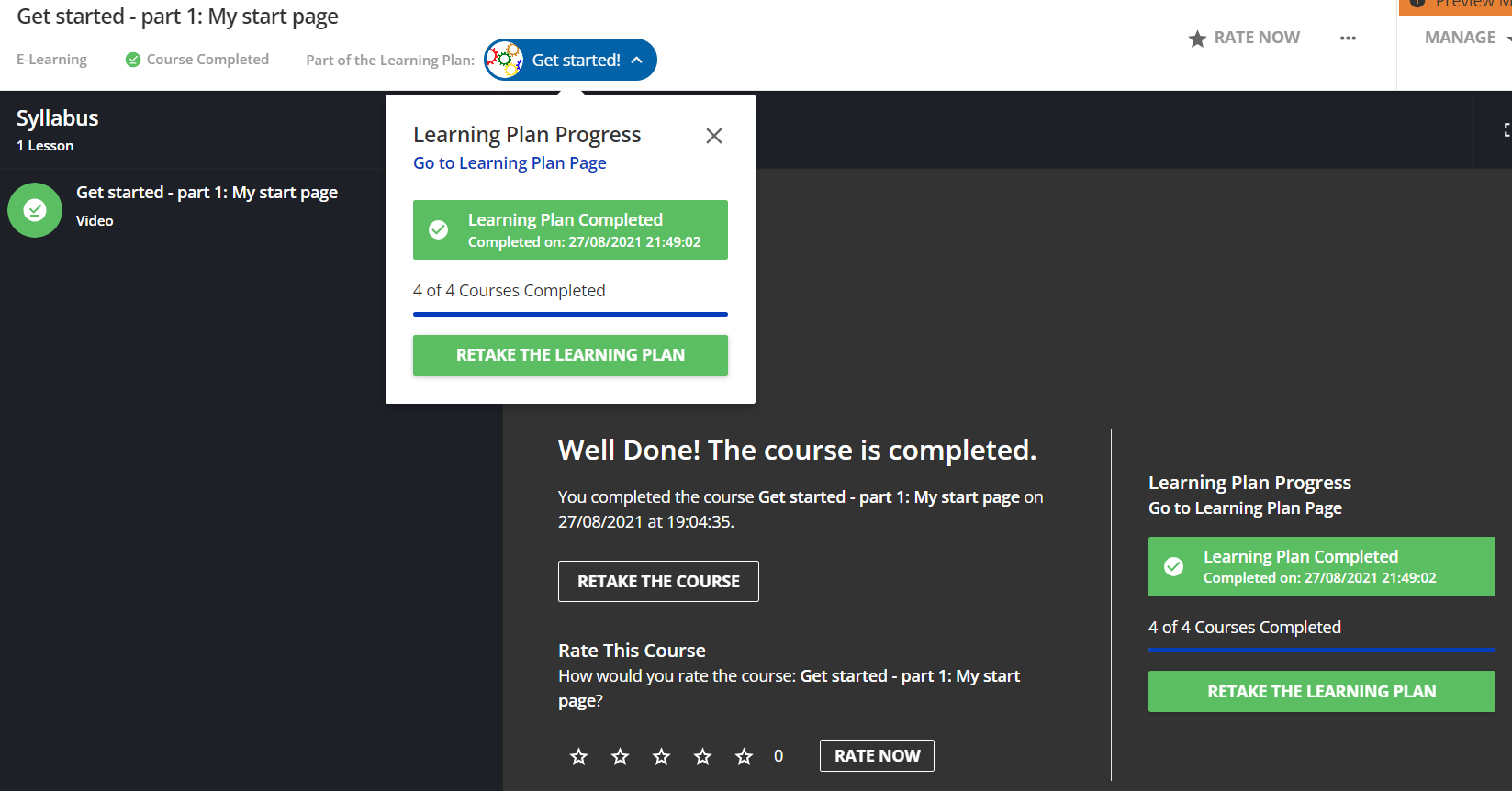
It is true that the button above the training material lists the individual lessons, and there is also the "Go to next course" button (BTW: Why are the terms lesson and course actually used for the same concept?). But this is only a poor substitute and does not work for learning plans that have already been completed, see my screenshot. Clicking on "Retake the learning plan" always leads to the same screen. The only way to see another lesson is to click on the link "Go to Learning Plan Page" in the drop-down box. Not very user-friendly and not easy to find …

Perhaps someone has had similar experiences and wants to replace learning plans with courses with multiple learning materials? Any ideas or comments?

Uwe


Hi @Uwe Sprengart I just got to testing Learning Plan functionality, and sadly I have to admit my hopes for experience improvement are disappointed. 

So about navigation inside of learning plan, at first I was happy to see that navigation is better with “Go to next course button”, unfortunately, with sequenced learning plan, this might be a source of confusion for learners. Button is active no matter if I have completed or not completed the training. So if I use is from the level of a course that is a prerequisite, I’m just taken back to previous completed course. There is no pop up saying, “Prerequisites not met”. I would assume there will be message OR at least if prerequisites are not met, Next button should be greyed out.

Another thing I noticed which is also a bit of pain is, when you are in a course inside of a learning plan, there is no intuitive way to close it (or I’m missing something). I would assume, that similarly as with SCORMS, there should be ‘X’ in top right row, or some sort of quick access exit button?


Is there a way / any CSS programming to change the color of the course completion “circle” for each course in a learning plan?  The blue does not match our branding and would like to resolve.  


Reply