Hello Everyone,  

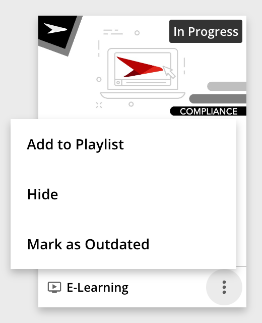
Trying this community out for the first time.  I have a question surrounding the Playlist feature.  We are currently not utilizing this feature in our LMS, however in the top right hand corner of a  course the option to add to a Playlist still exists.  Anyone have the correct CSS code that would eliminate this feature all together?  I would love to put that in the CSS editor to not have the option available.  Fingers crossed.  Thanks everyone. 
Would also like to disable this button from courses and/or learning assets.


@kferguson to hide the Add to Playlist button on the asset player page, you can add the below CSS to your Custom Styles area on the Configure Branding & Look page:

#addtoplaylist {display: none;}

@alightbsas, the Add to Playlist button that appears on the course player page doesn’t have a unique ID so it’s a little trickier:

doc-layout-action-buttons buttonuaria-label="Add to Playlist"] {
display:none;
}

The downside to this code is that it only works for English. You’ll have to add a corresponding code for every language you support as well


Hope this helps!


@nick.tosto  did you have to make any updates to this code with the new player? I’m still seeing the “add to Playlist” option in the courses. 🤔


@Mdubey this code hides the “more” menu which includes both the “Add to Playlist” option and the “mark as outdated” option: 

.lrn-widget-course-header-actions dcb-ui-menuniconname="more-horizontal"] {

display: none;

}

I’ll see if I can find a better snippet that only targets the Add to Playlist option consistently but that code should be a decent temporary solution.


@nick.tosto  This is good enough for our needs! OMG, I could hug you. THANK YOU!!!!


For those curious, this got detailed out in a post over here for a way to do each menu item instead of the whole menu:

For playlist it is:

.dcb-ui-list-item-aside-provided:has([data-icon-name="add-playlist"]) {
display: none;
}


@nick.tosto Again, thank you for helping us remove it from the course pages. Just found it popping up in the list of My Courses. Any CSS for removing it here to? I really did try to figure our how to write the CSS without asking you this time, but I have no idea how to code. HA! 🤦🏻


So the problem on this one is that there’s nothing unique to call other than text which doesn’t work due to multiple languages to isolate just that menu item, unlike in the prior example. You can use ‘child’ to could for it, but this menu is in many widgets and pages and depending on user and role the child number will be different (for instance if an admin there can be an edit at the top moving the ‘add to playlist’ down one, and in that case it would show and the edit would hide...)

Only way I see is to hide the full ‘...’ menu again here, and really it sounds like you want it across all cards and list views, this should do that:

/* Hide '...' menu  on list view*/
.ui-list-item .ui-card-footer {
display: none;
}

/* Hide '...' menu on Card view*/
.ui-card-wrapper .ui-card-footer .ui-card-button-actions {
display: none;
}

That being said, you are losing all the actions across them all then, so you might need to be careful and isolate certain pages or widgets.


@kferguson to hide the Add to Playlist button on the asset player page, you can add the below CSS to your Custom Styles area on the Configure Branding & Look page:

#addtoplaylist: {display: none;}

@alightbsas, the Add to Playlist button that appears on the course player page doesn’t have a unique ID so it’s a little trickier:

doc-layout-action-buttons buttonuaria-label="Add to Playlist"] {
display:none;
}

The downside to this code is that it only works for English. You’ll have to add a corresponding code for every language you support as well


Hope this helps!

Hi @nick.tosto - I tried using the above code to hide the Playlist option, unfortunately no luck 😞
Well I am using the old course player. So any help to hide the “Add to playlist” in both the Course Player as well the ILT session page, would be appreciated. Thank you in advance 🙂.


I was able to get this code to work in our production site.

.lrn-widget-course-header-actions dcb-ui-menu[iconname="more-horizontal"] {
display: none;
}

However, our sandbox was recently updated with the September 2024 release and it doesn’t remove the “...”. Has anyone else experienced this? I looked in coding but can’t tell which one to grab to remove it. 

Thanks in advance for your help!


Hi all,

I’ve tried all of the CSS listed above and none of it is working. Any chance you all have new CSS I can try? 


Hi all,

I’ve tried all of the CSS listed above and none of it is working. Any chance you all have new CSS I can try? 

@jbrandow I realized my CSS snippet #addtoplaylist: {display: none;} contained a colon that shouldn’t be there. try:

#addtoplaylist {display: none;}

to hide the button on the asset player page.


Reply