Question

Unenrol from course

  • November 12, 2024
  • 4 replies
  • 64 views

Forum|alt.badge.img+2

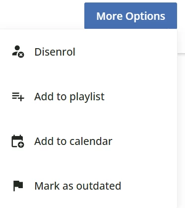
When the new course player was previewed a long time ago I raised the issue of the unenrolment button being almost impossible to find.  I’d hoped as we got nearer to go live this had been addressed, but alas no. 

I have 2 questions about this drop down and wondering if anyone can tell me if they have similar issues and can suggest some workarounds:


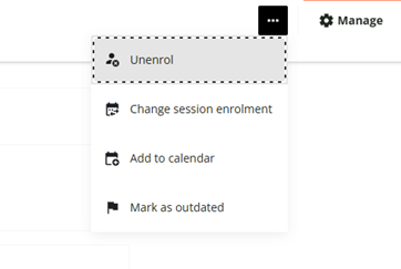
  1. Does anyone else agree that the unenrol button is hidden and not easy to find, and how they intend to mitigate the queries we’ll be getting from users on how to find it?
  2. The ‘Add to Calendar’ button does not work properly for us (the email notifications we send out with an ICS file does work).  This button allows users to ‘add to calendar’ or copy the webcal link.  In our org, where we use Outlook classic, trying to import this way ends in an error.  Does anyone know why, or whether there is a way to hide this option if there isn't a fix? 

4 replies

lrnlab
Hero III
Forum|alt.badge.img+10
  • Hero III
  • November 12, 2024

Agree that’s it annoying now that it’s almost completely hidden...Something like a button saying “more options” might make more sense.


  • Novice II
  • April 10, 2025

Hi ​@KTJD

We’ve run into some confusion for this as well. Has anyone explored creating buttons via CSS to have that option display on the menu beside the ellipse? Would need to makes sure it applies to the same session/pathing, etc. Wondering if there are any examples where people have created buttons like this we could start from. 


  • Novice I
  • September 1, 2025

I haven’t found a way to make the different options into separate buttons, but in case it’s of any interest to anyone, I’ve had a go at making a custom button that replaces the ellipses with “More Options”


/* Style the "More Options" button */
button.dcb-course-header-more-options {
display: inline-flex;
align-items: center;
justify-content: center;

padding: 8px 16px !important;
border-radius: 6px;
border: 1px solid #ccc;
background-color: #f8f9fa;

font-size: 14px;
font-weight: 600;
color: #000 !important;
cursor: pointer;
transition: all 0.2s ease-in-out;
}

/* Hover effect: darker background + white text */
button.dcb-course-header-more-options:hover {
background-color: #0056b3;
border-color: #004494;
}

button.dcb-course-header-more-options:hover::after {
color: #fff !important;
}

/* Keep white text & blue background when menu is open */
button.dcb-course-header-more-options[aria-expanded="true"] {
background-color: #0056b3;
border-color: #004494;
}

button.dcb-course-header-more-options[aria-expanded="true"]::after {
color: #fff !important;
}

/* Remove the SVG ellipsis icon completely */
button.dcb-course-header-more-options svg {
display: none !important;
}

/* Remove icon wrapper if it still exists */
button.dcb-course-header-more-options .lmn-button-icon {
display: none !important;
}

/* Reset content layout so text is centered with no gap */
button.dcb-course-header-more-options .lmn-button-content {
display: flex !important;
align-items: center !important;
justify-content: center !important;
gap: 0 !important;
padding: 0 !important;
}

/* Add custom text label */
button.dcb-course-header-more-options::after {
content: "More Options";
font-size: 14px;
font-weight: 600;
color: #000;
}


This version makes the button white with black text normally, and then blue with white text when hovering (blue: #0056b3) or when the menu is open (slightly lighter blue: #004494).


lrnlab
Hero III
Forum|alt.badge.img+10
  • Hero III
  • September 1, 2025

interesting ​@HJP thank you for sharing . You should also post it under the HTML & CSS discussion thread so we can find it easily

https://community.docebo.com/html-css-49