I’m sure one of you clever css gurus has figured this out already. Help please.
I want to change the inactive user icon to be something more obvious, like a big red cross, or maybe a skull and crossbones, but I can’t get any further than something to do with the span.status-state
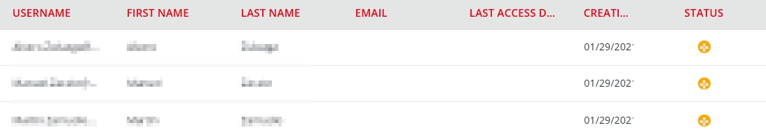
We’re experiencing ongoing issues where our staff are not realising that the little grey dot means inactive. And now today I learned that one of our support staff has his display set to dark mode, which makes the status icon display a grey tick, so he thought the customer was active. Not ideal
Best answer by elamast
I’m sure one of you clever css gurus has figured this out already. Help please.
I want to change the inactive user icon to be something more obvious, like a big red cross, or maybe a skull and crossbones, but I can’t get any further than something to do with the span.status-state
We’re experiencing ongoing issues where our staff are not realising that the little grey dot means inactive. And now today I learned that one of our support staff has his display set to dark mode, which makes the status icon display a grey tick, so he thought the customer was active. Not ideal
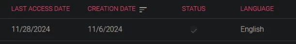
It’s interesting because the checkmark is still there in when the account is inactive, but is gray to match the circle color. The checkmark is there through the pseudo-class .zmdi-check:before, and is present in both active and inactive states.
I also observe three possible states for the DIV that contains the circle and checkmark: .status-state (gray circle), .status-state .active (green circle), and .status-expired (red triangle--for expired users). So let’s target the .status-state that is not also .active:
@gus You probably know this but, by default in the system there is a coloured circle (green) surrounding around the checker mark when the account is active. And when the account is inactive it’s just grey with no checker mark. Why not adding more colour to the checker mark so that it stands out if one us using dark mode?
I’m sure one of you clever css gurus has figured this out already. Help please.
I want to change the inactive user icon to be something more obvious, like a big red cross, or maybe a skull and crossbones, but I can’t get any further than something to do with the span.status-state
We’re experiencing ongoing issues where our staff are not realising that the little grey dot means inactive. And now today I learned that one of our support staff has his display set to dark mode, which makes the status icon display a grey tick, so he thought the customer was active. Not ideal
It’s interesting because the checkmark is still there in when the account is inactive, but is gray to match the circle color. The checkmark is there through the pseudo-class .zmdi-check:before, and is present in both active and inactive states.
I also observe three possible states for the DIV that contains the circle and checkmark: .status-state (gray circle), .status-state .active (green circle), and .status-expired (red triangle--for expired users). So let’s target the .status-state that is not also .active: