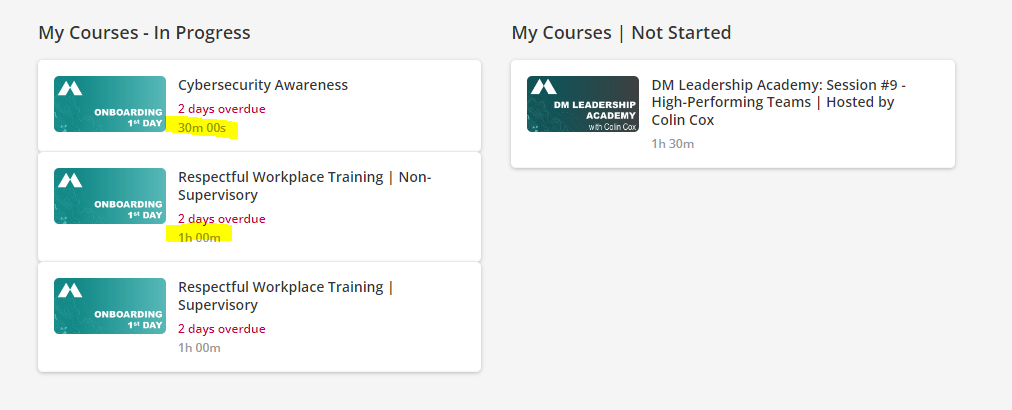
By default, when you add time options for a course, the course duration on the cards (in a catalog) is displayed with just the initials for hour, minutes, and seconds.

We consider showing the seconds as insignificant and would want to display only the hours and minutes or just minutes. For example: 1 hour 10 mins or 70 mins

Our initial thought was to do it through CSS changes but that does not seem to be an elegant method. Is there a way to apply this customization?

We also want this!

I can’t think of any use case where it would be relevant to display course duration in seconds. :smile:


There are so many places in the system where the seconds indicator shows up. My biggest pet peeve is that it appears when using the date/time short code in notifications for ILTs, it shows up as 7/6/2021 3:00:00 pm - 7/6/2021 3:30:00 pm which is just so hard to read. So we’ve put date and time in session or event name to get around using the short code. @SankarV I couldn’t find a suggestion in the ideas portal for removing the seconds indicator in the course duration on the course card so you might want to go ahead and add one. There is one for the short code/notification LMS-I-2331 if you’re interested in voting for that.


@Cindy McElhinney Seconds indicator is pretty awful in notifications. Thanks for the suggestion. I’ve upvoted LMS-I-2331 too.


Hi all - when I try to report on Course Duration, I keep getting blank fields on the report. Can anyone tell me what I need to add to the Course to report on Course Duration and what data this field is actually pulling in? I thought it might be average time but I have added this to several courses and still getting a blank result. Is this option only available for ILT or for eLearning too? Thanks!


Curious if anyone came up with a CSS solution for formatting the course duration?  We are using Docebo’s instance for Dayforce Learning which is similar, and still displaying course durations oddly on the list view, some showing seconds…. thanks for your help!    


Curious if anyone came up with a CSS solution for formatting the course duration?  We are using Docebo’s instance for Dayforce Learning which is similar, and still displaying course durations oddly on the list view, some showing seconds…. thanks for your help!    


The best I would be able to recommend there is to just hide them, since can’t apply too much logic to the different conditions.


Circling back, can confirm they are just in as text, so hiding is the best route. If you wanted to:

This one hides the Time and the Vertical line Space that shows up with it when other items are there, in list view:

.ui-list-item-duration .ui-list-separator {
display: none;
}

This does the same but for card views:

.ui-card-duration, .ui-card-separator {
display: none;
}


Reply