Inspire 2021 - Admin Tips and Tricks to Save You Time


:bulb: Tip #1 - Admin Dashboards and Landing Pages:bulb:


As LMS Admins our priorities are often driven towards creating and supporting those who will be helping to deploy training. That includes managers and power users who need access to data to ensure that their staff are up to date. Since Super Admins have access to everything in the platform we can often put off creating dashboards until we’ve enabled all the other members of our staff. 

Why should we create Admin Dashboards?

  • Admin Dashboards can create shortcuts to key process and resources both inside and outside the LMS

  • Dashboards can help to embed your processes in new Admins by centralizing the resources needed to your job.

What should should we consider when building an Admin Dashboard?

  • What is your mission and what processes does your team have to accomplish that?

  • What are the tools inside and outside that make up those processes?

  • How can we position these on a Custom Widget Page to create a page full of resources for Admins?

  • What Widgets can we use to reduce friction and clicks for our admins.

  • Remember! Since this page is serving a much smaller group (sometimes just one person!) you have a lot more flexibility than the pages you deploy for other audiences. Enjoy yourself! 

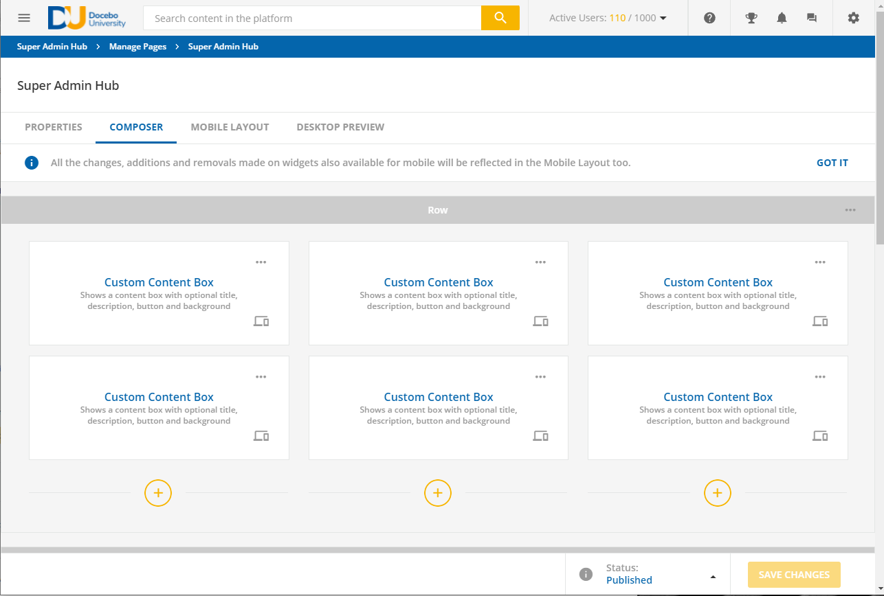
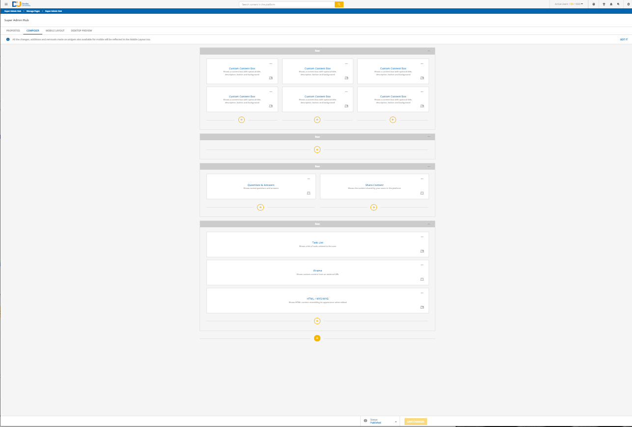
Here’s a couple screenshots of what we have for Super Admins in Docebo University. 
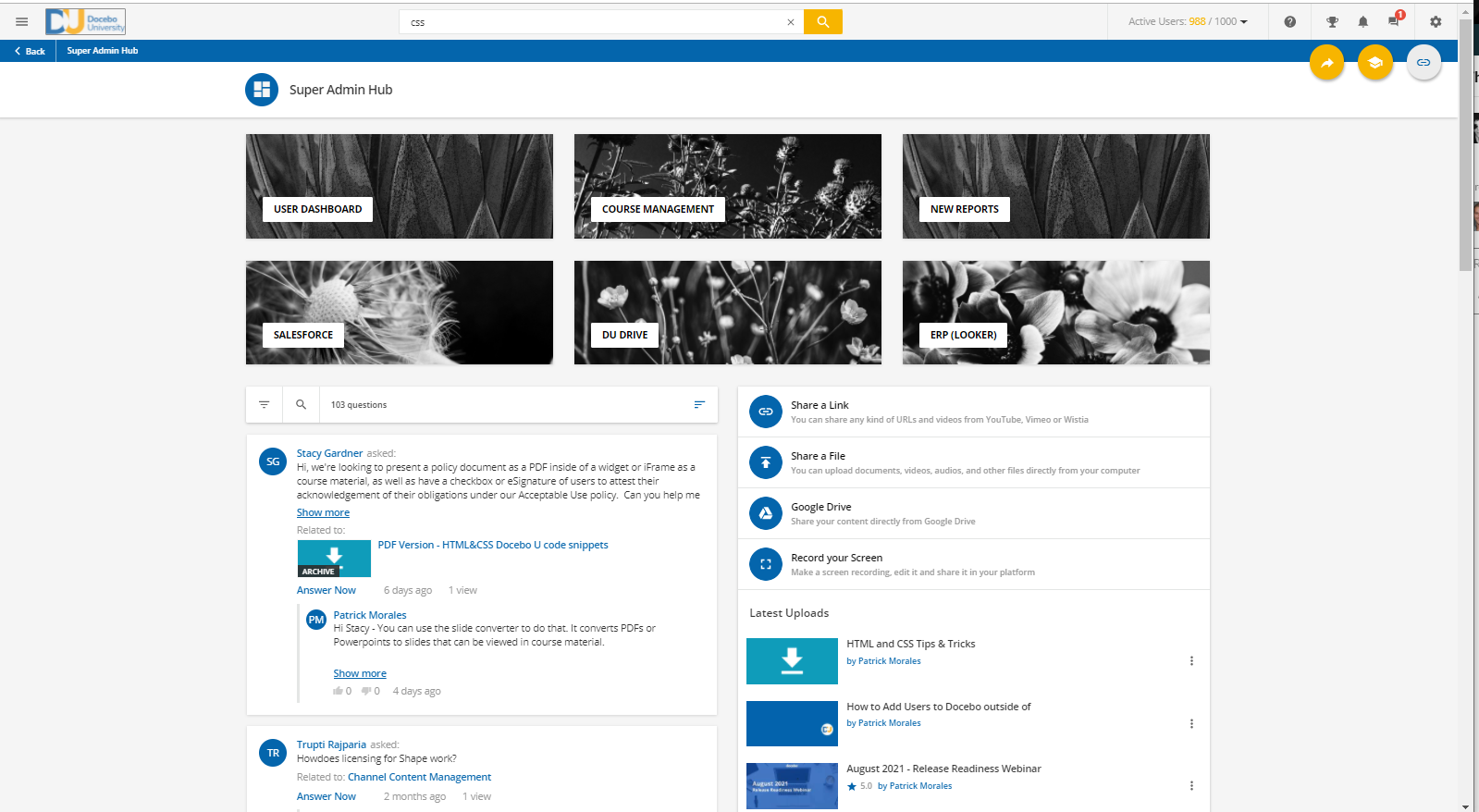
 

At the top are two rows of Custom Content Boxes. The top rows link to the most heavily used functions in the LMS. The bottom row links to external resources that our team uses pretty heavily. 

Additionally we use the Share Content widget to create a one stop location for uploading content to channels. Next to that is a Q&A widget that allows us to monitor any questions related to assets in the system.
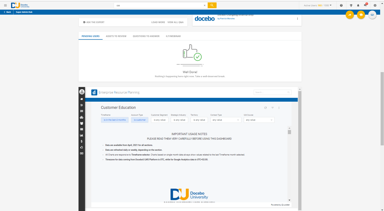
I’ve included a task widget in this example as a potential option for your team. This is a pretty essential widget if you use the built in self registration function as well as have SA’s who are also instructors in ILT courses or have an e-commerce use case. 

Below that is an i-frame widget that links to an external dashboard created by our looker team.
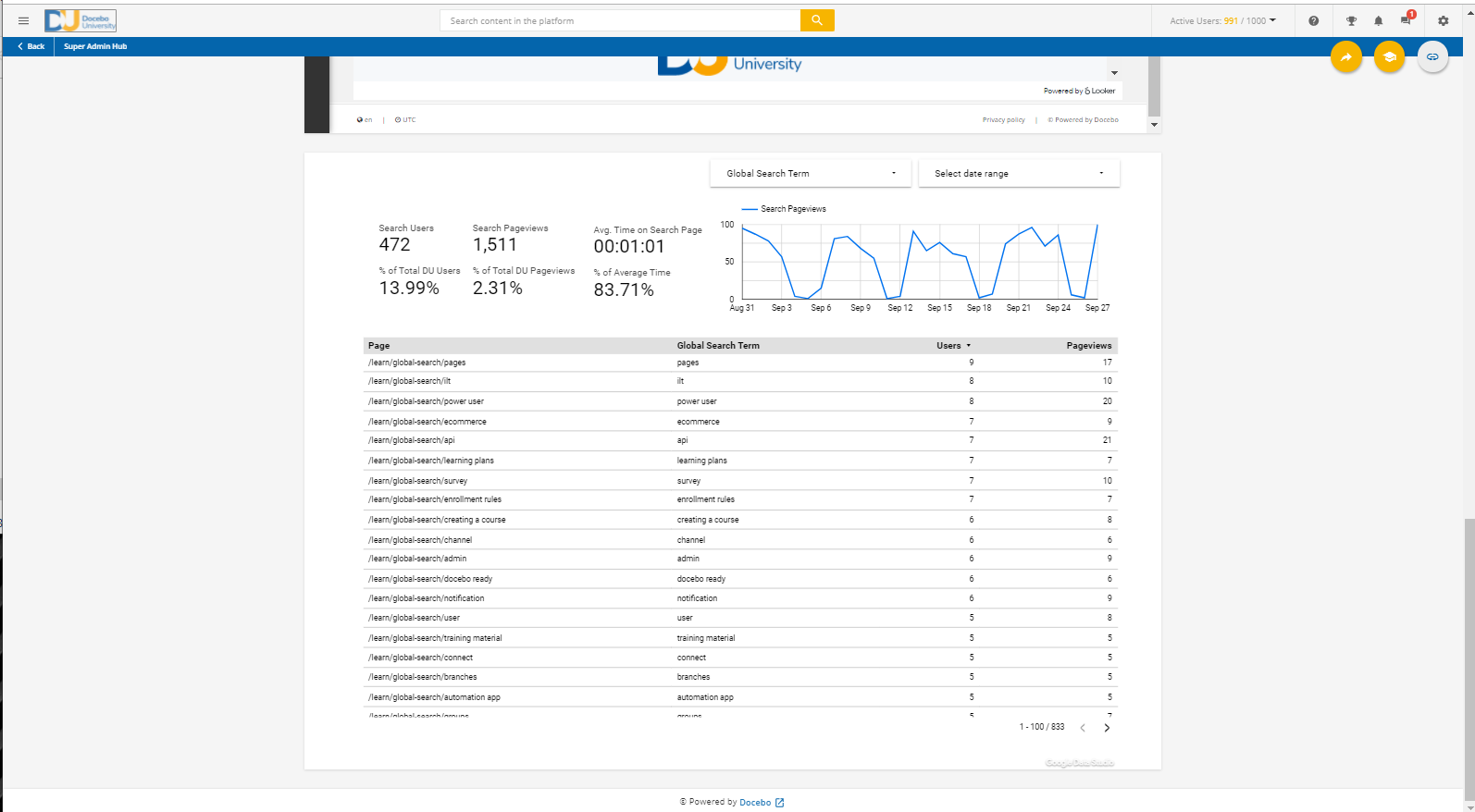
And finally is an i-frame to a Google Data studio where we’ve built an integration that allows us to monitor what search terms customers are using in the global search. (I can hear you already - “How do I set that up?!” - Well keep checking the community in the following weeks and you’ll find out.)


:bulb:Tip #2 Browser Tricks:bulb:


Get ready because this is a couple tips and tricks rolled into one!


Bookmarks

While Admin Dashboards are fantastic for centralizing your teams mission depending on the size of your team they require consensus about what’s important and what lives there. 

But what strategies as individual admins can we implement to reduce precious clicks and thus time. 

Just a reminder but almost every page in the LMS has a unique URL that can be bookmarked which means that you can build your own individual dashboard by bookmarking the pages that are essential to your individual work flows. 
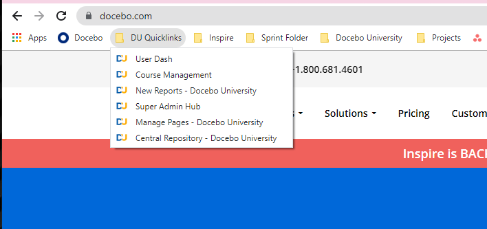
 

Here’s an example of my set of quick-links. It’s important to keep this list small otherwise it might not provide more value vs the gear icon in the platform.


Which leads me to another interesting concept…


Sprint Bookmarking

We all have our own methods of accomplishing tasks that we need to get done whether they’re in the LMS or not. One method I’ve started to adopt is to create a “Sprint Folder” which is just a folder where I move links necessary to complete a specific “sprint” of tasks. 

Here’s what my sprint folder looked like as I worked on my inspire presentation. For me less is more so that I stay on task.​​​

Adjusting the Page Size

Have you ever wished you could take a full screenshot of the entire Custom Widget Page you just created (maybe that Super Admin Dashboard you just built) but can’t get the whole page in one screenshot? 


Or maybe you’re getting frustrated creating that page because you want to drag a widget from the top of the page to the very bottom and you’re getting stuck. 


You can adjust the page size inside your browser by using the following keyboard shortcuts:

Mac: ecmd] + r+] or b-]

PC: octrl] + t+] or /-]


Here’s the backend of the DU Super Admin Hub. This is the default size and it can be difficult to drag icons to the bottom of the page. Without altering the page size we have to sort of move them between rows until we get to the location we want.
And here’s what the page looks like when we’ve zoomed out by using the keyboard shortcuts above. Now we can easily drag these widgets between rows. 


:bulb:Tip #3 Formatting URLs:bulb:


Relative URLs and Custom Content Boxes

Let me know if this sounds familiar. Maybe you’re a new or existing Extended Enterprise customer and you’ve just built a custom page and linked to it with a custom content box on another page. You’ve just copied and pasted the URL into the custom content box and clicked save and you’re filled with excitement. Next thing you know you got an email from someone saying they’re getting a 404 error when they access the page. 

Or maybe you’re on pins and needles thinking about an upcoming change to your custom domain and you’re thinking “Oh no all of those URLs are going to break when we make the change”

Well strap in! You’ll love this trick. 


Want to share this tip with a peer or colleague? Check out the guide on using relative URLs: 
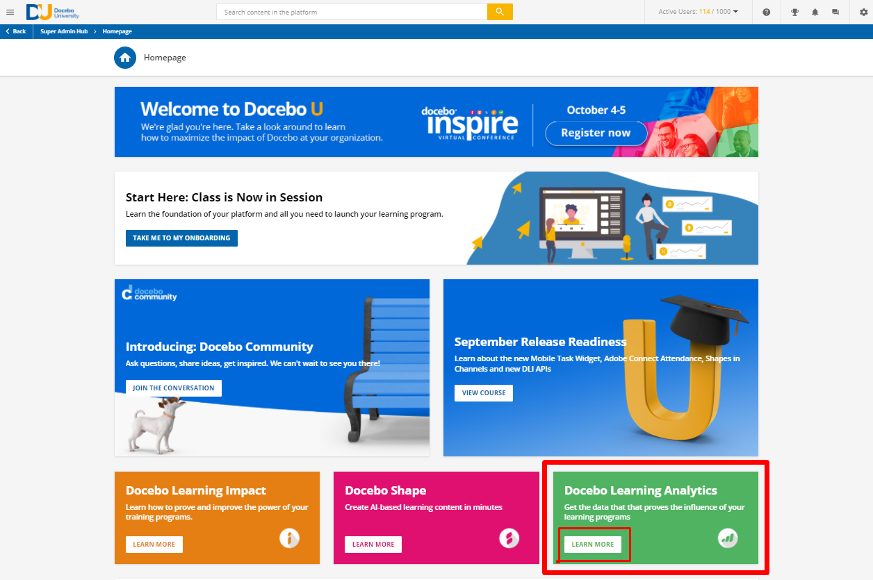


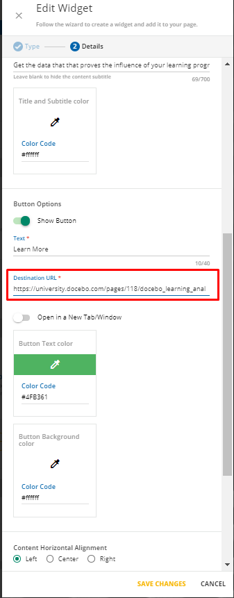
Here’s the current home page of DU just chock full of custom content boxes. Let’s focus on the Docebo Learning Analytics Widget.
And of course here’s where that URL inside the Custom Content Box settings. 


But what if I told you don’t have to (and probably shouldn’t) use the full URL?


Instead of using the full URL you can actually use what’s called a “relative URL” to populate the URL field inside of a custom content box. 

So using our example above: 


https://university.docebo.com/pages/118/docebo_learning_analytics

Becomes: 

/pages/118/docebo_learning_analytics


Why It Matters!

This is important because it future proofs your platform from any future domain changes as well as allows you to use the same page across multiple domains if you’re an extended enterprise client. It works because it will fill in the root domain of whatever domain the user logged into the LMS with which ensures they won’t see any of those pesky 404 errors


Pre Enrollment vs Post Enrollment Course URLs


When we create e-learning courses within Docebo there are a host of different ways that users can be provided links to the courses. By default the a lot of our customers will provide a self enrollment/deep link that when clicked the user will be automatically enrolled into the course. 
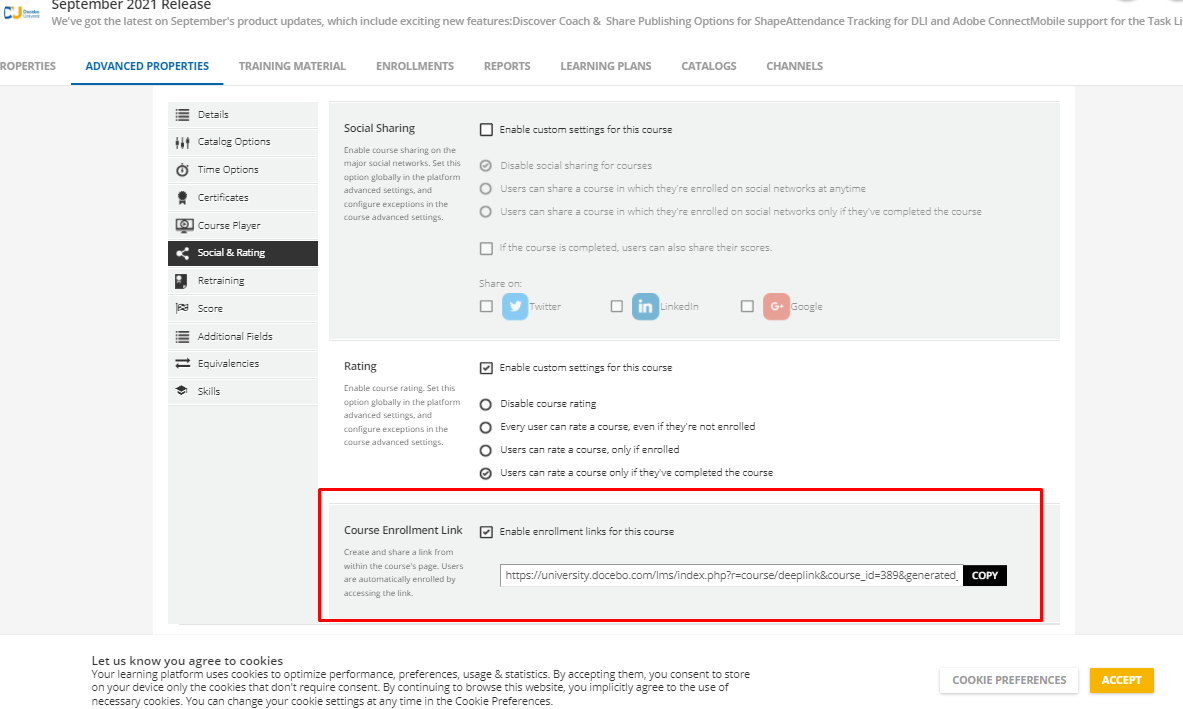


That’s a great strategy but that link won’t redirect to the course landing page if the user is already enrolled in the course which means it might pose some difficulties if you’re sending the link to mixed audience of enrolled and unenrolled users.

The best strategy is to use the pre-enrollment URL, the URL that’s exposed on a course landing page before a user has enrolled, because this URL will redirect whether the user is enrolled in the course or not. 
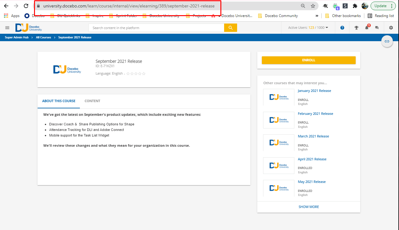


The difficulty is that as admins when we click “preview” course we’re enrolled into the course and will be presented with a URL that only users who are enrolled in the course will be able to use.
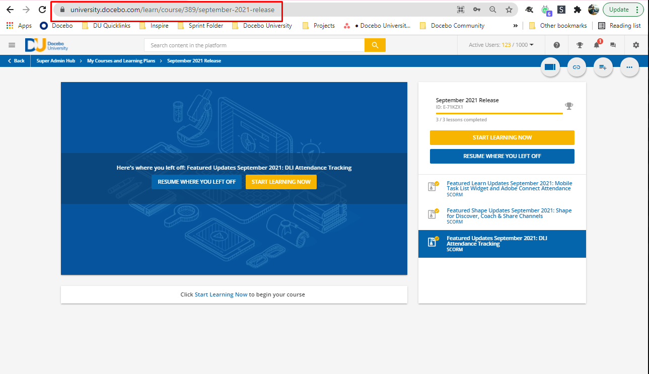


The good news is that these URLs are predictable and can be built using the following guide!

If we’re trying to build links for emails or want to provide a “pre-enrollment” view (which will require the user to enroll themselves by clicking “enroll now” then we want to use the following format. For transparency I've also included examples of how the URLs change after you’ve enrolled (“post-enrollment”)


Here’s the format for Pre-enrollment URLs

https://rwww.yourcustomdomain.com]/learn/course/internal/view/elearning/ecourse_id]/ course-title-with-dashes-where-spaces-go]


Pre-enrollment course link format: /learn/course/internal/view/elearning/id/name

Post-enrollment course link format: /learn/course/id/name


For learning plans, the format is as follows:


Pre-enrollment LP link format: /learn/learning_plan/view/id/name

Post-enrollment LP link format: /learn/lp/id/name


Here’s a Google Sheet I’ve made for converting Course URLs. All you have to do is click “preview course” from the Admin view within the LMS then copy the URL and paste it in the box titled “Insert the URL you'd like to convert below:

Here’s an excel spreadsheet that can be downloaded inside of DU.


:bulb:Tip #4 - Keeping Menus Tidy with Hidden Menus:bulb:


In order for a user to be able to access a custom page you’ve created it must be assigned to a menu that a user has visibility over.  But what if you don’t want to clutter your user’s menus with too many navigations while given them the ability to access those menus through custom content boxes in custom widget pages.

Let’s start by creating a menu that the user will see when they login. 
 

  1. Navigate to the ⚙️ Admin Menu Manage Menus
  2. Select the in the top right to Create a New Menu
  3. You can name the menu whatever you’d like but we’ll be naming this “Customer 2021” to reflect the group of users who will see the menu when they login.
  4. Set the visibility of the menu to include whatever users you’d like to see the pages within this menu (groups, branches, and/or levels). In our example we’ll be choosing the group “Customers” and checking the box “Users” so that only users in that group will see this menu.
  5. Add whatever “hidden pages” you’d like to share
  6. Select Save Changes
  7. On the Manage Menus page, move this “Customer 2021” Menu to the top of the list so that users in the customer group will be assigned this menu when they first log in
  8. Publish the menu
     

Now that we’ve created our visible menu for customers we’re going to build a second menu that contains all of the other pages that we want these users to have access to. 


  1. Navigate to the ⚙️ Admin Menu Manage Menus
  2. Select the in the top right to Create a New Menu
  3. Name the menu something like Catch All or Hidden Pages
  4. Set the visibility of the menu to include whatever users you’d like to see the pages within this menu (groups, branches, and/or levels)
  5. Add whatever “hidden pages” you’d like to share
  6. Select Save Changes
  7. On the Manage Menus page, move this “Catch All” menu to the very bottom of the list
  8. Publish the menu

This will ensure that these pages are visible to the user when you link them to the page from elsewhere in the platform, but because the menu is at the bottom of the hierarchy, it will be superseded by other menus higher in the Manage Menus section.

Another cool aspect of this is that you can assign a page to a menu and until you tell someone what the URL is or add a button they won’t know it’s there. This can be helpful if you’d like to get the opinion of someone in that audience without exposing the link to the entire audience.


:bulb:Tip #5- Testing Notifications :bulb:


Let’s start by discussing a concept called “plus addressing”. This allows you to create multiple test user accounts with unique email addresses while having those notifications sent to the same email address. 

Here’s an article from google explaining the concept:


If you don’t want to create multiple accounts or aliases for specific tasks, just add a plus sign (+) and any word before the @ sign in your current address.

Messages will still reach you, and you’ll have an infinite amount of emails for different purposes.


For example, if your email address is cassy@solarmora.com, use cassy+news@solarmora.com or cassy+urgent@solarmora.com.


Using the above strategy we can now create a workflow for testing the formatting and execution of new notifications. 


First Create the users you’d like to test using the “plus addressing” model used above.


Next Create a group called “Test Notification Group” (you can name it whatever you’d like!) and add the test users you’ve created. 
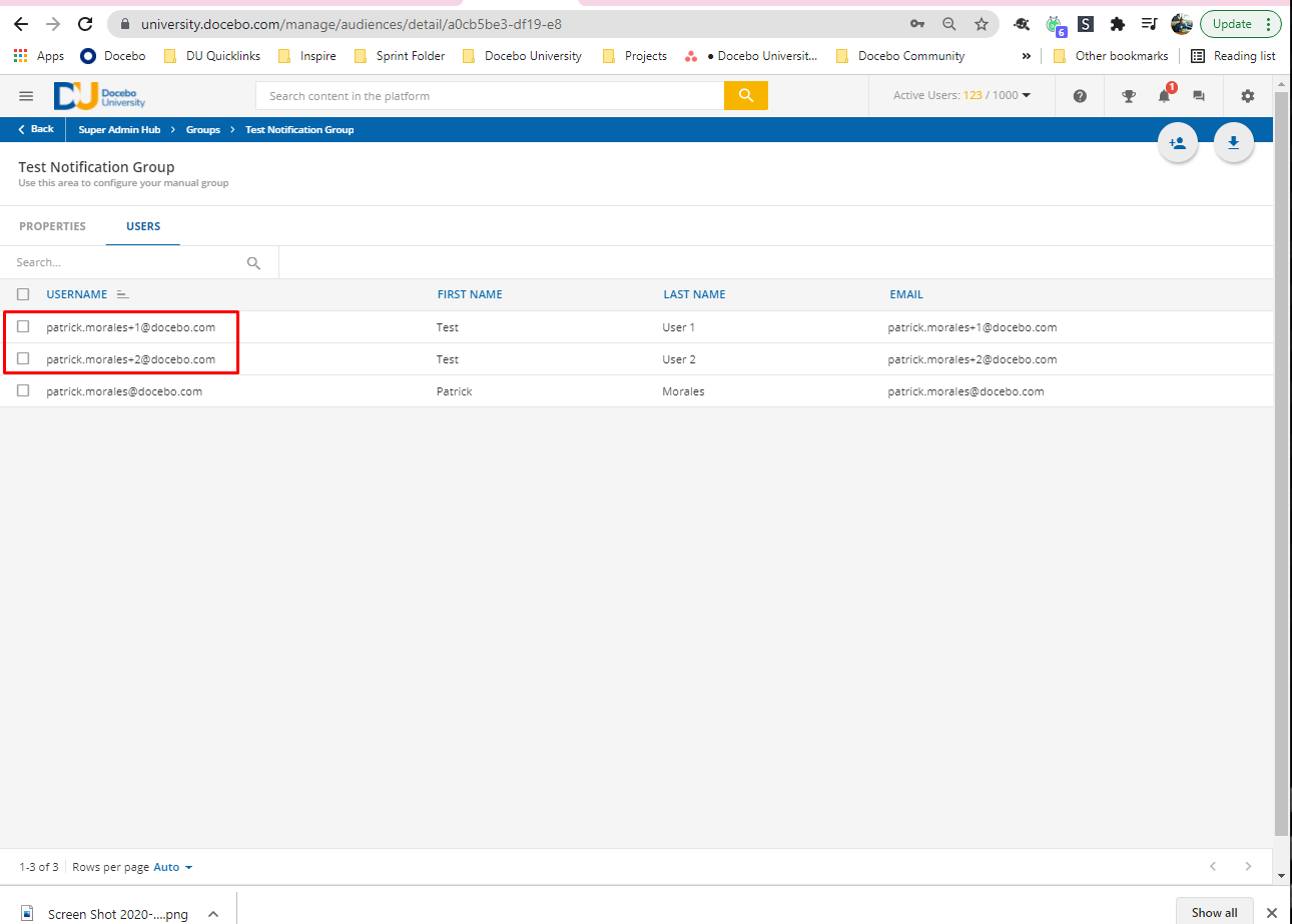
 

Now we have a group that can be targeted and we have users that can be enrolled into courses or will be the target of whatever notification we decide to test.

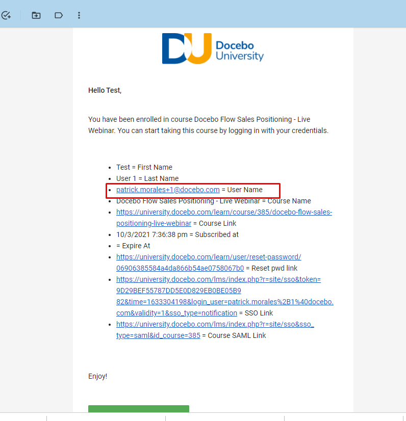
Additionally we’ll receive all these notifications in the root email (in this case patrick.morales@docebo.com)
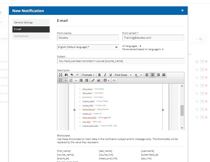
 

One other thing that I like to do when I’m testing notifications is to make a key of all the short codes I’m using at the bottom of the notification.

Now if we enroll these users into a course (or perform what ever action would trigger the notification we can receive the notification in our inbox. 


Here we can see the key that I’ve created so that we can evaluate how things are formatted.


:rotating_light: Bonus Notification Tip! :rotating_light: 

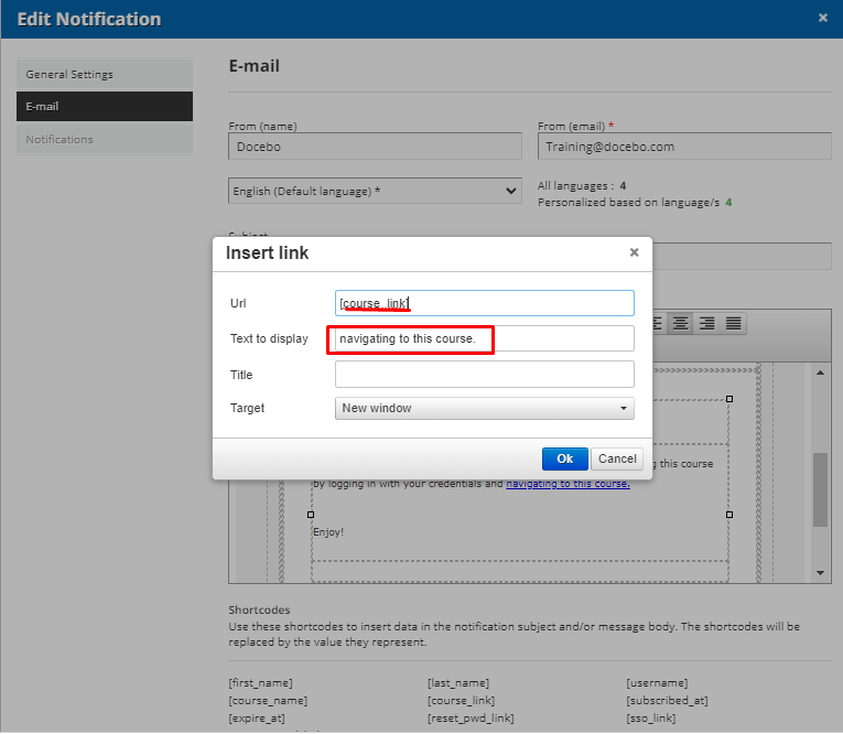
Did you know you can embed url short codes into text?
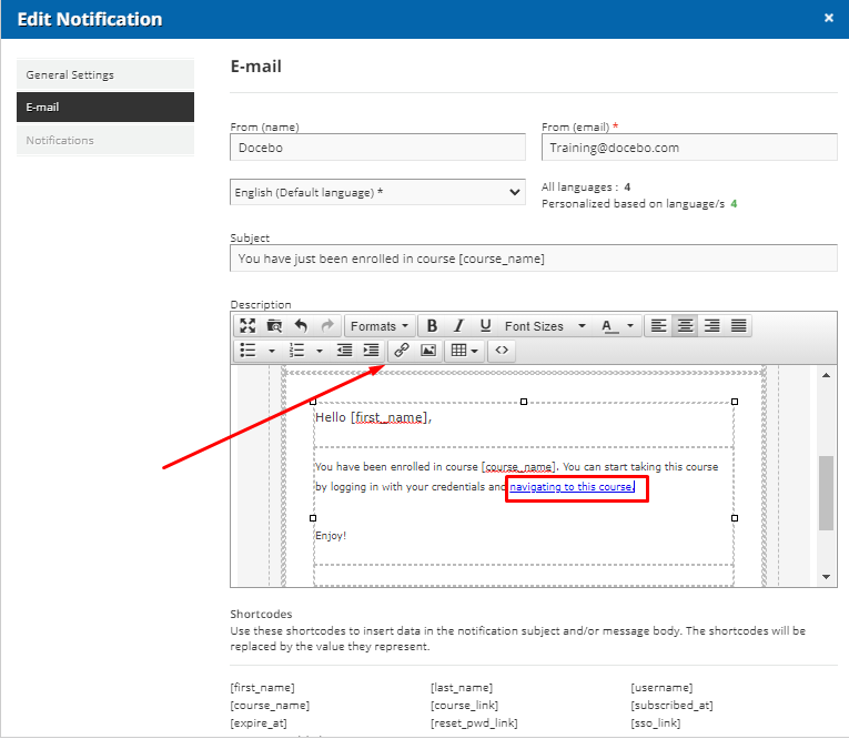
 

Here we can see that we’ve created a link by using the link editor.


But did you know that instead of using a URL you can insert a short code. It does need to be a short code that generates a URL for it to work.


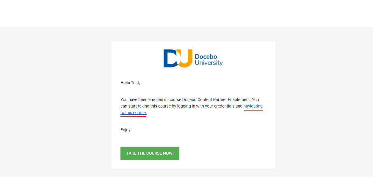
Here’s what the finished product looks like. 


Thank you so much for all these very helpful tips!!!!  We are extended enterprise and shortening the URL is going to save us so much time and pages!


Thanks so much @pmo Love the session. Lots of great tips! 


Very interesting tips!  Thanks for providing them.


Hello! Thanks for the tips. Loved the presentation!

My one question I have is about the pre-enrollment links and how those work on mobile. 

  • If the user has the Go.Learn app, does the link open the app and take them to the course you’ve linked to?
  • If the user does not have the app, does it open their web browser and take them to the course (after logging in)? 

We’ve had issues with the course enrollment link from the Social & Rating tab under Advanced Properties of a course. They don’t work on mobile but we’re pushing mobile. 


We have an HTML widget (which appears on multiple pages) where I created a banner and they click on it. But they can’t click on it on mobile because I use that enrollment link. Here’s what it looks like. If this pre-enrollment link works on mobile, this will solve a lot of the issues we’ve had!


Hello! Thanks for the tips. Loved the presentation!

My one question I have is about the pre-enrollment links and how those work on mobile. 

  • If the user has the Go.Learn app, does the link open the app and take them to the course you’ve linked to?
  • If the user does not have the app, does it open their web browser and take them to the course (after logging in)? 


@ChrisPrice 

If the user is navigating through the Go.Learn app and clicks on a custom content box that uses a relative url they will be taken to that course or page within the app (assuming they have that page on their menu and the settings of the course)

If the user does not have the app it would open in their web browser (though they maybe prompted to download the app depending on your settings).


great session!


Hello! Thanks for the tips. Loved the presentation!

My one question I have is about the pre-enrollment links and how those work on mobile. 

  • If the user has the Go.Learn app, does the link open the app and take them to the course you’ve linked to?
  • If the user does not have the app, does it open their web browser and take them to the course (after logging in)? 


@ChrisPrice 

If the user is navigating through the Go.Learn app and clicks on a custom content box that uses a relative url they will be taken to that course or page within the app (assuming they have that page on their menu and the settings of the course)

If the user does not have the app it would open in their web browser (though they maybe prompted to download the app depending on your settings).
 

Hi! I might not have been clear with our intentions. We post in Microsoft Teams when we release a new course and we usually use the enrollment link as the hyperlink. Would using the pre-enrollment link solve the issue of the enrollment deep link not working on mobile? 


@marva.terrell This is a great post and conversation thread to read. 


Yes I agree this was a very useful session!


Hello! Thanks for the tips. Loved the presentation!

My one question I have is about the pre-enrollment links and how those work on mobile. 

  • If the user has the Go.Learn app, does the link open the app and take them to the course you’ve linked to?
  • If the user does not have the app, does it open their web browser and take them to the course (after logging in)? 


@ChrisPrice 

If the user is navigating through the Go.Learn app and clicks on a custom content box that uses a relative url they will be taken to that course or page within the app (assuming they have that page on their menu and the settings of the course)

If the user does not have the app it would open in their web browser (though they maybe prompted to download the app depending on your settings).
 

Hi! I might not have been clear with our intentions. We post in Microsoft Teams when we release a new course and we usually use the enrollment link as the hyperlink. Would using the pre-enrollment link solve the issue of the enrollment deep link not working on mobile? 


@ChrisPrice Can you tell me a bit more how the links aren’t working on mobile? I’m going to do some testing with our app and get back to you. I think there might be an issue with how the mobile app loads that doesn’t allow for external URLs to redirect to a specific course within the app. So the relative URLs will work inside the app but I’m not sure that the URL would take you to a certain “page” within the Mobile app.


@pmo Hi! Thanks for taking the time to reply and chat with me about it. 


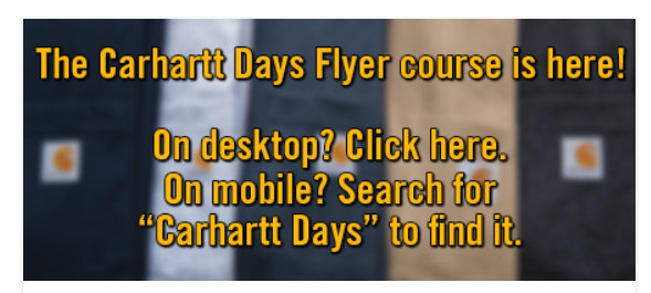
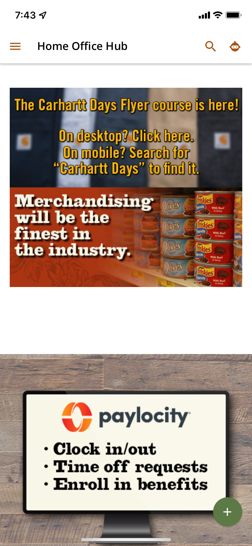
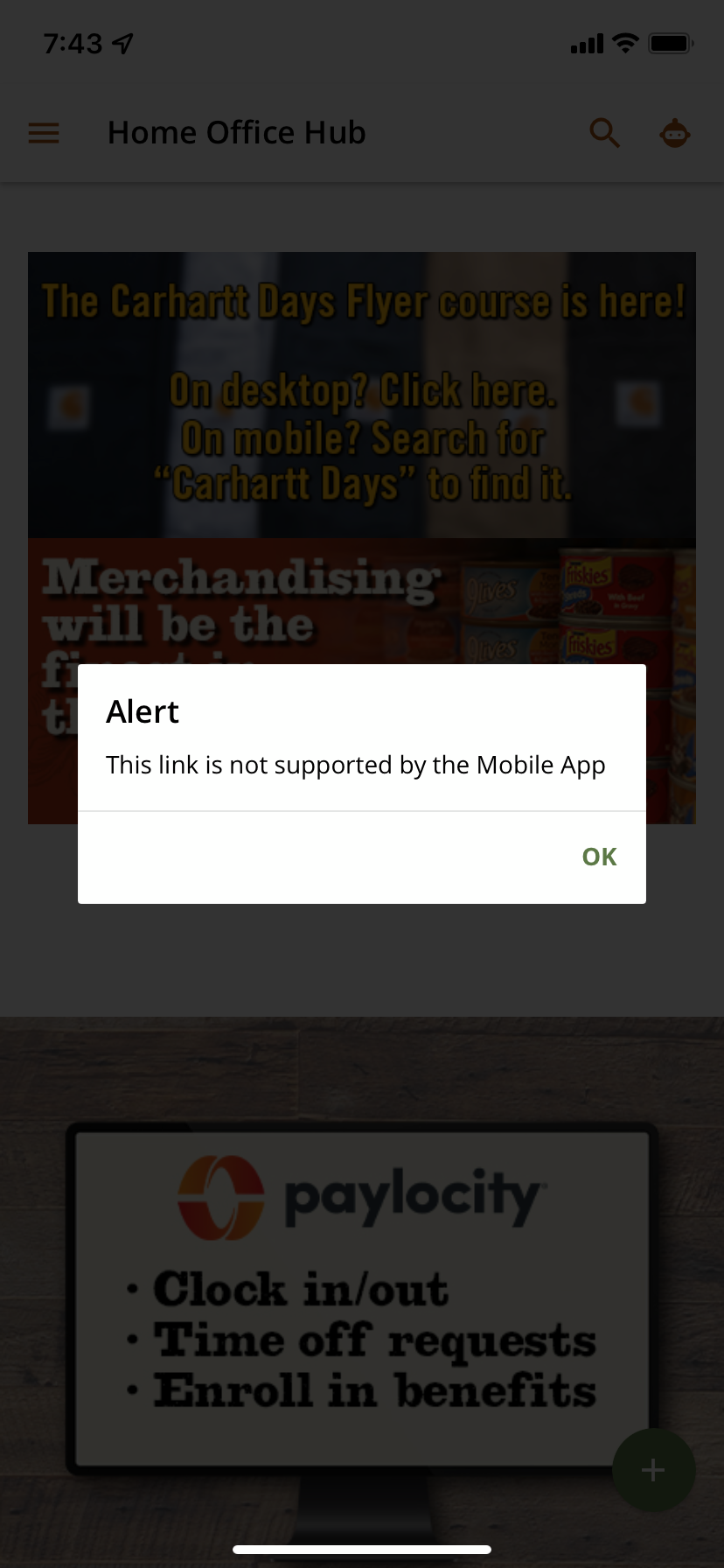
For our site, I use an HTML box to have a clickable banner that I swap out constantly. For the link I use the deep link enrollment link but these are not supported on mobile. I also use that link when I post about the new release in our Microsoft Teams channels. When they click on this banner on mobile, it says, “This link is not supported by the Mobile App.” As you see in my screenshots below, the Carhartt banner is the clickable banner I’m referring to. If they click that on the mobile version, you can see in the next screenshot the error message. Let me know if I can provide any other info! I’ll be testing with the pre-enrollment link sometime this week when I have a chance!


@ChrisPrice I just tested with a relative URL and it will allow you to click the link and redirect you within the app. I’m still not sure what the behavior would be following the link from teams to the mobile app. That might require some testing with your team. 


@ChrisPrice I just tested with a relative URL and it will allow you to click the link and redirect you within the app. I’m still not sure what the behavior would be following the link from teams to the mobile app. That might require some testing with your team. 

Thank you for replying! I’ll do some testing and report back at some point :)


This is a great resource - thank you….


Any luck converting the google sheet to an excel document? I’m not an Excel wizard and don’t often use it, but I think there’s some part of the formula that needs replacing in excel (I’ve downloaded it as an excel file, but the formula isn’t replacing the URL). I’m trying to work on it but I think I’m breaking it more hah!


Any luck converting the google sheet to an excel document? I’m not an Excel wizard and don’t often use it, but I think there’s some part of the formula that needs replacing in excel (I’ve downloaded it as an excel file, but the formula isn’t replacing the URL). I’m trying to work on it but I think I’m breaking it more hah!


Just a helpful FYI for everyone. Excel stripped the “/” out of the google sheet so the second sheet was named “Data/Calculations” in the google sheet but it’s just “DataCalculations” in Excel. This didn’t fix the formula though. I was so hopeful this would fix it. 


@ChrisPrice You’re right the missing step for excel is that it doesn’t have a “split to text” function that you can apply to a cell the way you would other functions like SUM, AVG, etc. In excell you have to manually split the cell/cells with clicks rather than using an “=split” like you would in google sheets.

I’ve put some time on my calendar for later this week to see if there’s a different way to accomplish this on excel. 


@pmo Thank you! I appreciate you working on this. I’m using the google sheet but our team wanted me to convert it to excel for them. This different link format you showed us has been so helpful. Using this link to link banners to courses and posts in Microsoft Teams has been extremely helpful. Thank you again!


@ChrisPrice I figured out a way to do it and have added it to a channel inside of DU as well as the body of the post. 

You can find that spreadsheet here


This is fabulous.  Thank you.


Some great tips here! 

Thanks very much :-)


Reply