Answer

Test Responses - change color with CSS

  • October 16, 2024
  • 7 replies
  • 158 views

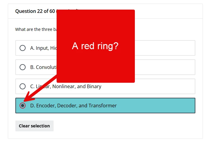
Due to our branding and look color configuration, whenever anybody selects a response in a test question it highlights to red, making it appear like an incorrect selection.


We had a lot of trouble balancing our platform appearance with our corporate color scheme, so I’m really reluctant to start moving that around again.

I’m sure it should be possible to override this with css, but I just can’t find the right elements to do it. I’ve been able to change individual radio buttons and checkboxes, but not the whole container, and not only for the selected response. @gstager you seem to be pretty much the king of css. Have you come across this before?

Also, has anybody found a list of which elements are controlled by which branding colors?

Best answer by DPatel

Hi there,

Hopefully the following CSS helps you here. Amend accordingly and test in a Sandbox environment if available

dcb-course-lesson-questions dcb-ui-input-radio:where([data-dcb-ui-version="2"]) input[type=radio]:checked {
border: 2px solid #FFFFC5!important; /* Targets the border colour when selected */
background-color: #ADD8E6!important; /* Targets the inner colour of the above when selected */
}

dcb-course-lesson-questions dcb-ui-input-radio:where([data-dcb-ui-version="2"]) input[type=radio]:checked:before {
background-color: #CBC3E3!important /* Targets inner colour when selected */

}

dcb-course-lesson-questions dcb-ui-input-radio:has(:checked) {
border-color: #000000 !important; /* Change to your desired border color when selected */
background-color: #90EE90!important; /* Changes the pink background when selected*/
}


7 replies

Forum|alt.badge.img+2
  • Novice II
  • Answer
  • October 16, 2024

Hi there,

Hopefully the following CSS helps you here. Amend accordingly and test in a Sandbox environment if available

dcb-course-lesson-questions dcb-ui-input-radio:where([data-dcb-ui-version="2"]) input[type=radio]:checked {
border: 2px solid #FFFFC5!important; /* Targets the border colour when selected */
background-color: #ADD8E6!important; /* Targets the inner colour of the above when selected */
}

dcb-course-lesson-questions dcb-ui-input-radio:where([data-dcb-ui-version="2"]) input[type=radio]:checked:before {
background-color: #CBC3E3!important /* Targets inner colour when selected */

}

dcb-course-lesson-questions dcb-ui-input-radio:has(:checked) {
border-color: #000000 !important; /* Change to your desired border color when selected */
background-color: #90EE90!important; /* Changes the pink background when selected*/
}


  • Author
  • Helper I
  • October 17, 2024

Thanks so much @DPatel. That was a massive help. Using this as a template I was able to work out how to update all the different question types. Very grateful.


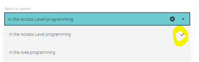
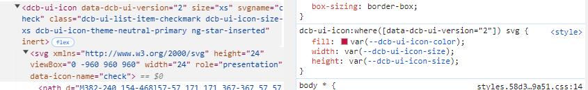
The only thing I just cannot change is the checkmark on the inline and association questions.


I’m sure it’s somewhere in here, but I just cant get it to work. Any suggestions?


Forum|alt.badge.img
  • Novice I
  • March 31, 2025

@gus were you able to get amend the checkmark? I’m also in the same boat with branding and the red color selection on exams. Thank you!


  • Author
  • Helper I
  • April 1, 2025

Hi ​@klames . Yes I was.


I’m pretty sure these are the only lines you’ll need for that:

  • Multi-Choice questions:
lmn-input-checkbox .lmn-input-checkbox svg {
fill: #323e48 !important; /* Targets tick colour when selected */
  • Association and Inline: 
lmn-input-select input[type=select]:filled:before {
background-color: #6dcbd1 !important /* Targets tick colour when selected */


But it’s been a while, so below is the full css section for all the related updates I’m using, in case you need anything extra.

Note that about a month ago Docebo advised a software upgrade that affects course player css, as of April 2. The version below includes those updates.

/** Single Choice **/
lmn-input-radio input[type=radio]:checked {
border: 2px solid #323e48 !important; /* Targets the border colour when selected */
background-color: #dde0e4 !important; /* Targets the inner colour of the above when selected */
}
lmn-input-radio input[type=radio]:checked:before {
background-color: #323e48 !important /* Targets inner colour when selected */
}
dcb-sh-answer-single-selection lmn-input-radio:has(:checked) {
border-color: #323e48 !important; /* Change to your desired border color when selected */
background-color: #6dcbd1 !important; /* Changes the background when selected*/
}
/** Multi Choice **/
lmn-input-checkbox input[type=checkbox]:checked {
border: 2px solid #323e48 !important; /* Targets the border colour when selected */
background-color: #dde0e4 !important; /* Targets the inner colour of the above when selected */
}
lmn-input-checkbox .lmn-input-checkbox svg {
fill: #323e48 !important; /* Targets tick colour when selected */
}
dcb-sh-answer-multiple-selection lmn-input-checkbox:has(:checked) {
border-color: #323e48 !important; /* Change to your desired border color when selected */
background-color: #6dcbd1 !important; /* Changes the background when selected*/
}
/** Association **/
lmn-input-select input[type=combobox]:filled {
border: 2px solid #6dcbd1 !important; /* Targets the border colour when selected */
background-color: #6dcbd1 !important; /* Targets the inner colour of the above when selected */
color: #6dcbd1 !important; /* Targets the colour when selected */
}
lmn-input-select input[type=select]:filled:before {
background-color: #6dcbd1 !important /* Targets tick colour when selected */
}
dcb-sh-answer-associations lmn-input-combobox:has(:filled) {
border-color: #6dcbd1 !important; /* Change to your desired border color when selected */
background-color: #6dcbd1 !important; /* Changes the background when selected*/
color: #6dcbd1 !important; /* Targets the colour when selected */
}
/** Inline **/
lmn-input-select.lmn-input-select-active .lmn-input-select-wrapper,
lmn-input-combobox.lmn-input-select-active .lmn-input-select-wrapper,
lmn-input-autocomplete.lmn-input-select-active .lmn-input-select-wrapper {
outline: 2px solid #323e48 !important; /* Change to your desired border color when selected */
background-color: #6dcbd1 !important; /* Changes the background when selected*/
}
lmn-input-select.lmn-input-select-filled .lmn-input-select-wrapper,
lmn-input-combobox.lmn-input-select-active .lmn-input-select-wrapper,
lmn-input-autocomplete.lmn-input-select-active .lmn-input-select-wrapper {
outline: 2px solid #323e48 !important; /* Change to your desired border color when selected */
background-color: #6dcbd1 !important; /* Changes the background when selected*/
}


Forum|alt.badge.img
  • Novice I
  • April 15, 2025

Thank you! This was very helpful ​@gus  &  ​@DPatel  

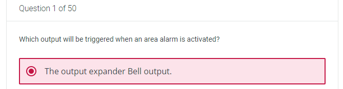
I’m experiencing an interesting result. I’m trying to investigate where it might be going wrong, but if you have ideas I’m open to them. Thank you for your patience, as I’m fairly new to CSS and so far implemented basic CSS in our platform successfully.
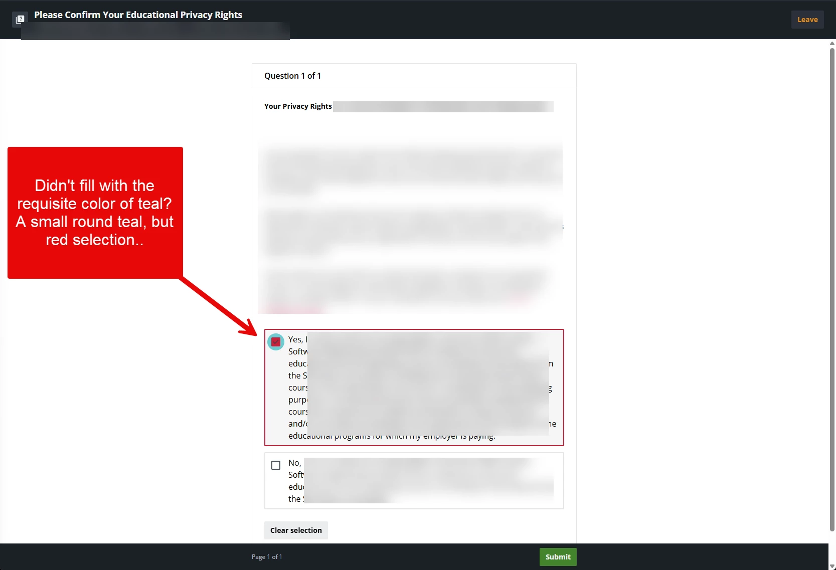
  • Exam screenshot 
  • FERPA (we use the test ability to gather this data). There is no wrong or right answer setting for this “Test”
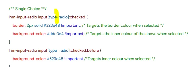
 

I implemented the code you supplied ​@gus. Once I have the code correct, I will then change the color slightly to branding requirements for the organization. However, I’m not there yet! Code below.


/** Single Choice **/

lmn-input-radio input[type-radio]:checked {

    border: 2px solid #323e48 !important; /* Targets the border colour when selected */

    background-color: #dde0e4 !important; /* Targets the inner colour of the above when selected */

}

lmn-input-radio input[type=radio]:checked:before {

    background-color: #323e48 !important /*Targets inner colour when selected */

}

dcb-sh-answer-single-selection lmn-input-radio:has(:checked) {

    border-color: #323e48 !important; /* Change to your desired border color when selected */

    background-color: #6dcbd1 !important; /* Changes the background when selected*/

}

/** Multi Choice **/

lmn-input-checkbox input[type=checked]:checked {

    border: 2px solid #323e48 !important; /* Targets the border colour when selected */

    background-color: #dde0e4 !important; /* Targets the inner colour of the above when selected */

}

lmn-input-checkbox .lmn-input-checkbox svg {

    fill: #323e48 !important; /* Targets tick colour when selected */

}

dcb-sh-answer-multiple-selection .lmn-input-checkbox:has(:checked) {

    border-color: #323e48 !important; /* Change to your desired border color when selected */

    background-color: #6dcbd1 !important; /* Changes the background when selected */

}

/** Association **/

lmn-input-select input[type=combobox]:filled {

    border: 2px solid #6dcbd1 !important; /* Targets the border colour when selected */

    background-color: #6dcbd1 !important; /* Targets the inner colour of the above when selected */

    color:#6dcbd1 !important; /* Targets the colour when selected */

}

lmn-input-select input[type=select]:filled:before {

    background-color: #6dcbd1 !important; /* Targets tick colour when selected */

}

dcb-sh-answer-associations lmn-input-combobox:has(:filled) {

    border-color: #6dcbd1 !important; /* Change to your desired border color when selected */

    background-color: #6dcbd1 !important; /* Changes the background when selected */

    color: #6dcbd1 !important; /* Targets the colour when selected */

}

/** Inline **/

lmn-input-select.lmn-input-select-active .lmn-input-select-wrapper,

lmn-input-combobox.lmn-input-select-active .lmn-input-select-wrapper,

lmn-input-autocomplete.lmn-input-select-active .lmn-input-select-wrapper {

    outline: 2px solid #323e48 !important; /* Change to your desired border color when selected */

    background-color: #6dcbd1 !important; /* Changes the background when selected */

}

lmn-input-select.lmn-input-select-filled .lmn-input-select-wrapper,

lmn-input-combobox.lmn-input-select-active .lmn-input-select-wrapper,

lmn-input-autocomplete.lmn-input-select-active .lmn-input-select-wrapper {

    outline: 2px solid #323e48 !important; /* Change to your desired border color when selected */

    background-color: #6dcbd1 !important; /* Changes the background when selected */

}


  • Author
  • Helper I
  • April 15, 2025

@klames you have a dash instead of = in your first radio input setting which is causing the circle to not update.


Unfortunately I can’t help you with the privacy setting as we don’t use it - all our privacy is handled through our main web portal. But there are heaps of smart and helpful people around here who should be able to give you some direction on that one. All the best.


Forum|alt.badge.img
  • Novice I
  • April 22, 2025

Thank you so much! This has been so helpful and I posted to see if I can find ways to tweak it some more :)