
Design Inspiration: Show me your thumbnails!


Hi Community!

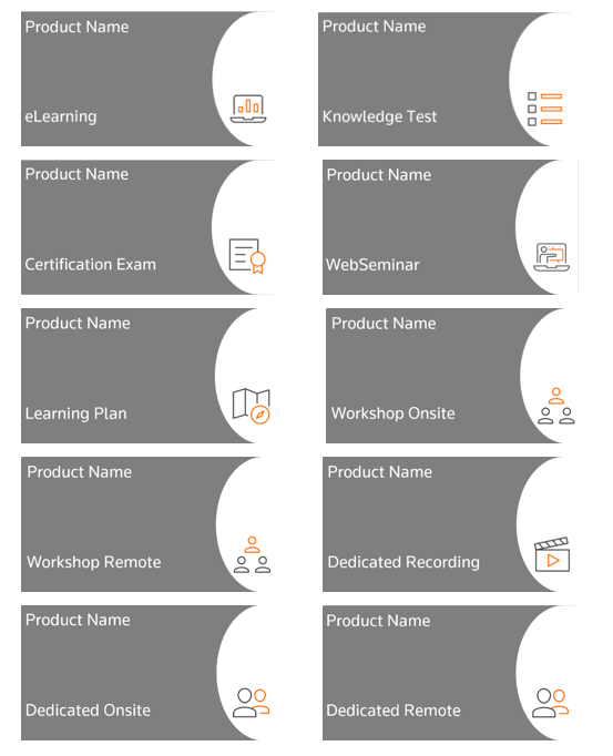
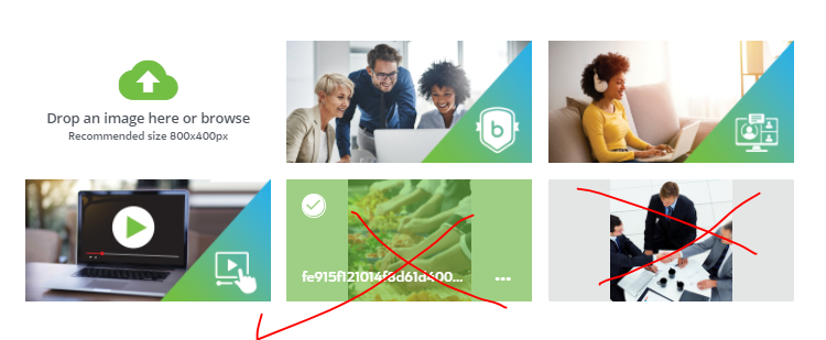
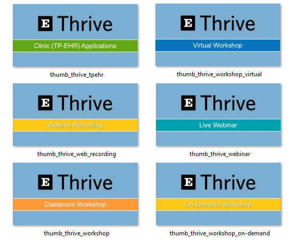
I am about to start work on developing a system of thumbnails with our designer that are cohesive, simple and tell the user what they are looking at without having to open a course/asset. I want to create a consistent brand experience and use the thumbnails to support content management for the different types of content, users and learning objects. 

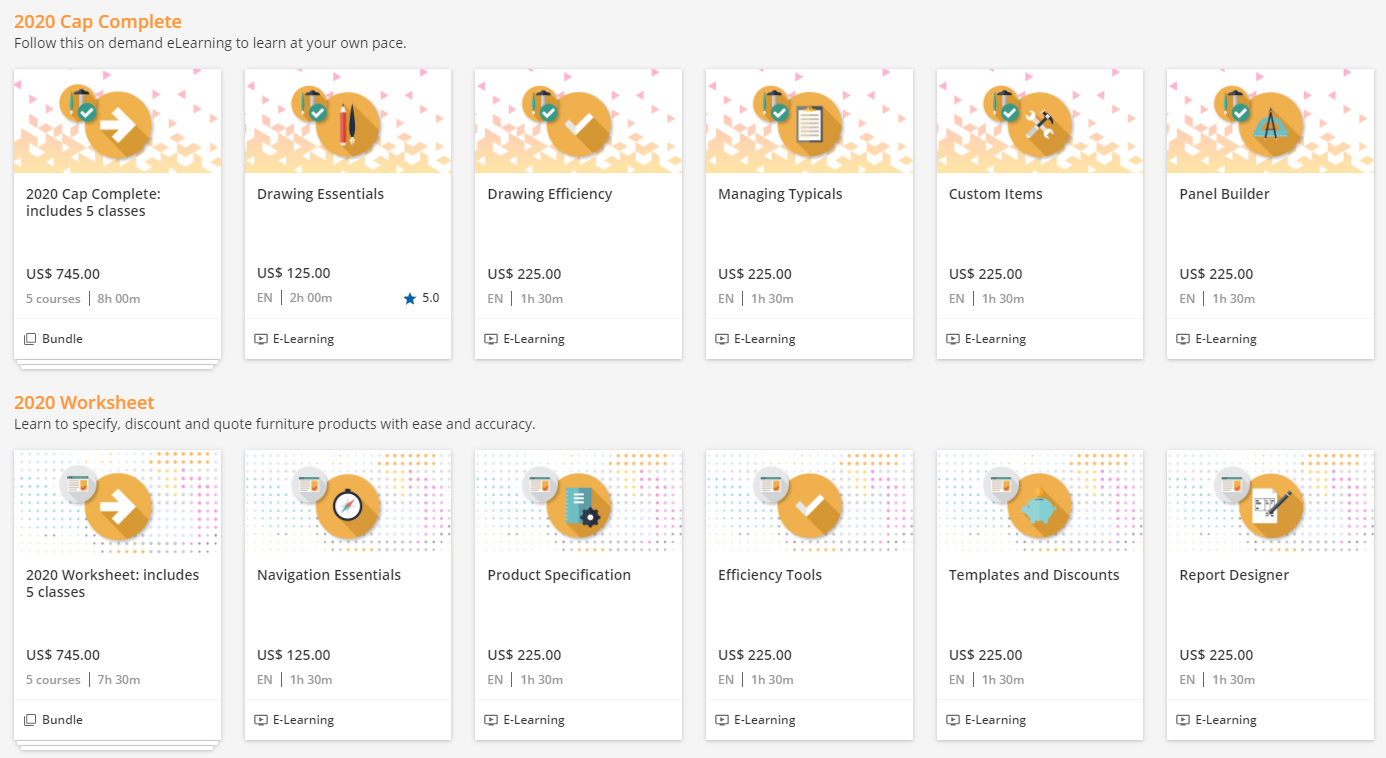
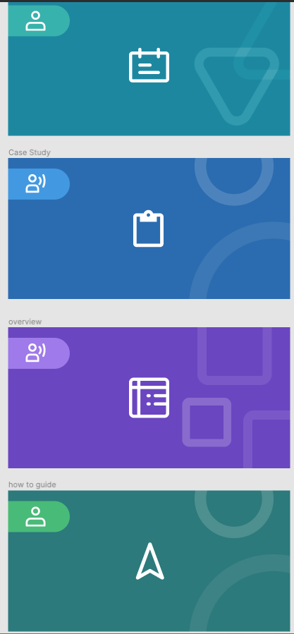
Feeling inspired by the share from cshrecengost in the Design and creative ways of using your platform discussion, I’d LOVE to see how you have handled this in your platform.


Did this post help you find an answer to your question?

7 replies

Forum|alt.badge.img
  • Novice III
  • 29 replies
  • September 24, 2021

We support multiple products and multiple delivery methods - Learning Plans, eLearning, exams, remote multi-customer workshops, remote dedicated training, topical “WebSeminars” and onsite workshops and dedicated ILT. To distinguish between all of these I created these tiles/thumbnails in PowerPoint and save them as PNG to upload. 


steveninfinger
Helper III
Forum|alt.badge.img+7

We are using these 3 images (respectively) for exams, ILTs, and eLearning. 


Forum|alt.badge.img+2
  • Docebian
  • 65 replies
  • September 30, 2021

@hannah.hansford I’m a big fan of using colors and icons on course thumbnails to help distinguish content of different types.


For instance you can have specific colors for content on a given topic while using specific icons for something else like difficulty, product, content type etc. Using visual cues is a fantastic way to enhance the user experience and let users find things more quickly.


I think Docebo Academy does a pretty good job of this if you want to explore an example. After you’ve been in the platform a few times you start to understand that everything related to reporting is color-coded orange, while everything related to design is red etc. 


I’d love to see how your thumbnails turn out once they’re done!


designessa
Novice III
Forum|alt.badge.img
  • Novice III
  • 15 replies
  • September 30, 2021

Here’s an example from a couple of our public catalogs.  

  • The small icon matches the software we are teaching in that class.
  • The large icon represents the topic.

Good luck!  


Thanks for sharing your systems for designing and applying thumbnails. Here’s a sample of what we came up with.

The person in the top left shows the audience (internal or external), the colour and centre icon show the type of content (overview, how to guide, example etc.), and the shape in the background shows the author (HQ, partner, team member). 

These are being applied to assets in our knowledge base. Courses (e-learning and VILT) will have unique thumbnails.


jbridges
Novice III
  • Novice III
  • 46 replies
  • April 5, 2022

@kferguson design ideas


sjennings78
Guide II
Forum|alt.badge.img+4

For one of our software platforms, we use our logo and then a color-coded bar to indicate the course type and/or application area:


Reply


Cookie policy

We use cookies to enhance and personalize your experience. If you accept you agree to our full cookie policy. Learn more about our cookies.

 
Cookie settings