Is anyone willing to share a screen shot of your course description area? 

We currently have the following info in the description:

  • description of the course
  • prereqs for the course
  • course objectives
  • accreditation info 

It’s all text. We’re considering adding some formatting with HTML or graphics. I’m interesting in seeing some examples of others that have just a single text description in their description area. thanks! 

HI @steveninfinger a very subjective question...it really depends on the course itself...generally we ask our admins to provide 1-2 sentences on what the course is about and add other relevant data the user needs to know before they enroll (especially if it’s a purchased course) so they have an idea of what they need to accomplish and what completion the course should give them (very similar to what you have above. When it comes to formatting, I think it’s best to keep it simple and use the many other graphics options like thumbnails, background images, content imagery, etc.

We tend to keep things simple using only bold text to highlight main or important parts of the description (when it’s that long) and bullets and some colored text to highlight required steps/information, etc. We have used tables in the past but they tend to get messy depending on the users’ screen resolution or become too large in some cases...


Hey @steveninfinger, I love this question! I’d be really interested to see how others have taken their course description areas to the next level. We follow a similar approach to what @lrnlab described, keeping things fairly basic for most of our course descriptions.


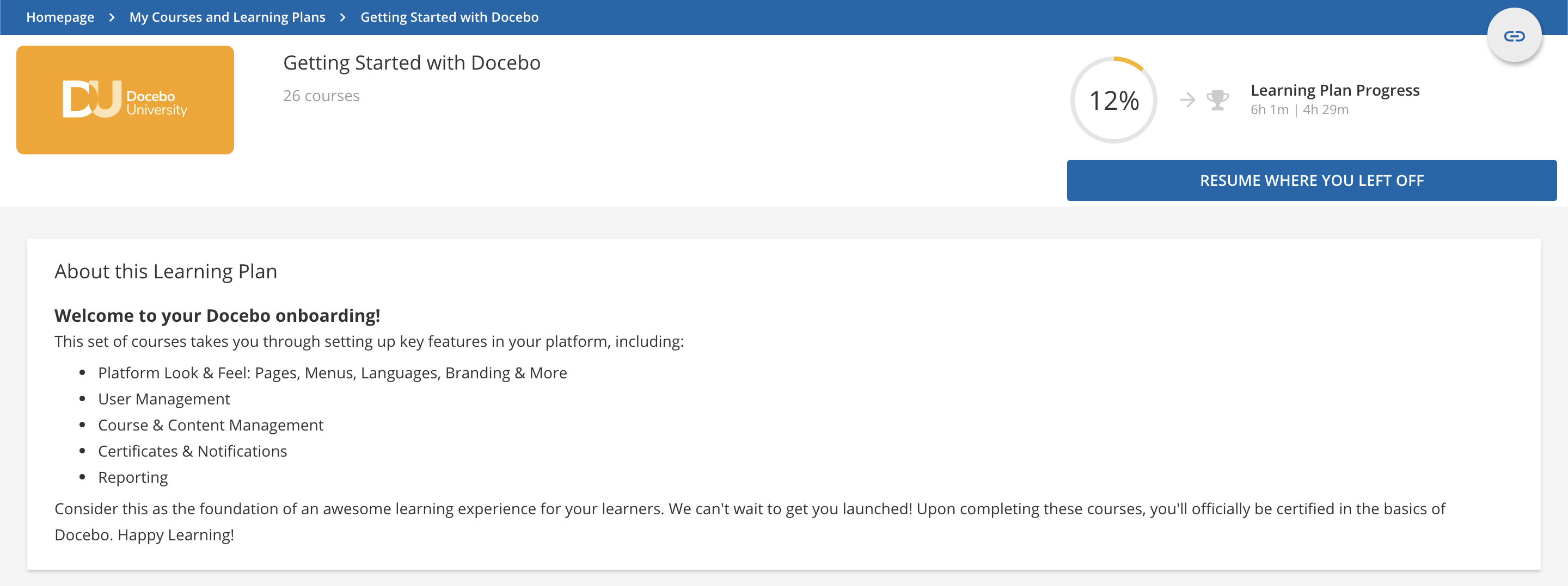
Below is an example of a cleanly formatted Learning Plan description from Docebo University that focuses on giving the learner an overview of the different topics that are covered in the LP.


Simple Learning Plan description that relies on basic text formatting like line breaks, bold text, and bullets to organize information.


I also really love the way that our course developer, @ryan.woods structures descriptions of courses on the course overview page within the Rise courses in DU. Below is an example pulled from the Delegating Administrative Tasks with Power Users course. This description adopts many of the best practices that @lrnlab highlighted in his reply.


In this course, you'll learn:
1. What power users are, and why they matter

2. How to create a power user profile

3. How to add power users to the platform

4. How to leverage power users strategically


Course Expectations: 

Watch 1 video

Answer 2 knowledge test questions

Take 2 project challenges

Time:

5 - 7 minutes per lesson

15 - 20 minutes for the whole course


Outline:

Unit 1: What power users are (and why they matter)

Learn the value of power users from a common scenario

Define power user

List some common use cases for power users


Unit 2: How to create a power user profile

List different kinds of power user permissions

Trace process of downloading the Power User App

Trace process of creating a power user profile

Test your knowledge of power user profiles

Take a project challenge to create a power user profile


Unit 3: How to assign power user profiles to users

Trace the process of creating an individual power user

Watch a video to see how to create power users through a CSV file

Take a project challenge by creating a power user


Unit 4: How to leverage power users strategically

Review some strategies for leveraging power users

Test your knowledge of power user strategy


I hope more users who have found creative ways to use Course Descriptions stumble across this thread!


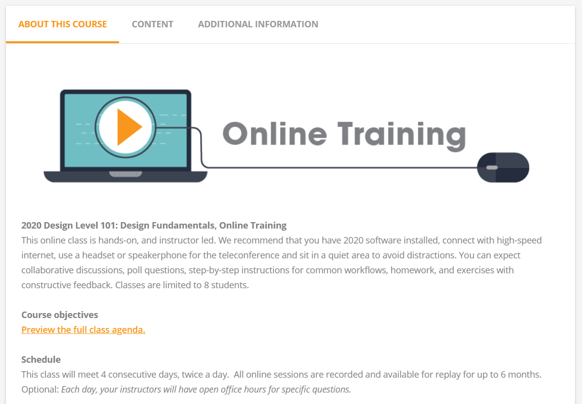
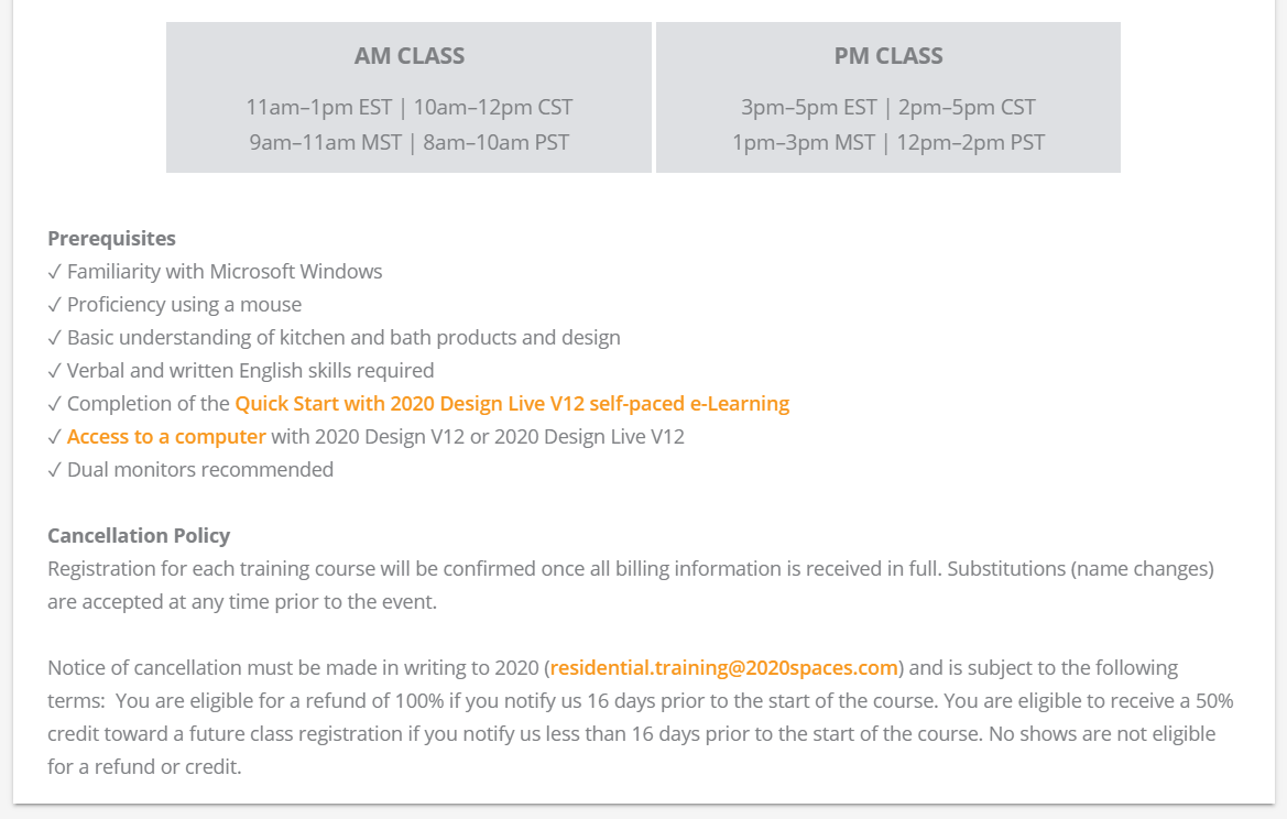
Here’s an example of one our online instructor-led courses:


I would love to see what you come up with!  

Vanessa


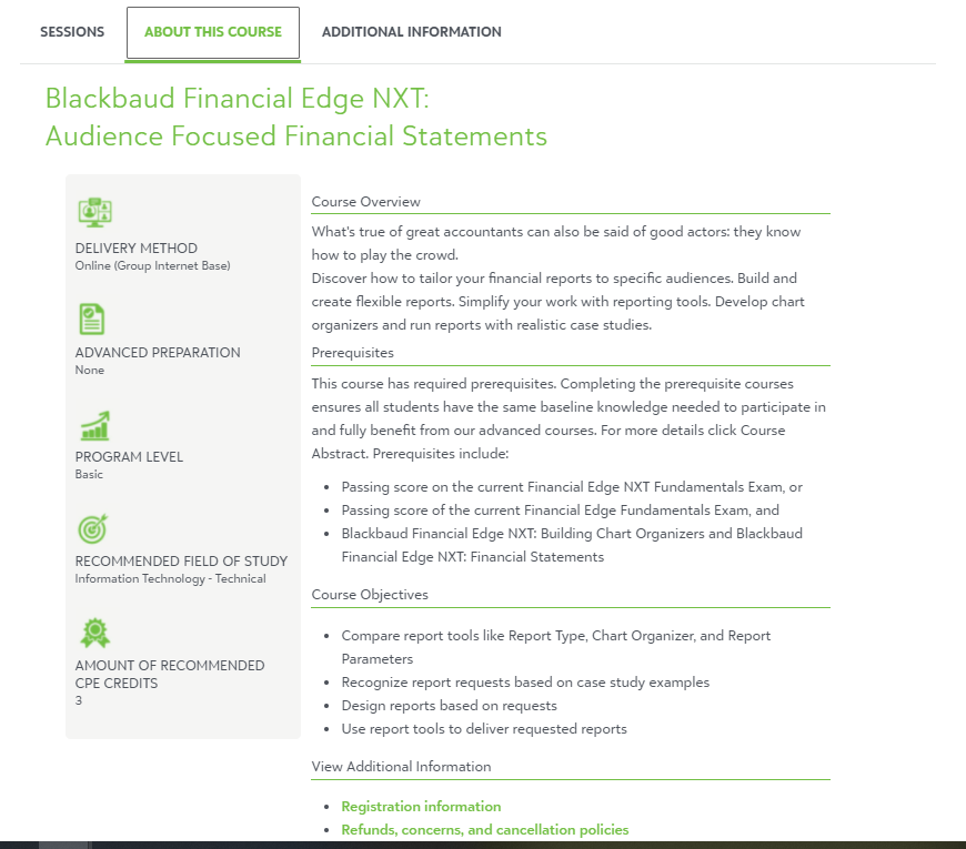
Thanks for the examples, y’all. This is what we’ve more or less settled on for go-live.


@designessa @steveninfinger these. are. awesome. 😍


Are either of these designs utilizing customized HTML? If so, would you be willing to share code snippets with the community?


Thanks @Adam Ballhaussen - the example I posted has been refined a few times over the last year but it’s mostly a copy and paste from our marketing material plus an image and a table.  

I’m so impressed by the example that @steveninfinger posted, it turned out great!


@designessa @steveninfinger I have come back to this tread 4 times in the past two days to look at your course descriptions.  So so awesome!  Totally inspired.


Thanks everyone! We have a talented team working on graphics and UI. I’ve attached the HTML to the .txt file below. I’ll also add it to the code group so it’s easier to find in the future.


You’re a legend @steveninfinger. Thank you!


@kferguson  some great, creative ideas here for future when we get to the course outlines for Marksys U. 


Thanks everyone! We have a talented team working on graphics and UI. I’ve attached the HTML to the .txt file below. I’ll also add it to the code group so it’s easier to find in the future.

Thank you Steven for sharing this file. Is there any additional css code that needs to be added for this to render how you have it in your app?


@steveninfinger where would I put that HTML code for something like this? .


@steveninfinger where would I put that HTML code for something like this? .


  1. Course Management
  2. Select your course
  3. Properties tab
  4. General Settings > Details
  5. Scroll down to the description section
  6. Click on the code view icon 
  7. Paste


Reply