Hi, Community!
Looking for some ideas/advice on learner dashboard configuration. We’re looking to revamp our learner dashboard to make it easier for our learners to navigate. I realize that we all have different priorities and needs when it comes to the learner dashboard, but hoping to gather some new ideas from this post that could potentially be translated for our use case. Things we’re looking to improve upon:
- Ability to easily distinguish between required learnings (aka compliance courses with due dates) vs. optional learnings that are automatically assigned
- Also how to distinguish between courses assigned via enrollment rules or assigned by a manager vs. self-enrolled courses (is this possible?)
- Ability to easily navigate to the course catalogs page where learners can self enroll into other desired courses
- A less “busy” dashboard than we currently have
- Minimize the need for scrolling/the number of clicks for learners to find what they need
Note: We are not currently using DC&S
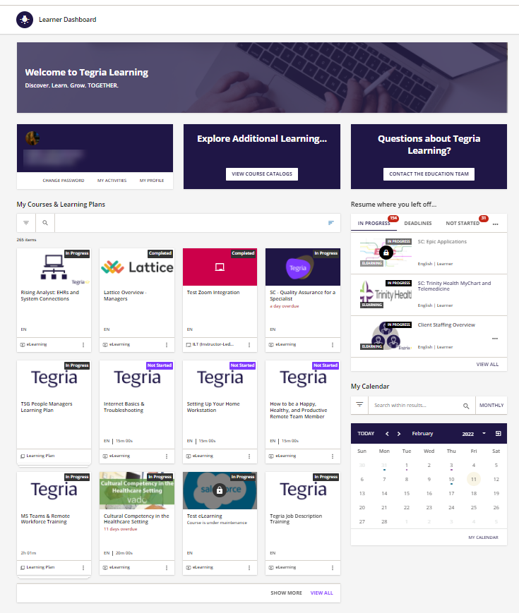
Current Learner Dashboard for Reference:

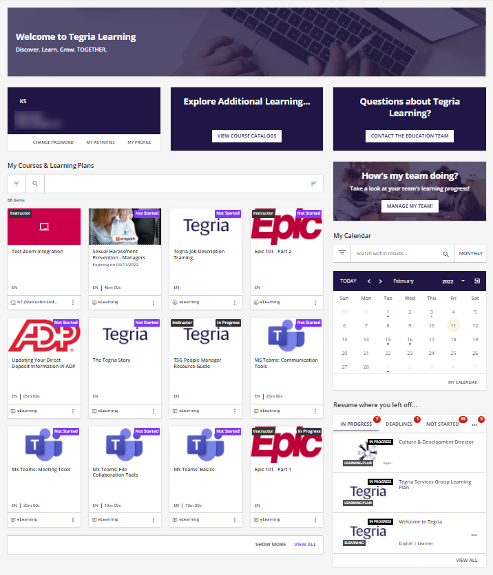
Current People Manager Dashboard for Reference:


