This series is inspired by individuals working with limited resources and little to no access to dedicated design teams. I’ve been working in the Docebo space for over a year now, managing and designing our LMS entirely on my own.
When I stepped into my role, our LMS was already built—but it focused on functionality over look and feel. My goal has been to create pages that better organize the large volume of information in our central repository, starting with the homepage (and make it look pretty lol). There’s still a lot to learn and unlock within the platform when it comes to what’s possible from a design and UX standpoint, and this series documents that journey.
Topic: Homepage Design
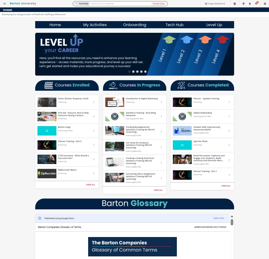
Some background on my use case - we use Docebo internally for onboarding, training, and (soon) professional development. I have tinkered with a lot of the features on my homepage and so far I am happy with my results! I did the following things by using the widgets available in Docebo, especially the HTML widget:
- A navigation bar that leads to important links (HTML widget)
- A carousel to showcase an overview of the LMS, “Meet the Team”, highlighted important apps we use in the company, and a TED talks page I built for inspiration (HTML widget)
- Courses/Learning Plans are displayed based on completion (Courses & Learning Plan Widget)
- Added a widget that helped me embed a Google Doc that updates in real time if I made revisions in the Google Doc (HTML widget)
- Programs I use to help me make all this - ChatGPT, Docebo Community posts, Fark Tools (courtesy of a community member
@Bfarkas ), Adobe Express or Canva, codepen, and chats with other Docebo Users (shoutout to @JZenker and his Inspire conference session last year!)
This is just the homepage! I was able to make other landing pages too but I am still tinkering with them. As much as I love the homepage - simple, clean, and the design is cohesive, I feel like I am missing something?? I haven’t heard any complaints from my users though haha.
Questions I have:
- Did you build a separate homepage for leadership positions like executives or managers? How does the design differ? What widgets were most effective for them?
- What cool things were you able to bake into your homepage without a 3rd party coming in to help you? It could be cool things that you’ve done through the widgets!
- If you have a navigation bar, what do you put on it? I find that I need to refresh my options because I feel like only “Onboarding” and “Tech Hub" is used
Here is a peek at my homepage! I would love to see what others have built 😊