We are currently testing the new course player functionality in our sandbox, but we want to get ready to release to everyone.

If you have released it to all of your users, I’m curious to know:

  • How it was received by your users? 
  • Any questions or issues that are coming up from your users? 
  • Did you do any communication to your users about the new course player? Or did you just turn it on?

Excited to hear from others about this!

I have this exact same question.  Thanks for asking it before I got on this morning to do so!

I am particularly interested in how much CSS work you had to do to get it ready for prime-time viewing.  We are looking at more that we had hoped for.


No. We’re taking our time with it, since we have until October. We want to time it right and make sure the changes are communicated out to our learners ahead of time. We’re also working on a redesign of our Docebo homepage and channel pages, and we might bundle the course and learning plan player update in with that.

Communication is essential for major UI change like this. If you prepare people for the change, then your reception is likely to be more positive than if you just flip the switch.

Right now, we just have it turned on in the Sandbox and for Super Admins in Production. However, the handful of users who have seen it when I’m presenting seem to like it.


I have this exact same question.  Thanks for asking it before I got on this morning to do so!

I am particularly interested in how much CSS work you had to do to get it ready for prime-time viewing.  We are looking at more that we had hoped for.

We’re not intending to do any CSS work. What CSS fixing do you think it might need? Getting rid of “dark mode?”

For us it would be to hide the system-generated tags for training materials.  The system does not do a very good job of selecting tags, so we just hide them. 

Which someone would like to do that for the new course player, here is the post that has the CSS to hide that: 


We were rapidly accelerating towards deploying but ran into a pretty substantial issue / UX regression with VILT enrollments not surfacing the event times for learners in an intuitive way during testing, which has slammed the brakes on the initiative.


No...we are still trying to figure out how to roll this out...testing is first, then job aids, then socializing, etc...many more steps before launching...


Are Docebo making changes to the interface based on feedback/issues found?  If so I'd rather wait until these changes have been implemented.


Are Docebo making changes to the interface based on feedback/issues found?  If so I'd rather wait until these changes have been implemented.

Good question - I’m hoping they are prioritizing the ideas that they are having us open for the New course player. 

I did open a ticket for an issue regarding ILT sessions that were evaluated by an instructor.  Instructor feedback was not visible on the new course player, so a user would only see their score and no instructor notes.  They are working on pushing a fix for that. 

I’m curious to know what other tickets are floating around for the new course player. 


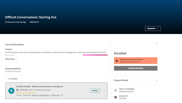
I haven’t fully looked into looked into the all the new quirks of the new course player, but there are some glaring issues.  e.g. I can’t see an unenrolment option on a course I’m enrolled on (see below).  I’m a bit worried that we’ll be forced to roll out something that is broken?


Not yet, it doesn’t work with our design and we’re going to have to redo some of our design elements to make it work well and look good. It’s kind of frustrating because we just set everything up and now we have to adjust it all. It comes with the territory, but I don’t quite understand how it enhances the user experience. 


I’d love to hear from others if they like it and why. What’s better about this course player than the old one. I recognize that some of my hesitancy could just be about change aversion. 


How did you all learn about this updated course player? I just happen to stumble upon the information.


How did you all learn about this updated course player? I just happen to stumble upon the information.

@dsizemore It was on a product update post.  Here is the original post:

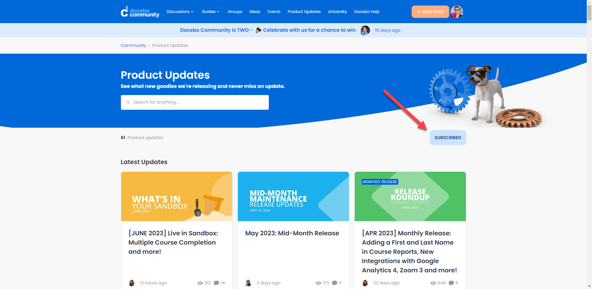
To stay on top of the latest releases you can subscribe to the Product update posts, so you receive an email when a new announcement is posted. 
Go to this link: https://community.docebo.com/product-updates

And click Subscribe


Thank you!


I have learned from my CSM that they will implement customization of the player background that is currently black.

In spite of the many improvements this change brings we have discovered some regression that is concerning.

We have considerable concerns with some of the negative changes that we hope to mitigate with CSS only if they do not make changes that eliminate the need for it so we are holding off and making plans for how to adjust and communicate the changes to our learners. Among the changes we will likely implement:

  • Hiding course tags is one since they are not useful and misleading to learners
  • Using localization to change the word Syllabus back to Table of Contents or Agenda
  • Hide the “More Options” ellipsis on courses which will offer learners an option to Mark Content Outdated
  • Modify the Scooter girl image on the course launch page as it doesn’t align with our branding
  • Hide exposed learning plan and e-Learning course codes

A change we are hoping for that is a stumbling block for us is the pre-requisite pop-up change in the learning plans.  We use them extensively and the current player reveals exactly which courses are pre-requisites that are blocking access to a locked course in a learning plan when a learner hovers their cursor over the lock on the course.  The new player eliminates the hover pop-up in favor of an “i” icon at the end of the course title which leads to a pop-up upon clicking on it that says only pre-requisite not met with no information about which course is blocking access.  This loss of functionality is a regression for us and is a negative for the user experience.


Basically on hold to see final code and then develop workarounds over here….Looking to add stable things into the CSS Customizer for Fark.Tools too once things are stable, but doesn’t seem quite time yet….


Basically on hold to see final code and then develop workarounds over here….Looking to add stable things into the CSS Customizer for Fark.Tools too once things are stable, but doesn’t seem quite time yet….

Yeah, after seeing this thread and the linked post that was announcing the new course player where folks are seeing some missing things, we are going to hold off a little longer.  Seems as though they are still working through stuff, like I had found a bug for ILT sessions that were evaluated - instructor feedback is not displayed to the learner on the new course player!

I call that, ‘notes to god’….you can give any feedback you want, no one is gonna read it :)


We did, but then we rolled it back because of this issue: 


@kcortave thank you for sharing!  This helps in supporting our case to wait to push the player until this is fixed.

I’m curious to know - aside from the session time not being displayed, was there any other feedback from your users? 


@Annarose.Peterson  

The only other feedback was positive regarding the look and feel. I think the biggest win is the “Join Now” button. If we didn’t run our VILT sessions on self-enrollments I would likely have kept it on because it is definitely a big improvement.  


I presented the views to our User Experience panel and it was overwhelmingly preferred overall.  The only feedback that went to the favor of the old version is that they slightly preferred the Course Outline on the Right vs. Left.

We have switched our Sandbox over to the New Course view, but leaving the old version until our current wave of new users are through before making this major change.  We will launch it at our go-live in a month.

That’s exciting @heather.wallace2!  I like that you presented to a user experience panel too.  That’s a great idea to get some questions answered before releasing.


Basically on hold to see final code and then develop workarounds over here….Looking to add stable things into the CSS Customizer for Fark.Tools too once things are stable, but doesn’t seem quite time yet….

Can’t wait for updates to FarkTools!  Please keep us posted.  😀


We had it live for about 1 month, Some issues with Control panel showing over the top of Subtitles for too long and now we find the Playlist function doesn't work correctly. I have today reverted to the old player. (it is not possible for learners to delete or edit playlists and there is no option to choose which course to watch in the play list, you have to start at the first)

“Hi Gary,
You are totally right 
I have already informed our tech team and I would expect the information to be let known in the Community, although I am unable to confirm a date for that either.

Hi Gary,
Thank you so much for bearing with us while we were checking again
We opened a Feature task in order to achieve parity of function with the current course player, but we have not yet received an update from them. 
 
As this particular task has been identified for refactoring, it is going through a further analysis and it seems that since we do not have a release ETA, it is possible that the launch of the new course player in October will take place without the playlist functionality. 
 
Notwithstanding, I (and my colleague of T2) have informed our dev's about the importance.
 
I can certainly place this ticket on hold while waiting for the possible ETA and in this case, I would also think to encourage you to discuss your specific use case with your Account Manager Robert Embrack if I am not mistaken, so to help addressing it while waiting for the ETA 
 
In the meantime I wish you a fantastic day 


Hello Gary,
Thank you so much for bearing with me 
After review, I will need to collaborate with our Tier 2 team to investigate this in more detail. We will reach out shortly with next steps and continue to keep you updated here.


Just a quick heads up for anyone who may not have heard the news:

Update as of September 7, 2023: 

To give you more time to manage this transition, we’ve decided to delay the deprecation of the existing Course & Learning Plan player until June 2024. We’ll be sharing more information on the Product Updates page soon.


Reply