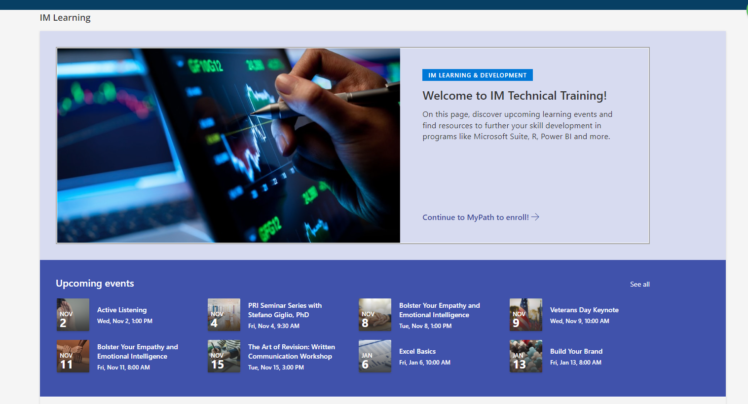
Hello, it would be great to have enhancements to the existing homepage for a more seamless feel - something like this. We’ve received a lot of feedback from our clients lately that the homepage feels “clunky”. This tool is sharepoint for reference. I understand we can utilize this layout via an iframe or HTML, but it would be great if the pages that more functionality/flexibility to be able to do it in the tool vs. a separate site. Just an idea. Thank you!


wow i need more coffee - “update interface” and “user experience”.. apologies! 


It’s entertaining to me in a world where SharePoint ends up being the example of cleaning/better interfaces. Years of people associating SharePoint with old and clunky, I know the newer online only versions are quite nice, just run into the old perception when trying to put them out there to folks, always an uphill battle.


@RebeccaBarns- good afternoon. The beauty of Docebo? Is that the system overall qualifies as an LXP (learning experience platform). As in, you can drive your experience as much or as little as you would like for your organization with as many of the tools and little customization or as much customization as desired.

I personally think the continued challenge is trying to find something that fits well for everyone. I think seeking for continued flexibility and additional templates? YES.

75% of the Corporate Learning Management Systems on the market today drive your user experience for you - and your org is locked into it - which in turn drives “tired LMS syndrome”.

Only given - a person helping to design your experience may need enough experience to actually design the experience into something beyond very good to great. If you are after incremental tidbits of ideas and improvements, the community has all types of details waiting for you and your next generation of an implementation.


So the product team is making enhancements in the flexibility and functionality to actually build in pages?


also - for the record, i’m not suggesting that sharepoint is the answer. we’ve received feedback that the user experience isn’t as seamless as they would like it - so we’re looking into work arounds and alternative approaches to provide options for our clients


also - for the record, i’m not suggesting that sharepoint is the answer. we’ve received feedback that the user experience isn’t as seamless as they would like it - so we’re looking into work arounds and alternative approaches to provide options for our clients

I understood, was just chuckling to myself since historically SharePoint was always looked down on UX/UI wise and it has made such strides recently to be able to be used for a good comparison. 


I am not aware of any larger enhancements to the page composer or widget sets. I do know incrementally, there have been changes - for example the Tast Widget is now supported by the mobile app - that came along this year.

There are quite a few ideas on how to improve the authoring experience as well.


HI @RebeccaBarns, thank you so much for sharing this feedback with us! May I ask, did you mean to make this an idea post?


Reply