
Question

Customizing Search Results

  • July 16, 2026
  • 10 replies
  • 99 views

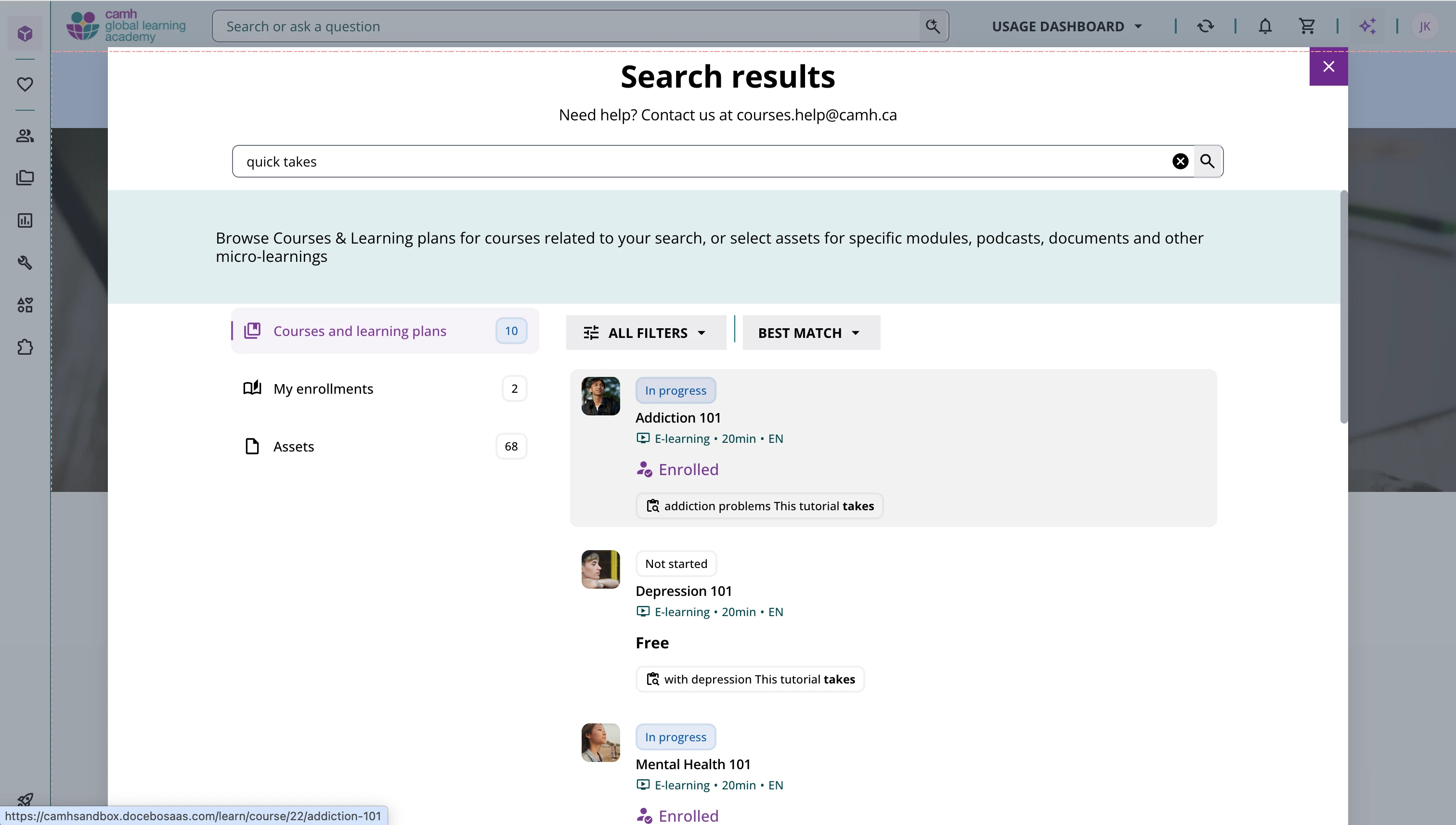
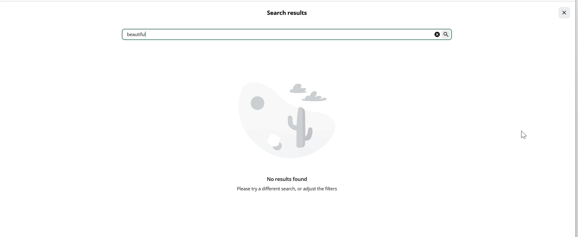
When a user types a keyword in the search bar at the top of the screen and the results page populates, is there a way to prevent the results from taking over the entire screen?  Or can you customize this page to display text or links to forms for submitting content requests?  All I’m seeing is the following screen with no additional navigation options or instructions:  
 

10 replies

Forum|alt.badge.img+1

We inquired about this to our CSM and were told it is working as designed.

Our concern is that unless you really look for the X at the top right, you don’t realize it’s a pop up and then you try to hit the back button, which doesn’t appear to do anything because what is happening is hidden behind the search window.


  • Author
  • Novice I
  • July 16, 2026

Agree - it gives off the appearance of dead end.  I need to be able to add specific text which appears at the bottom of all search results.  I also would like to not have the left hand navigation not go away.  


  • Novice II
  • July 16, 2026

It would be a great addition or change to help with the UX design, ​@JGPenney have you submitted this on the idea board? https://community.docebo.com/p/idea-submission-template


lrnlab
Hero III
Forum|alt.badge.img+10
  • Hero III
  • July 17, 2026

Hi ​@JGPenney have you looked in the localization app to see if you can update the text displayed on this page? There are likely labels you can update to something better than what is there now.


TrishAH
Helper II
  • Helper II
  • July 21, 2026

@JGPenney I thought the page was dead until my co-Admin was told by Docebo that it’s expected behavior. Not really what I was I expecting!

@lrnlab I’m going to look into the Localization even though it means I expect that people will read the message to ‘click the x to make the page go away’

The behavior is so obscure though.


  • Author
  • Novice I
  • July 22, 2026

Thank you all - I submitted a request and could actually use some upvotes / love if anyone agrees.  UX Improvements to Search Results | Community


  • Author
  • Novice I
  • July 22, 2026

Hi ​@JGPenney have you looked in the localization app to see if you can update the text displayed on this page? There are likely labels you can update to something better than what is there now.

Hi ​@lrnlab  - I updated using localization, but it still didn’t meet our need since it’s simple text and doesn’t allow us to point users to links.  Please see the enhancement request and would love your insight:  UX Improvements to Search Results | Community


  • Author
  • Novice I
  • July 22, 2026

It would be a great addition or change to help with the UX design, ​@JGPenney have you submitted this on the idea board? https://community.docebo.com/p/idea-submission-template

Just submitted:  UX Improvements to Search Results | Community  Thank you for the suggestion!


So we’ve been experimenting with using CSS - we use an before/after elements to add text after the “Search Result” title and the search bar, and have styled the close button to be more prominent.

We’d further styled the course cards themselves and the categories - but are in the middle of refreshing all our CSS with the UI updates.

It’s not the robust version we’d want (or it sounds like you want), but it’s a few little bits that help our learners.


Forum|alt.badge.img+1

So we’ve been experimenting with using CSS - we use an before/after elements to add text after the “Search Result” title and the search bar, and have styled the close button to be more prominent.

We’d further styled the course cards themselves and the categories - but are in the middle of refreshing all our CSS with the UI updates.

It’s not the robust version we’d want (or it sounds like you want), but it’s a few little bits that help our learners.


Could you share the code?