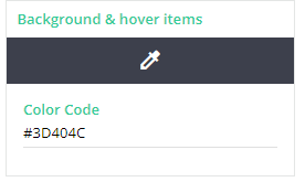
Is there a way to only change the background colour of the description toolbar or even the icon colours? My manager insists on having it grey but I can’t read / see the icons. Below is what it currently looks like.
Appreciate any help - my eyes are so sore!
Thank you
Page 1 / 1
do you mean on the admin side?
Yikes, thats terrible and a massive accesibility issue. Is that set so it is all WYSIWYG tool bars around your system?
Hi @lrnlab and @Bfarkas!
Thank you so much for your responses. Yes, its on the admin side and pretty much in all the wysiwyg toolbars and heading sections.
This is another example (Channel Management within Admin Menu) where the colour change has impacted being able to read the headers because the font is also black -
I would even be partial to making the font colours white however I was initially apprehensive to this in case it changes the font colour of the admin menu - below is a snip of the admin menu
Thank you so much for your responses, appreciate it greatly!
Wow, that is going to be a lot of areas to override. I almost wonder is the reverse an easier route, is there a particular spot or two your boss wants the dark or is it just as many places? Thinking can you set the real setting to something a little better and then just tweak.
You’re right, lots of areas to override and new areas keep popping up. He would just like the background and the top toolbar area in #3d404c. I don’t think anything else would matter to him in the backend as he doesn’t use the platform but as long as it stays the same in the front, it would be okay