Hi everyone,
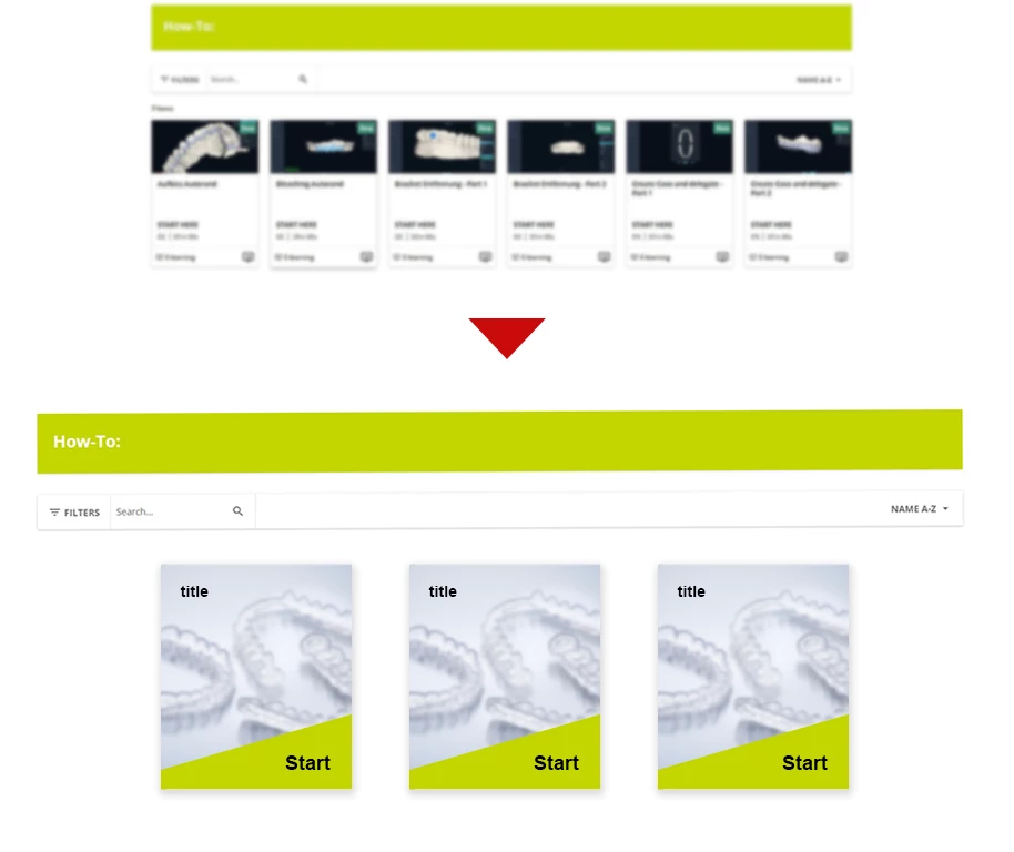
I’d like to use this thread to collect ideas, solutions, and best practices for customizing course cards and the surrounding layout.
I’ve already come across some CSS and HTML solutions, such as rounded corners or hiding specific information, but I’m curious to see what else is possible. Ideally, I’d like to avoid replacing course cards entirely with linked images.
From my perspective, I’d love to:
- Display larger images
- Reduce the amount of information shown on the card
- Limit the layout to a maximum of 3–4 course cards per row
- Use GIFs instead of static images
Overall, I’d really like to see a more customizable and flexible design for course cards.
Looking forward to hearing your thoughts and seeing what you've already implemented!