So I was tinkering around with the cards in the course catalog trying to find a slightly different look and found that the CSS adjustment was not real drastic. I thought some others may be interested in this small adjustment.
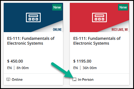
Here was the starting point.
You’ll notice I had chosen an image and used the Localization Tool to change the wording on the bottom already.
I was looking to pull out the icons on the bottom as well.
Here is the after
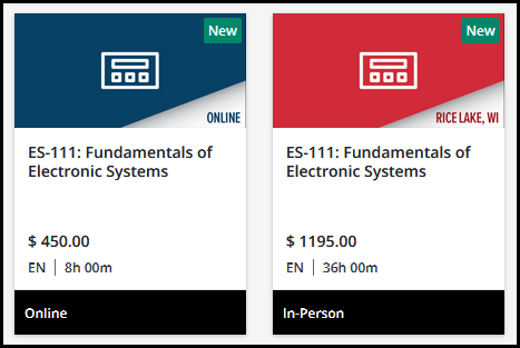
I got the icon out but then the text needed a small padding adjustment. Then I wanted to try changing some colors on the bottom for the background and text color.
Here is the code for the above changes.
/** Make padding adjustment and background color change for catalog cards **/ ui-card-footer { padding-left: 5px; background-color: #000000; }
/** Remove icons from bottom of course catalog cards **/ ui-card-footer ui-icon { display: none; }
/** Change text color for bottom of catalog cards **/ ui-card-footer span { color: white; }
Hopefully this helps someone out someday.
Page 1 / 1
Thank you so much for sharing! I love this.
Most welcome.
I realized a little bit afterwards that I needed to have the Learning Plan pop a bit after making that adjustment. So here’s another nugget.
Real easy to swap out your colors.
/** Adjust the color of the Learning Plan stacks **/
Thanks @gstager once again….Love the idea of upgrading these a little...Will the code work with any image we use as the thumbnail? or just with the defaults?
Ids doesn’t look like it’s impacting the image for thumbnail at all so should be safe. All footer and wrapped related.
Nice work @gstager went down a similar path last year and started completely reformatting the shapes for fairly different look, always fun
Do you find the ui-card is not too generic for applying to a lot of widgets and views? Are you selecting down on pages or widget ids to get around that? The card wrappers get used quite a bit in different forms.
I like this a lot! Thanks as always @gstager!
looks great. Can i ask - do you know of a way of hiding the language and cost?
Every single one of our cards say ‘Free’ and ‘En’ - would be good to hide this.
looks great. Can i ask - do you know of a way of hiding the language and cost?
Every single one of our cards say ‘Free’ and ‘En’ - would be good to hide this.
This has hidden the price, language and the separator bar. However, I do not know if this changes anything else on the platform, so please check yourself :)
Thanks - will give it a go.
Thanks @gstager once again….Love the idea of upgrading these a little...Will the code work with any image we use as the thumbnail? or just with the defaults?
I don’t see why it wouldn’t work with any other image. I have a custom image being used in my screenshot.
Do you find the ui-card is not too generic for applying to a lot of widgets and views? Are you selecting down on pages or widget ids to get around that? The card wrappers get used quite a bit in different forms.
There are a number of elements that are pretty generic and get used in multiple places. Where I need to, I drill down as far as I have to. I like to click on the little icon in the inspector that will show you all the elements that use the same selector. That helps narrow things down lots of times.
@gstager yeah I get the principle and know how to drill down, it was more of for everyone’s knowledge and was curious that these changes weren’t impacting other widget types since the card UI is so common and has underlying specifics that sometimes shift so I had previously found I needed to be more specific to a wrapper above the card UI calls to be specific to a widget type or widget ID or page ID.
@Bfarkas - When I first did this one - I was concerned about that as well so I took a quick glance at a custom page I have with several other widgets on it just to see if they suddenly looked funky or not.
They seemed fine and only the catalog cards seemed different on that page.
Something may pop up later on - you know how it goes...
Yup, the trouble for this one comes down to different views of the same widgets if I remember right, so really comes down to your specific use cases, but it was definitely impacting other areas before, really wish there was a better css hierarchy map available to be able to see overlaps and not.
@Bfarkas - Did you find a place where this little mod affects another place?
If I can re-create, I could try to improve the code because I like the “certain something” the styling adds to these cards. I think it is worth holding onto.
I think we are misunderstanding each other.
The update is positioned as for course catalogs, but is focused on the card UI styling which is used in other places throughout the system and other widget types, i.e. channels, courses and learning plans, the card UI is one of the core design setups of the current theme.
For those that like those types of widgets to have different looks for different purposes, this would impact them universally (i.e. see my link to a channel update above) which is why I get nervous for it to be as broad and available for people to grab without knowing how to select more specific, at least to the widget type, Every widget type does have a special selector which if used would alleviate and keep the updates specific to their types, in this case channels all have doc-widget-channels that if used above the card UI would solve the issue.
Viewing from the perspective of sharing with folks who predominately are copy pasting this for results, so while totally get keeping as high as possible for your self to manage, do it myself, just wondering if it should be stated or added when sharing for broader use.
I get this is feeling more ranty now, and it is not intended that way, this is great, I just always get concerned of straight shares from outside perspectives.
@Bfarkas - No worries. You always make great points.
I’m no expert at this stuff so am happy to pick up additional wisdom where I can.
The common theme in all the CSS tricks is that everyone should do some testing in their environment.
If the solution works for you - great - if not, maybe we can figure out a way to address it specific to your use case.
A big challenge is that you can accomplish the same look in many different ways with CSS customizations and sometimes that means finding the right way to do it without conflicts.
Not all CSS tricks that are shared will work for every instance of Docebo as they are currently configured.
That is a good nugget for everyone to remember.
Hello everyone,
For the card footer color changes. Is there a way to alter the color of the icon rather than removing it?
Hello everyone,
For the card footer color changes. Is there a way to alter the color of the icon rather than removing it?
You could play around with these…
Just adjust the color to your liking. and be sure to test other areas of the platform.
g#classroom { fill: blue; }
g#elearning { fill: blue; }
Hello everyone,
For the card footer color changes. Is there a way to alter the color of the icon rather than removing it?
You could play around with these…
Just adjust the color to your liking. and be sure to test other areas of the platform.
g#classroom { fill: blue; }
g#elearning { fill: blue; }
Thanks - I’m trying to limit it to one page for now so I’ll have to dig down a bit. Thanks for the starting point.