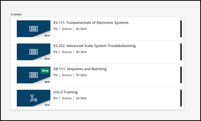
Hi - I genuinely feel lame asking this, but I have a catalog widget that I am using in list mode and there are three things that I would love to tighten up with the experience.

- make that title a little smaller
- cut down on the spacing if possible
- remove the status from the widget all together
With an attempt to make the widget to the left scale better with the one that is “dynamic”.
If some of you have fought this and have something that can come out of your backpocket? Maybe I can answer something for you soon enough?????
Any help would be appreciated….


