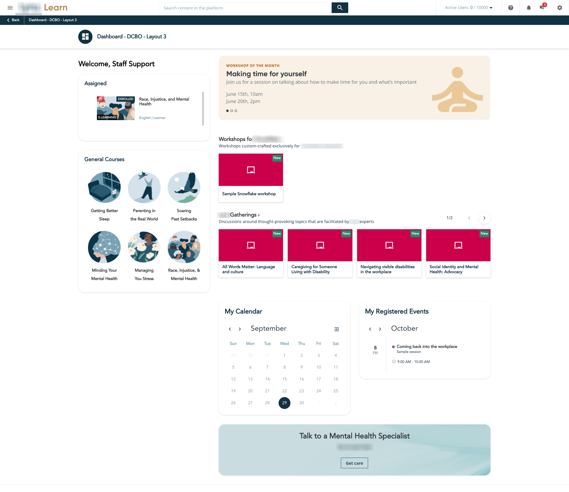
We are a very small charity and none of us overly good with IT systems. We have set up and have been using Docebo for a number of years now, but there are issues we have with the system that i am sure could be easily resolved with some coding and re-design, non of us however are competent to do this ourselves.
Has anyone used an external body to do this that they could recommend? Unsure if Docebo offers this service itself?
Page 1 / 1
Hi Clare,
We handle HTML and CSS so probably we could help you.
Could you tell us more about your issues?
We want to change the layout of the sign in page and remove the register button, we also want to make the content page stand out a little easier too if possible on our courses.
Docebo offers a service called “Learning Design” where we’ll partner with you to build and design custom widget pages that deliver an improved user experience. We have lots of page templates and examples of what has worked well in the past .
If you want to learn more about the service, I’d recommend talking to your Account Manager.
Also regarding the register button on the sign in page, you should be able to turn this off from the advanced settings area:
Thanks for the info @clare.barber,
About the Login page changes, as @nick.tosto showed to you can remove the register button in the advanced settings. If you want some different customization we already have done customization for some clients (for example moving, changing some elements). However, as those are not simple tasks, we would need to analyse it in detail in order to understand what can be done, if you want more info feel free to send me a DM
I have a slight issue, if I remove the register button, users then can’t purchase my courses!
Any ideas on how to remove from sight on the landing page but still enable learners to purchase courses and register when completing purchase?
If I correctly understand your question, you would like to let users register on the platform only in the purchasing process, right?
If that is the case, indeed hiding with CSS the register button could be the right approach. By doing that, the users will be able to register in your LMS only via the cart while purchasing the courses.