We had a need to make the “Enroll” button disappear for Power Users.  We wanted to give customers the ability to manage their own user enrollments in the system, but not to be able to get free classes for the Power User (bypassing the shopping cart).  Here was the initial solution in CSS:

/*hide course enroll button*/
display:none;
}


However, we also offer some free online tests to the public, and the solution above affected *all* enrollment buttons.  The solution to make the “enroll” button selectively disappear was based on CSS siblings:

ui-button-raised-primary + ui-button-raised-primary saria-label="Enroll"] {
display:none;
}

/*hide course enroll button under shopping cart*/
ui-button-raised-primary + ui-button-raised-primary saria-label="Enroll"] {
display:none;
}


This CSS allows you to essentially make the “display:none” conditional upon the appearance of the “add to cart” button being above the “enroll” button.  I hope this helps someone else!

@elamast Thank you so much for this!!! (sending you all the virtual high fives). 

We have a ticket open with Docebo right now because of this issue, and they have let us know that they are working on it. But in the mean time, we are potentially losing revenue because power users can simply enroll into our pay courses.  if we can hide the enroll button for now, that would be so great!!


This is awesome. Thank you for sharing @elamast! Here is some additional information about an update coming soon from our Product Updates page that might help you both! 


HEADS UP! Course enrollment button visibility update for Power Users

For those using the Power Users app, please note that starting on August 19, 2021, in order for Power Users to be able to see the Enrollment button for courses,  the profile they are assigned must have both Enrollment and View permissions enabled for courses.


This is awesome. Thank you for sharing @elamast! Here is some additional information about an update coming soon from our Product Updates page that might help you both! 


HEADS UP! Course enrollment button visibility update for Power Users

For those using the Power Users app, please note that starting on August 19, 2021, in order for Power Users to be able to see the Enrollment button for courses,  the profile they are assigned must have both Enrollment and View permissions enabled for courses.

Thank you for sharing @Adam Ballhaussen


Hi @elamast . Although this post is a year old just wanted to give a quick thank you for this post. My team had spent far too many hours trying to find a solution for our subscription workflows (we needed to prevent users from enrolling freely into learning plans) and removing the enroll button through CSS did the trick. Thanks a ton! 


Hi @elamast . Although this post is a year old just wanted to give a quick thank you for this post. My team had spent far too many hours trying to find a solution for our subscription workflows (we needed to prevent users from enrolling freely into learning plans) and removing the enroll button through CSS did the trick. Thanks a ton! 


You’re welcome!


Thank you so so much @elamast  for sharing this. The out-of-the-box configuration was a major blocker for our launch and we spent many hours solutioning some non-so-nice work arounds. We are so happy we stumbled on your post as this was exactly what we were looking for! 

We are very happy that the Docebo Community is very supportive and appreciate the learn and shares posts! 😁


Hi @elamast ,

We have tried the remove Enroll Button for the public catalog course.

Adding CSS code in Configure branding and look


/* Hide Enrollment Part on Course. Switch XXX with Course ID START */ .lrn-course-overview-XXX .lrn-widget-content-enrollment { display: none!important } /* H?de Enrollment Part on Course. Switch XXX with Course ID END */


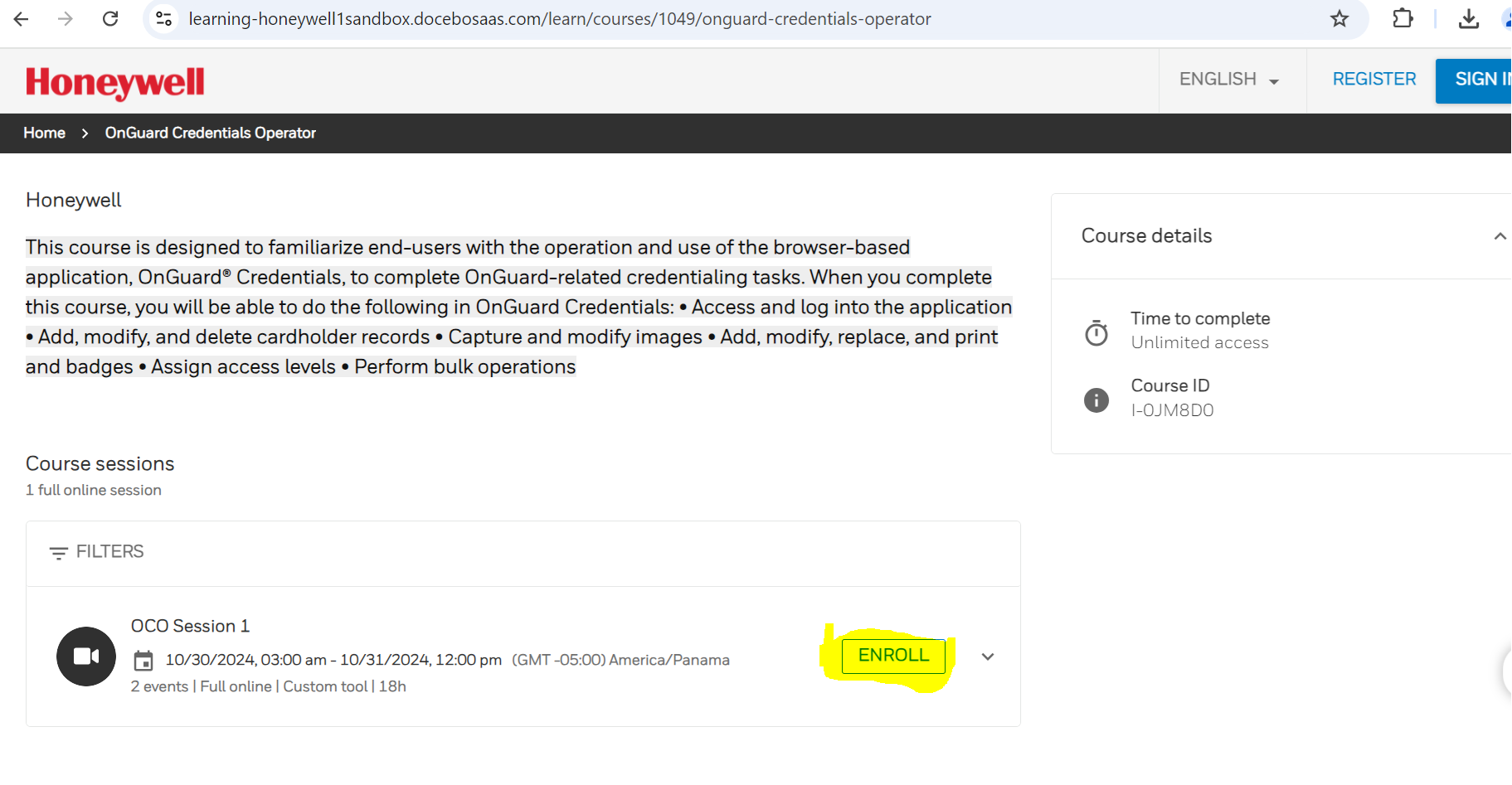
For E-learning, it works well, but for ILT courses, we can remove the enroll button from the course level but not the sessions.

Could you assist with this further?


Thanks in Advance.


In the new course overview page it appears to me that the Enroll and Add to cart buttons in the sessions area have the same selector but differ by the button text. 

If you’re using ecommerce, you need both the Enroll and Add to cart buttons operative.  If your browser supports the :contains() pseudoclass (which lets you look for the button text), you are in luck because you can use that to hide based on the button text.

If you’re not using ecommerce and want to remove the enroll button from the sessions section, you should be able to use this selector:  

dcb-ui-accordion-total-custom-panel-header > div > div > dcb-ui-button-outlined > button {

display:none;

}


Reply