

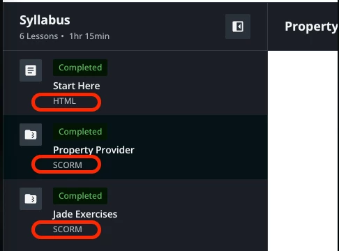
We desperately need to hide the training labels that are in the syllabus of the new course player. They have no meaning to our learners and the visual clutter is overwhelming. It also dissuades us from being able to use the short description for training materials that would add value to our learners.
I have combed through every mildly related community post and tried every CSS suggestion from the past few years in our sandbox. None have worked to hide training label. I reached out to Docebo Support and they said they do not advise on CSS.
Is there a CSS genius out there who can assist with this dilemma?
P.S. I know they can be changed via localization but our goal is to hide them entirely. That being said, if you changed yours, what did you change them to? Open to suggestions.
.
