


We are looking for a way to hide the Looks Good and Take a Look status banners from the My Team page. The majority of our courses do not have due dates and these banners have led to confusion by managers. Example: they see the Looks Good status for an employee and assume that employee has completed all courses so they don’t look at the Personal Summary page for the employee.
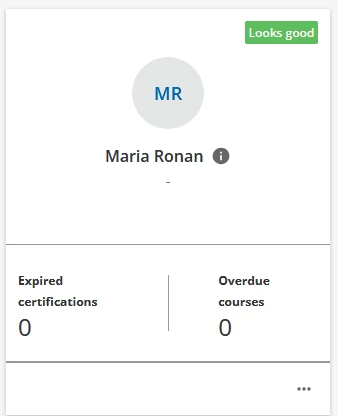
We tested the CSS provided in this post but found it removed status labels from other areas of the platform where we need the labels. We tried using the Localization Tool to adjust the wording. This wasn’t a good fit because we would need to use too many words to describe things to our managers. We tried simply entering a space for both Looks Good and Take a Look. This adds a small colored square in the upper right corner which would create a whole new level of confusion for managers.
Is there CSS that would specifically target these two labels and not others (or exclude other labels)? We are brand new to CSS and this is our first attempt to dip our toes in the water.
