Hi all,

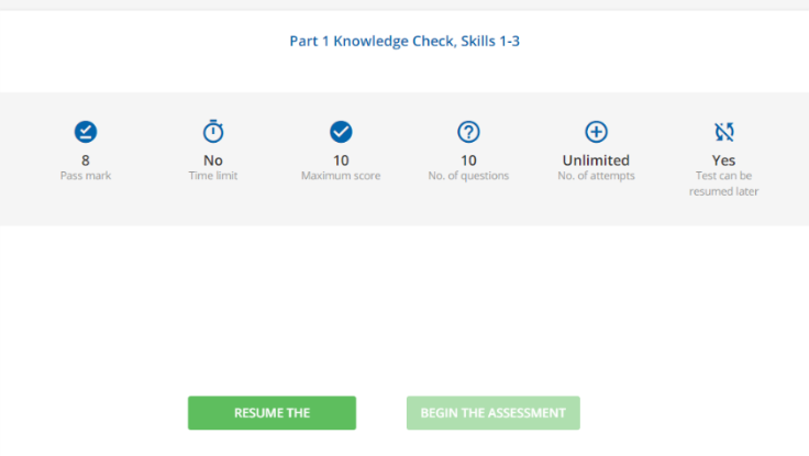
When I create Docebo tests in courses and users are resuming the test, the “RESUME THE ASSESSMENT” button is cut off, if I use the translation tools I can change to “RESUME THE TEST” and then it will show up, but I want it to say “RESUME THE ASSESSMENT”, any ideas with CSS that can fix this?

Thanks in advance!
 

Hi @rogergreenlee 

I don’t have CSS for you, but have you thought of removing the “THE” from the button using the localization tools? For example, you could shorten both buttons to the following.

RESUME ASSESSMENT

BEGIN ASSESSMENT


I mean, while there is CSS to solve this, in this case the above is the better route, less maintenance, potential other area impact, and no mobile concerns. 


Reply