
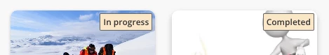
You’re looking to personalized the courses status badges (not started, in progress, completed)?
Below, you'll find a code snippet that you can insert into your Custom Styles 💡:
/* *********************************************** */
/* Course Status Label Colors - Card, List, Channels */
/* *********************************************** */

/* Not Started */
.ui-badge-status-success,
.ui-list-item-status-not_started .ui-badge-status-success {
  background-color: #020050 !important;
  color: #ffffff !important;
}

/* In Progress */
.ui-badge-status-neutral,
.ui-list-item-status-in_progress .ui-badge-status-neutral,
.ui-card-status-in_progress .ui-badge-status-neutral {
  background-color: #F7681E !important;
  color: #ffffff !important;
}

/* Completed */
.ui-card-header:has(+ ui-card-content span.color-accent-tertiary) .ui-badge-status-neutral,
.ui-list-item-status-completed .ui-badge-status-neutral,
.ui-card-status-completed .ui-badge-status-neutral {
  background-color: #008767 !important;
  color: #ffffff !important;
}
Go ahead and modify the color codes (#XXXXX) to your preference. Check out the examples below to see how the badges have been updated:
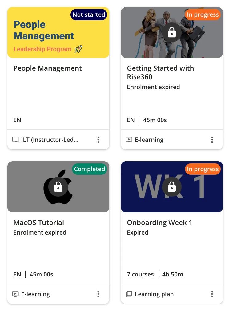
Hope it helps!
Similar articles:
- Make your widget with rounded corners
- Enhance the new calendar widget
- Hide the Page Title and subtitle
- Hide the language code on courses cards

