Hi all! I’m a little late to the party on testing the new course and learning pages in Docebo. I had some questions specifically about the new course in catalog page:

  1. We used to be able to hide the course in catalog page and go straight to the course. It seems like this is no longer an option. Can someone confirm?
  2. Is it possible to customize the widgets on the course in catalog page. A number of our courses have descriptions embedded directly in the SCORM objects, so we do not have them in Docebo. This means we are going to have a bunch courses with blank descriptions. It would be helpful to be able to hide the description on a course-by-course basis. 

Hi all! I’m a little late to the party on testing the new course and learning pages in Docebo. I had some questions specifically about the new course in catalog page:

  1. We used to be able to hide the course in catalog page and go straight to the course. It seems like this is no longer an option. Can someone confirm? you can choose to display courses in catalogue only those who are enrolled and couple that with an enrolment link. You will need to make sure to update your settings (advanced Settings) to allow users who are not enrolled or have access to a catalogue to launch a course with the course link only
  2. Is it possible to customize the widgets on the course in catalog page. A number of our courses have descriptions embedded directly in the SCORM objects, so we do not have them in Docebo. This means we are going to have a bunch courses with blank descriptions. It would be helpful to be able to hide the description on a course-by-course basis.  each course can have its own widgets so you can remove the Course Deck. widget from those that have no description.


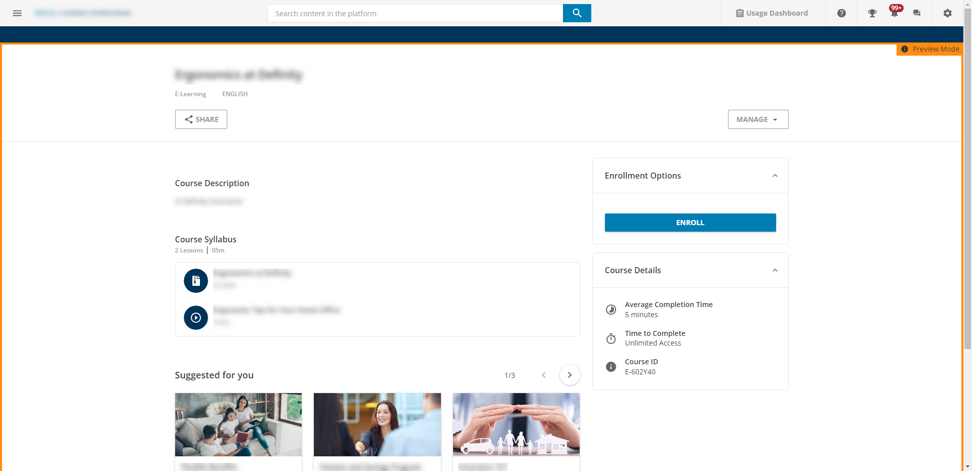
I may have explained that poorly. I’m referring to the revamped course overview page that appears for unenrolled users when they access the course for the first time in the catalog or search.


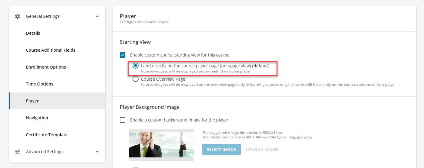
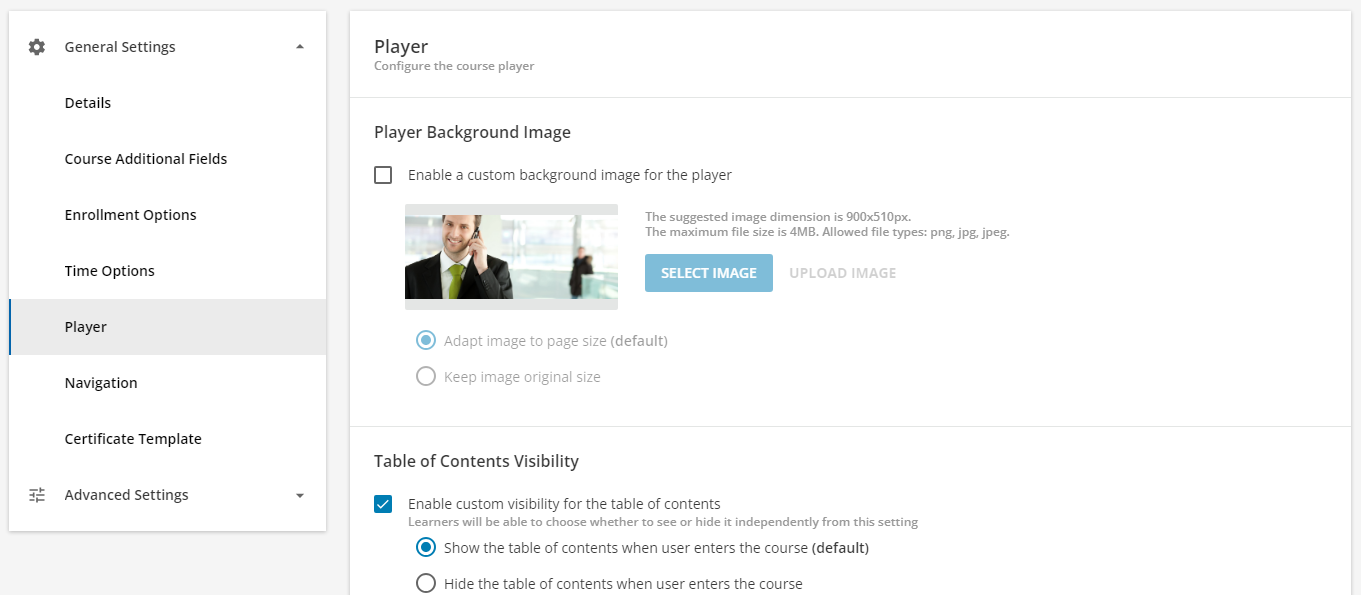
We can hide this page globally or at the course level in current state:


But it seems like there is no longer the option to do that with the new UI:


Am I missing something?


oh ok, never noticed that this was missing.. I would suggest you log a ticket with support to ask...it may have been removed due to the new player look. Have you tried in the new player to see what it looks like? If you only turn it on for yourself, you can compare by login in with another ID and see both versions 


it may have been removed due to the new player look. 

That’s what I was afraid of. We hide this course overview page from our learners because it’s an extra and unnecessary click for them to access training material. I’ll log a ticket. 


Reply