Best Answer

Divisions or Gates in a Learning Plan

  • 28 August 2023
  • 7 replies
  • 60 views

Userlevel 3
Badge

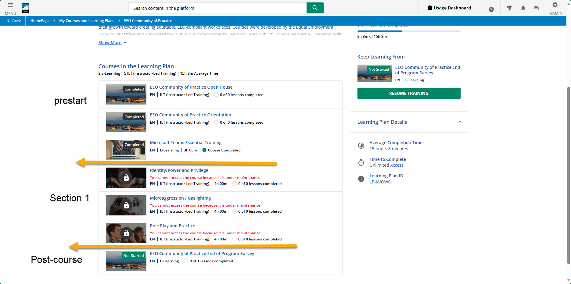
I have a cohort course that runs for months. Every 2 months, we start a new “section” of the course. I have each week’s content set up as a course. I have the overall program of content set up as a learning plan. I turn on the content for the learners a couple weeks before it goes live so they can see what’s coming.


I’d like to have a visual divider/gate I could put in the learning plan to show where the section breaks are. I realize I could have done each section as a course and make each week a folder in that course, but they have a lot of resources, discussions, and ILT sessions, so I wanted the streamline of a course per week. 


How can I better visually arrange this content?

icon

Best answer by KMallette 28 August 2023, 23:58

View original

7 replies

Userlevel 6
Badge +2

Have you tried using course Thumbnails as a visual divider/cue? 

Userlevel 3
Badge

Have you tried using course Thumbnails as a visual divider/cue? 

I’m not sure what you mean. Here’s what it looks like now with the yellow arrows and text being the type of thing I’d like to turn on. 


Userlevel 7
Badge +5

@EmilyW_Tacoma Hi, Emily … I think what @dianex.gomez means is to use the same thumbnail for all of the courses/training materials in a section, but different thumbnails for different sections.

For example, I use “ILT” and magenta for ILT courses, but each tile has a different audience. You can pick out some of the other themes I use.

So you could use one type of thumbnail for “pre-start”, another for “Week 1”, etc.

Userlevel 6
Badge +2

Yes @KMallette This is what I mean. Here is a sample of one I used. 


Userlevel 6
Badge +2

I believe sections are on the list of improvements when they finally get to the learning plan refactoring. I am SO looking forward to it. 

Userlevel 3
Badge

Thank you for the beautiful examples. Here’s what we had from our former LMS and we’d decided it was too hard to read the small text, so I’m excited to see the solutions you all have. And @dianex.gomez definitely want that change.


Userlevel 6
Badge +2

You could use images from different points of interest in Tacoma to differencite. The wording is to similar to stand out. 

Reply