we’ve received some feedback from users that when looking at the course catalog, it would be nice if courses were labeled ‘enrolled’ ‘in-progress’ or ‘completed’, similar to how it appears in the “My Courses & Learning Plans’ widget on the home page. I agree, this would be nice so that learners are not confused on what they have/have not taken when they are searching the catalog. Is this a setting? Or is this something that we would need to create an idea for?
Unfortunately not directly without using some widgets as a workaround, but folks still get there.
good news is an idea already exists:
https://community.docebo.com/ideas/show%2Dcompletion%2Dstatus%2Din%2Dcatalog%2D1634
bad news is it is parked and waiting for dev time.
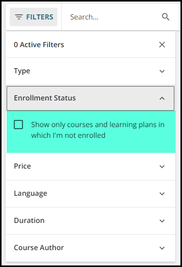
You could also filter out the ones you are already enrolled in so that only courses you have not taken are visible.
But manually and every time :(
Yeah - filters are one of those things could go either way.
Sometimes you want a filter to be persistent and other times you don’t.
It seems you’re always stuck either setting the filter/sort or unsetting it.
Like the default of sorting by most relevant on websites. LOL Ugh
I think it would be nice to somehow implement some storing of user preferences on things.
found this that might work if you build it as a custom page
agree
The problem I’ve seen with that is while on the custom page is fine, but users inevitably end up on the default catalog type pages at some point and then are confused as to why things are different. Whish there was a way to essentially replace a default page type with a custom page….
Reply
Log in to Docebo Community
Enter your email address or username and password below to log in to Docebo Community. No account yet? Create an account
Docebo Employee Login
Enter your E-mail address. We'll send you an e-mail with instructions to reset your password.