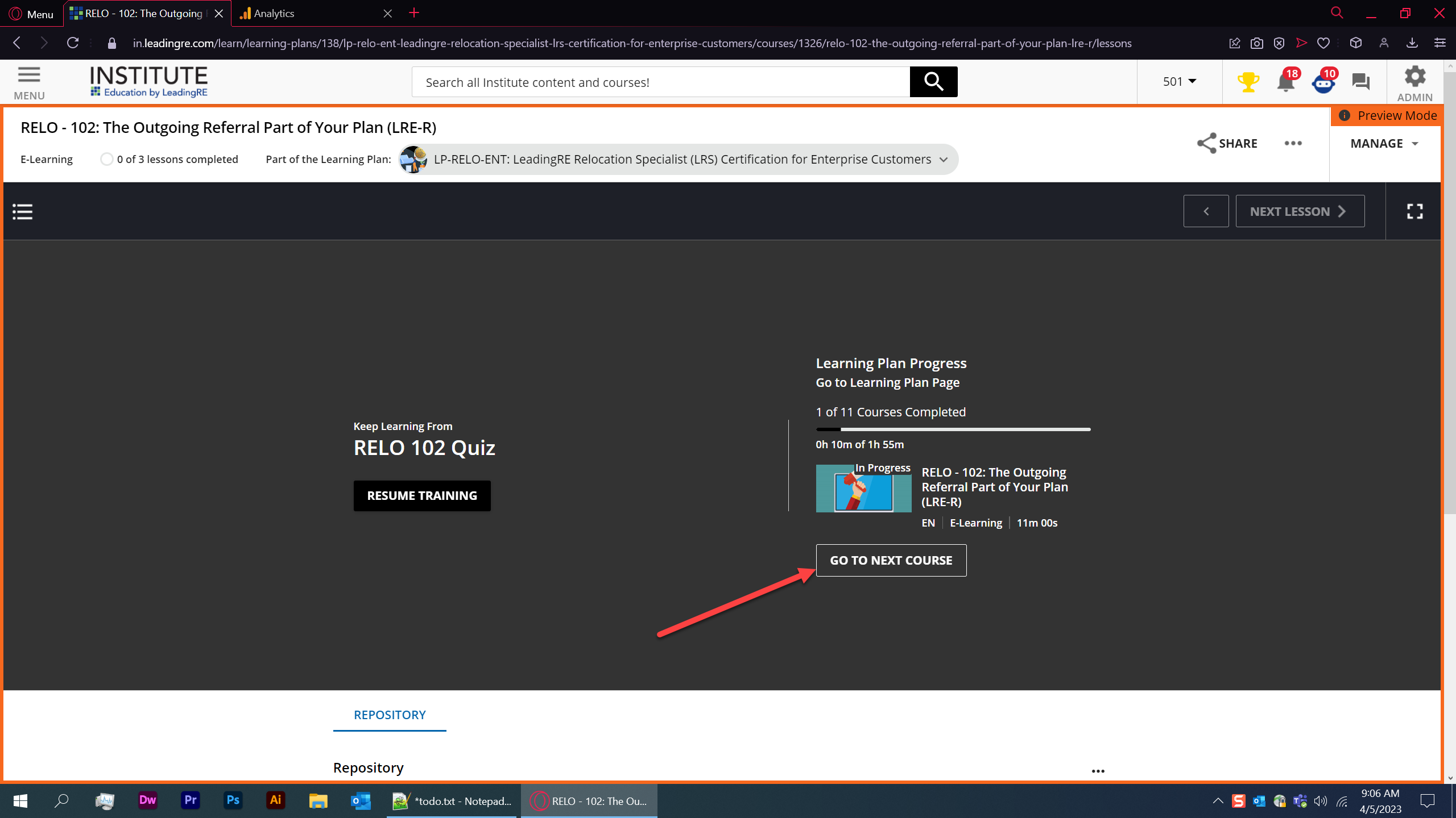
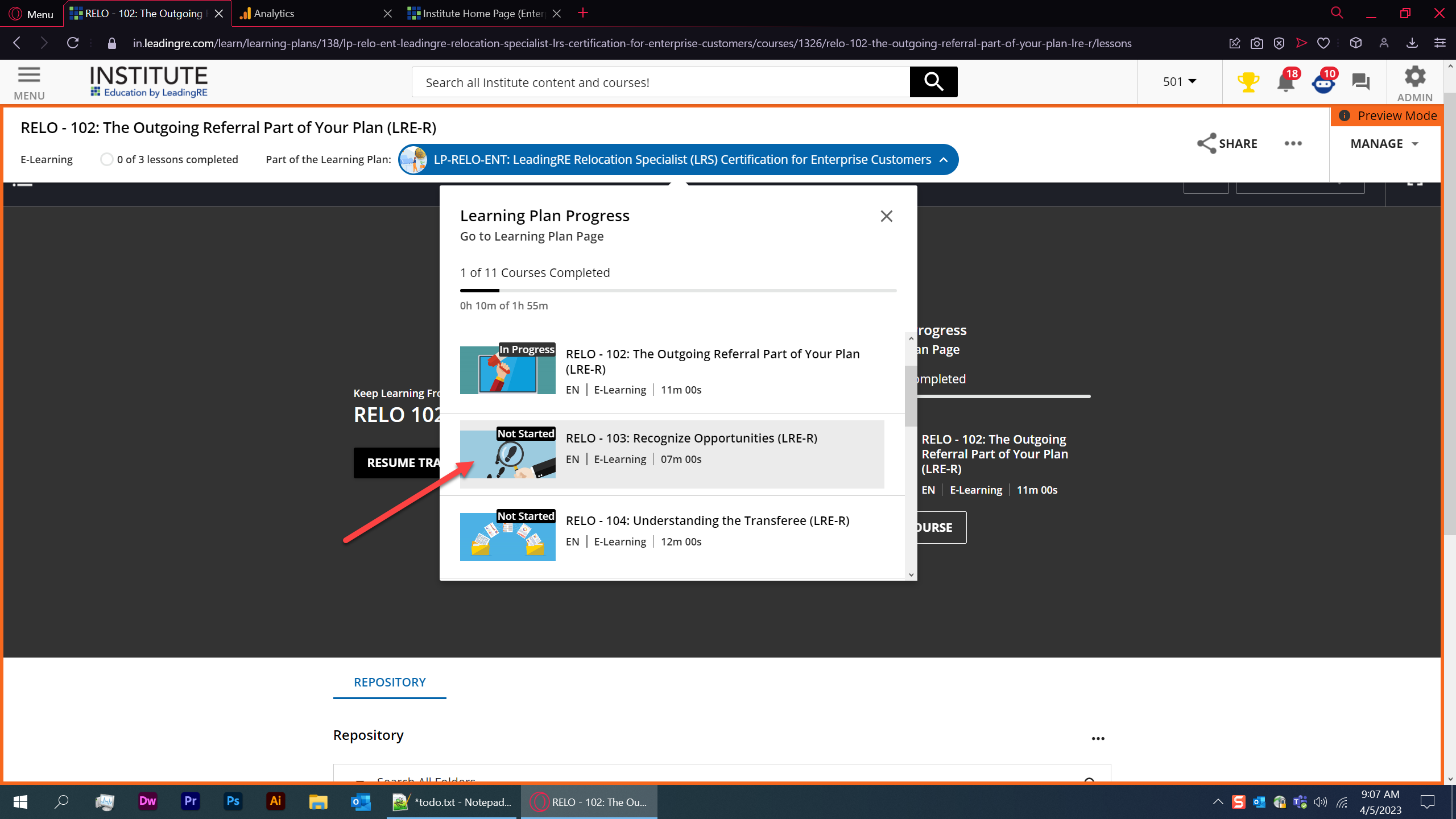
“go to next course” does nothing, just refreshes

I suspect this is by design and just poor wording/localization. Relo-103 would be the “next course”
Still, looks great so far!
I presume that grey background can be replaced WITHOUT css somewhere?

Enter your email address or username and password below to log in to Docebo Community. No account yet? Create an account
Enter your E-mail address. We'll send you an e-mail with instructions to reset your password.