Building Certificates? --> Here Are Some Things I Learned


Userlevel 7
Badge +5

I recently went through setting up some certificates for some well deserved learning accomplishments.

Here are some take-aways that I thought might be helpful for others (At least until that portion is overhauled).

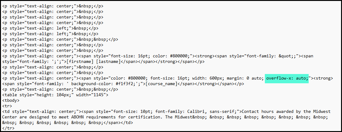
  1. Your Visual Editor, Source Code Editor, and PDF preview Are Not Friends
    Just a heads up - I needed to hop back and forth between all of these several times to tweak things the way I needed. It was time consuming. Many HTML attributes and inline CSS styling look great in the visual editor but are then ignored when you preview in the PDF. 

    I initially attempted to use pixel precision using margins and padding but those didn’t help. Also nice things like using a horizontal rule have strange effects when you go to PDF.
     
  2. The Table Is Your Friend - But There Are Still Rules
    I ended up using tables to space out the information and line things up. Don’t be fooled by what you see in the visual editor, though. A single cell on the left with the date that is justified to the right so that it isn’t on your uploaded border background may look like it resides on the left but it is way over on the right because the table cell goes all the way across.

    I ended up using multiple empty cells to force my text to the left as the cells seem to be evenly spaced across the whole PDF. I ended up using 5 cells in my row and placing my date shortcode in the first cell right justified to get it right. that first cell is only the first 20% of the width and right justify got it away from the border just right.
     
  3. Certificate Size Matters
    I started by using the recommended size of 2560 x 1810 but what I found was that when I printed the certificate, I had uneven margins so it wasn’t going to look right in a frame. If you use something closer to 2332 x 1802 you can get the same ratio as your standard 8.5” x 11” paper.
     
  4. Testing Updates After Student Earns A Certificate
    Once I got to the point where it was time to test a learner actually earning their certificate, I realized I needed a few more tweaks. Changes did not seem to be updating though. What I discovered was that I needed to delete the issued certificate so that the download could pull the new changes. Here is how I did that.

    On the certificates page - on the line of the cert you are updating and testing - find the icon of the little guy with the ribbon and click on it.


    Then find the course in the drop-down list.


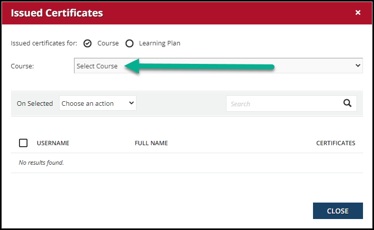
    Find and select the name(s) you wish to delete.


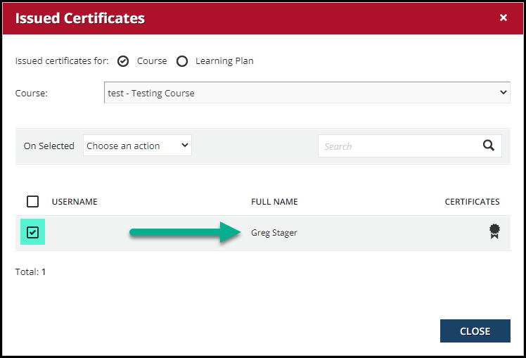
    Use the  On Selected  drop-down list and choose  Delete all the issued certificates


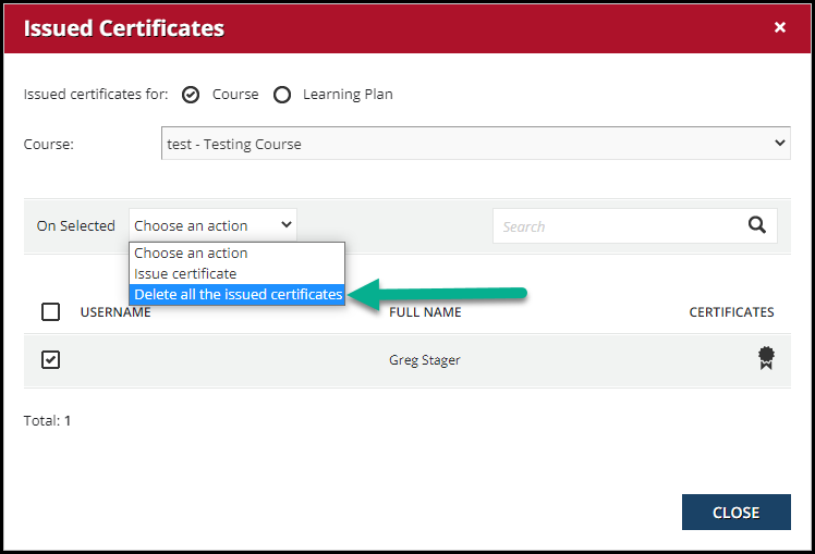
    You should notice the black ribbon turn grey


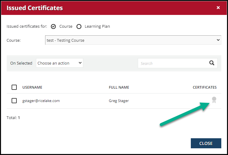
    Now you can close out and be able to download a new certificate with your changes.​​​​​​​

It may take a fair amount of back and forth to get this accomplished but in the end, the product should be good. For us, Certificates have always been generated and emailed manually to each learner and I am very excited that my learners will now be able to get their certificates immediately when they complete a course.

Hopefully this helps someone out today.

Feel free to share some things you have learned about making certificates.


12 replies

Userlevel 7
Badge +6

@gstager - if you start a channel on YouTube? I will immediately be a subscriber.

Thank you for this!

Userlevel 7
Badge +3

@gstager Many thanks for this. It’s essential reading for anyone wishing to create a certificate.

Userlevel 4
Badge +1

The table suggestion above is one I fully support. I won’t build a certificate template without a table. I recommend you put extra rows and columns in it so you can use the size of those cells to force things up, down, left, and right by individual pixels. This is the only way to get alignment to be exact. Save the template after each adjustment and then preview it to see if you nailed it. My goal is to only have 20 previews to get it right. It’s a little game I have with myself to see if I can “guess” on the adjustments needed after the first preview until it gets closer and closer and then “just right”. 

I’m hoping there might be some future enhancements with this where you can actually see the background image right behind the editor to make alignment of fields all doable in one go within the editor. 

Userlevel 7
Badge +3

The table suggestion above is one I fully support. I won’t build a certificate template without a table. I recommend you put extra rows and columns in it so you can use the size of those cells to force things up, down, left, and right by individual pixels. This is the only way to get alignment to be exact. Save the template after each adjustment and then preview it to see if you nailed it. My goal is to only have 20 previews to get it right. It’s a little game I have with myself to see if I can “guess” on the adjustments needed after the first preview until it gets closer and closer and then “just right”. 

I’m hoping there might be some future enhancements with this where you can actually see the background image right behind the editor to make alignment of fields all doable in one go within the editor. 

Certificates and emails…use web design 90’s style :)

the live preview in editor would be awesome. 

Userlevel 7
Badge +5

@jamie.morgan 

Here is the idea for you to vote up re:background image.


Userlevel 4
Badge +1

Vote added! 😁

Userlevel 1

The table suggestion above is one I fully support. I won’t build a certificate template without a table. I recommend you put extra rows and columns in it so you can use the size of those cells to force things up, down, left, and right by individual pixels. This is the only way to get alignment to be exact. Save the template after each adjustment and then preview it to see if you nailed it. My goal is to only have 20 previews to get it right. It’s a little game I have with myself to see if I can “guess” on the adjustments needed after the first preview until it gets closer and closer and then “just right”. 

I’m hoping there might be some future enhancements with this where you can actually see the background image right behind the editor to make alignment of fields all doable in one go within the editor. 

Certificates and emails…use web design 90’s style :)

the live preview in editor would be awesome. 

are you able to wrap text if, say, a course title is too long?  

Userlevel 7
Badge +5

@jyoung - personally not sure about autowrapping - been a while since I needed to look at this.

Have you tried a hard break?

<br>

Userlevel 1

@gstager Hi Greg, I’m not super technical.  I’ve attached a txt file of what I have (tried adding width on about row 14 of the txt file but not sure if that syntax is correct, doesn’t really help but didn’t break anything either)

I’ve also attached an example of the certificate.  Any help at all is greatly appreciated.  


Jamie

Userlevel 7
Badge +5

I wonder if adding 

overflow-x: auto;

would help control that…?

Userlevel 1

I wonder if adding 

overflow-x: auto;

would help control that…?

@gstager where do I add that in the text file above?  Are you able to download my code and add that overflow in at the proper spot, then upload back here?  That would be super helpful and I’d be extremely grateful.. Thanks for all the help.

Jamie

Userlevel 7
Badge +5

Let’s start by taking advantage of the opportunity to practice.

I am guessing that the course name is the part you want wrapped..?

We can add this style to the other inline styles already there in the same way that you added a width.

If this does not work - I am going to suggest that we get the course name into a cell as part of the table.

Reply