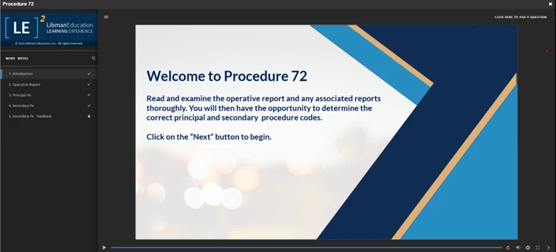
Hello there, we are just starting our yearly update of all our courses and also switching to the newer SCORM version from the older one our courses were created in and thought this would be a good time to fix something in the design of the course player that we have disliked since the beginning. Currently the title of the lesson being viewed is shown at the top of the screen in white font on a dark gray background. We would like to change this to a colour that matches our branding. We have been able to change the background and accent colours (after the attached screenshot was taken) but the banner at the top with the course title remains in the dark grey. I have searched this forum and Docebo University and cannot find anything that addresses this specifically, but maybe I am using the wrong search terms. Does anyone know of a way to change this?

I notice that Docebo itself has this gray title banner on its Docebo U courses so it seems to be the default. We can’t be the only one who does not like the gray banner at the top, but can’t seem to find a way to change it. Thank you in advance for any suggestions.
