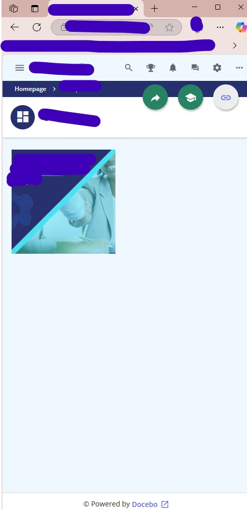
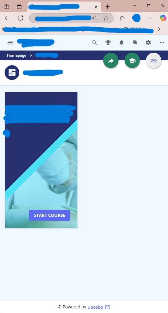
When the browser window is maximized, the course image appears correctly. However, when the browser is resized, part of the image gets cut off or doesn't adjust properly.
How can I ensure the entire image remains visible and responsive across different screen sizes or browser window adjustments? Is there a way to make the image scale or reposition automatically to fit the viewport?
When browser is maximized:
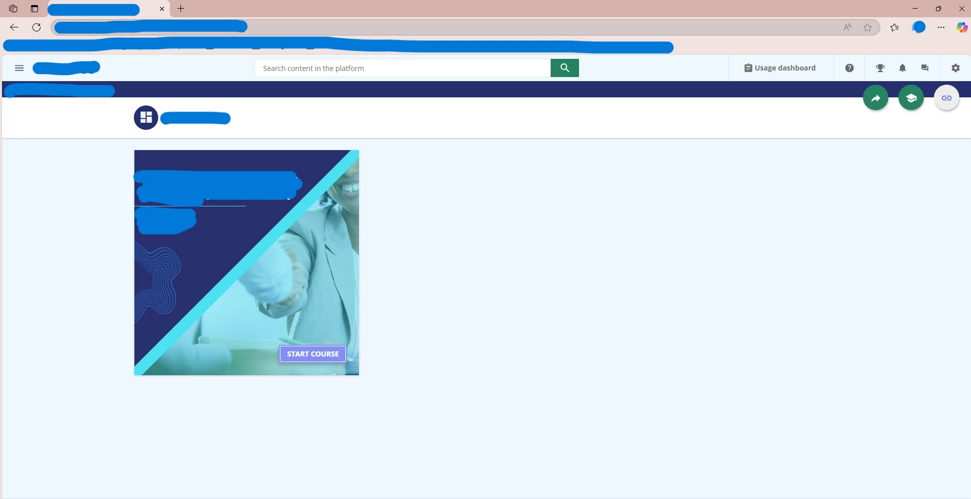
When browser is resized: