

Hey Everyone!
I have huge ideas for what I’d like to do with our platform, but I’m always interested in seeing the creative and unique ways others are using theirs. I’d love to hear AND see cools ways you have designed, unique ideas of utilizing your channels and pages.
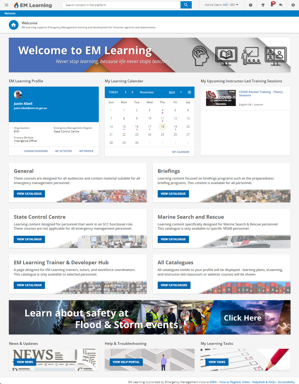
One of the most helpful tools that we have used is a google calendar integrated on a separate page, that allows people to register for GoTo Training Sessions. This was a work around after the platform stopped supporting GoTo. I know this isn’t super creative or unique, but it has been a great help!
I’d love to hear your unique platform ideas and uses!