Design inspiration: Creative ways of using your platform


Show first post

53 replies

Userlevel 2
Badge
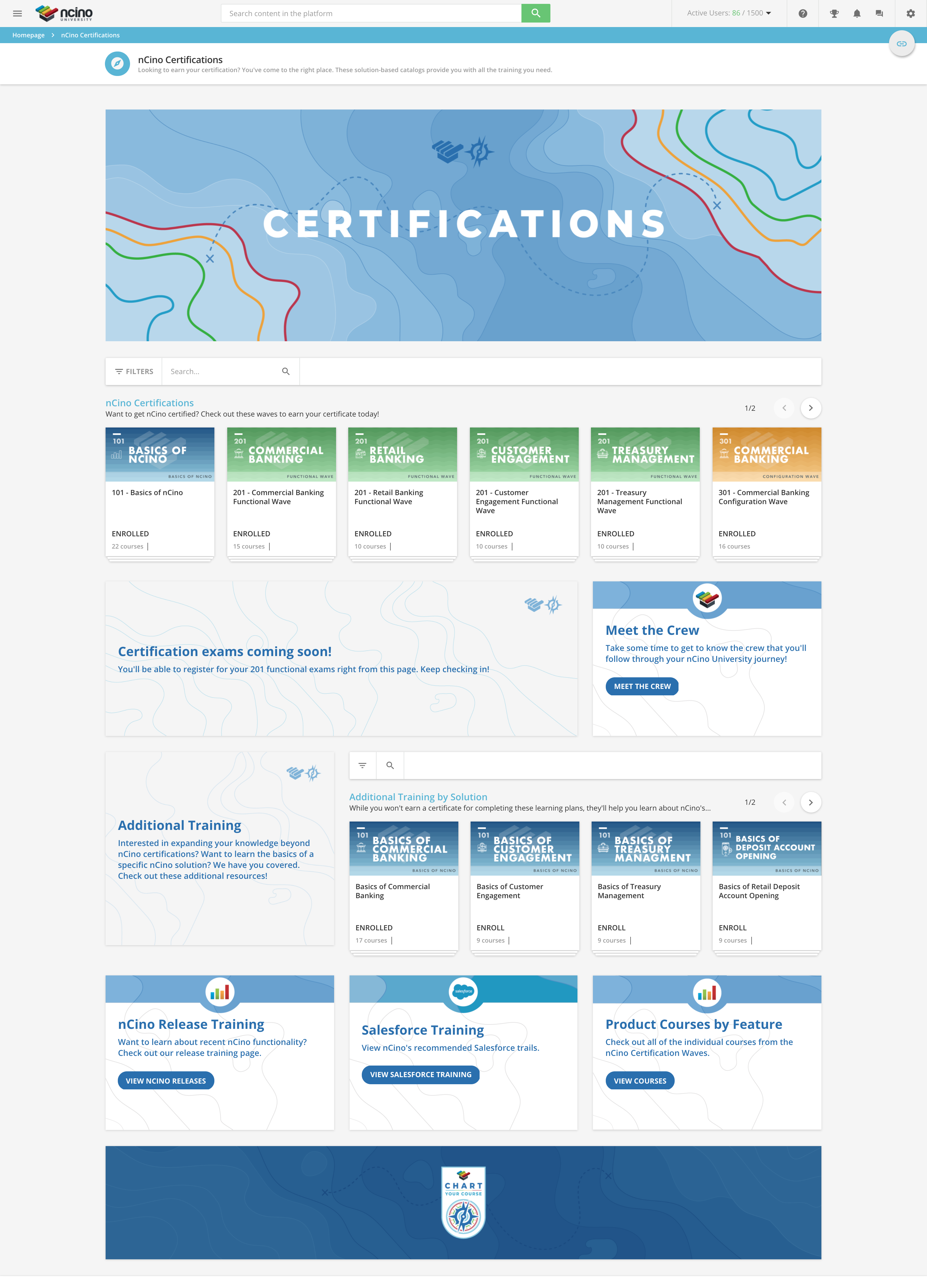
nCino University’s certifications page!


Userlevel 6
Badge +4

@alex.barley Love all the white space and the colors. 

Userlevel 3
Badge +1

@Salvo That homepage is awesome! How does one do the 4 tiles you have there?


Userlevel 7
Badge +2

We also use Comslider just like @Salvo (actually he recommended it to us a while ago, so thanks for that! We use it for our news section.

Aside from that, I like to think that we have a pretty clean menu :relaxed:


Userlevel 7
Badge +2

@Brupert we use an html code to have 4 boxes.


Userlevel 6
Badge +4

@salvo I know you’ve been bombarded with questions about your home page and here I have another one. Is the green bar below the comslider--the Get Going, Stay Ahead, Discover, Follow your heart-- are those clickable links to other pages, or is that there more to inform the user of what’s possible? I really also love how you have the menu at the top. I know it should be intuitive but I hate always having the tell the users to go to the “user menu” or the “hamburger menu” to navigate. Your implementation makes many otherwise hidden actions more visible to the user in a clean way that is also not overwhelming. We’re still struggling with what’s most important to show on the home page. I suppose that’s always a bit of a challenge. Thanks.

Userlevel 7
Badge +2

HI no worries, I love the interest. No, it’s just a pic. This explains the foundation of the platform. If you want you may be able to make it clickable by using HTML. I hope it helps. Let me know if you have any other questions. Thnaks

Userlevel 4

@Salvo what a beautiful platform! I’ve known so many folks who would love to have a moving banner, so I’m thrilled to learn about comslider. 


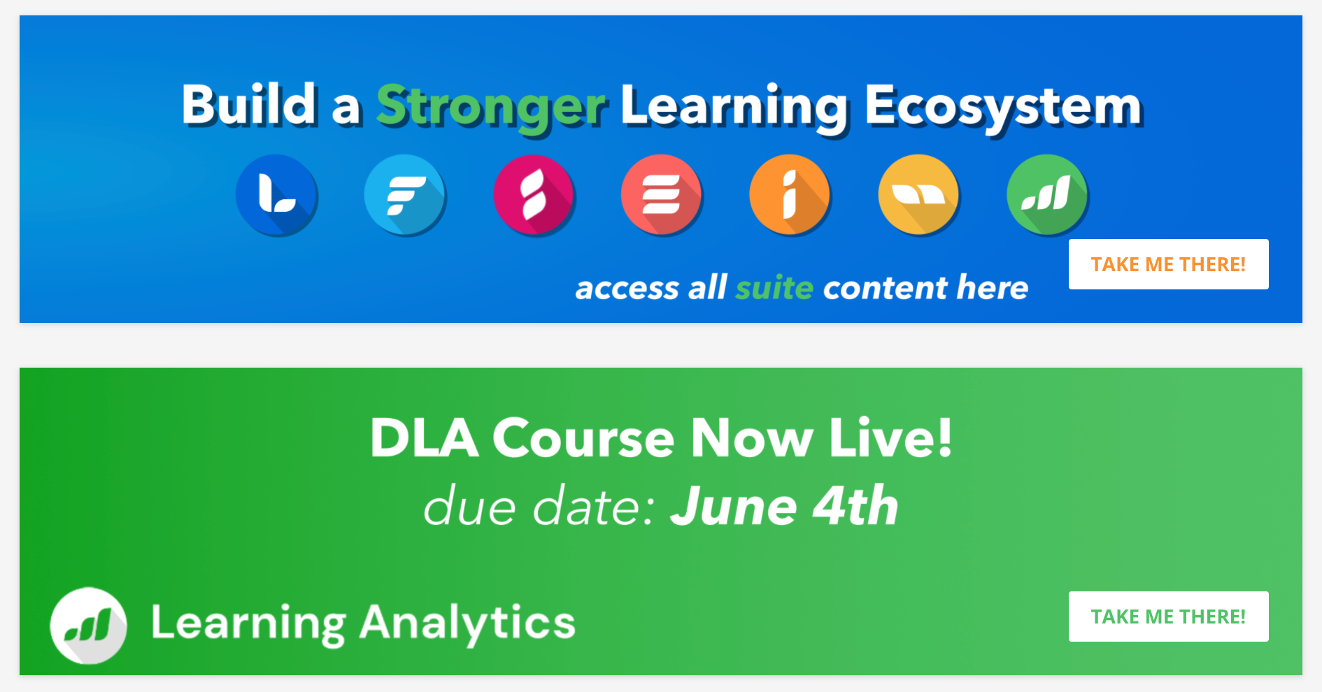
I have to second @Allie’s comment around keeping the banner updated. As a learner, I always appreciate having something new on the homepage, especially when it helps keep me up to speed with those we can celebrate or new opportunities to learn from within the vault. These are two banners we currently have up; 


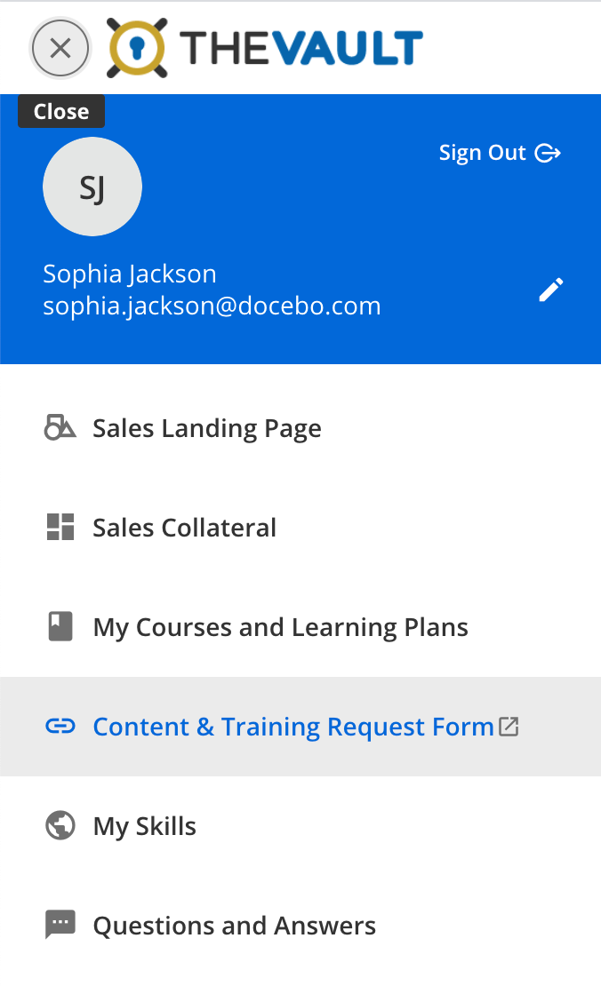
Another piece of design I really appreciate, is a place to give detailed feedback on what content we’d like to see added to the system. We have this opportunity exposed in the menu stack for learners and it links out to an Asana request from with detailed questions around what we’re hoping to see and gain from the new material requested. 

It’s always helpful when learners feel they have a voice in the system - to share best practices, to learn from their peers and to vocalize what they need to succeed! 

Userlevel 4

We also use Comslider just like @Salvo (actually he recommended it to us a while ago, so thanks for that! We use it for our news section.

Aside from that, I like to think that we have a pretty clean menu :relaxed:


This is a great clean design, I like that you use the colours in every element but not so overpowering. Would you be willing to share the html used to create your line of 6 buttons?
Thanks!

Userlevel 4

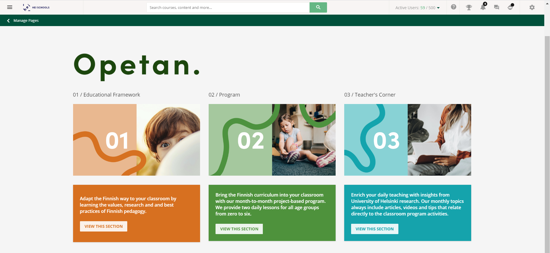
This is a design that one of our client uses, and I love how simple and elegant is it. A bit of classic Nordic design. :slight_smile:

Userlevel 4

One thing we implemented for a customer is a “See more” button. Unfortunately I can’t share the design we made for them here but it’s a very basic approach.

On the starting page you might not wish to overwhelm the users with a lot of information but still have additional information accesible for someone who hasn’t used the platform before or does not use it very often. (So their natural step would not be to use the hamburger menu).

What we did was to have a row with a header and below that two sections; “Courses not started” and “Courses in progress”. Below that on the middle of the page we put a html button (could be a simple image also) that when clicked loads a new page that has the same layout mentioned above but with more sections added, such as “Courses finished”, “your profile” etc. 

Userlevel 3
Badge

Does anybody know how to change the illustrations that are featured throughout the platform?  For instance this one that shows up if a course widget is empty (e.g. if a learner has finished all their courses and is not currently enrolled in anything new).  It would be a nice design customization if we could make this image something from our corporate culture, instead of being a random image that doesn’t fit our design language.  I learned how to change the accompanying text using the localization tool, but don’t know how to change the image.


Userlevel 4

I took a look at the html and CSS used on the page but was unable to locate the image via the browser console. If the link to the image can be located it can also be replaced. Checked the network-tab for “img” or “image” but no luck. Looks like it is placed a bit deeper.  Maybe @Adam Ballhaussen can shed some light?


Does anybody know how to change the illustrations that are featured throughout the platform?  For instance this one that shows up if a course widget is empty (e.g. if a learner has finished all their courses and is not currently enrolled in anything new).  It would be a nice design customization if we could make this image something from our corporate culture, instead of being a random image that doesn’t fit our design language.  I learned how to change the accompanying text using the localization tool, but don’t know how to change the image.


Userlevel 3

We have designed a lot of our customer sites and my suggestion is like you did Allie, listen to the learners, keep it simple , but also make it engaging by  color and images.  It depends on why your audience is there, who the audience is that dictates a lot of what we do.  We have done a lot with applying CSS to images, changed text box colors even the fonts colors, changing up the key words to different colors, removing items from site if they are not necessary by using CSS.  It is a powerful tool in working with Docebo.

Userlevel 3
Badge

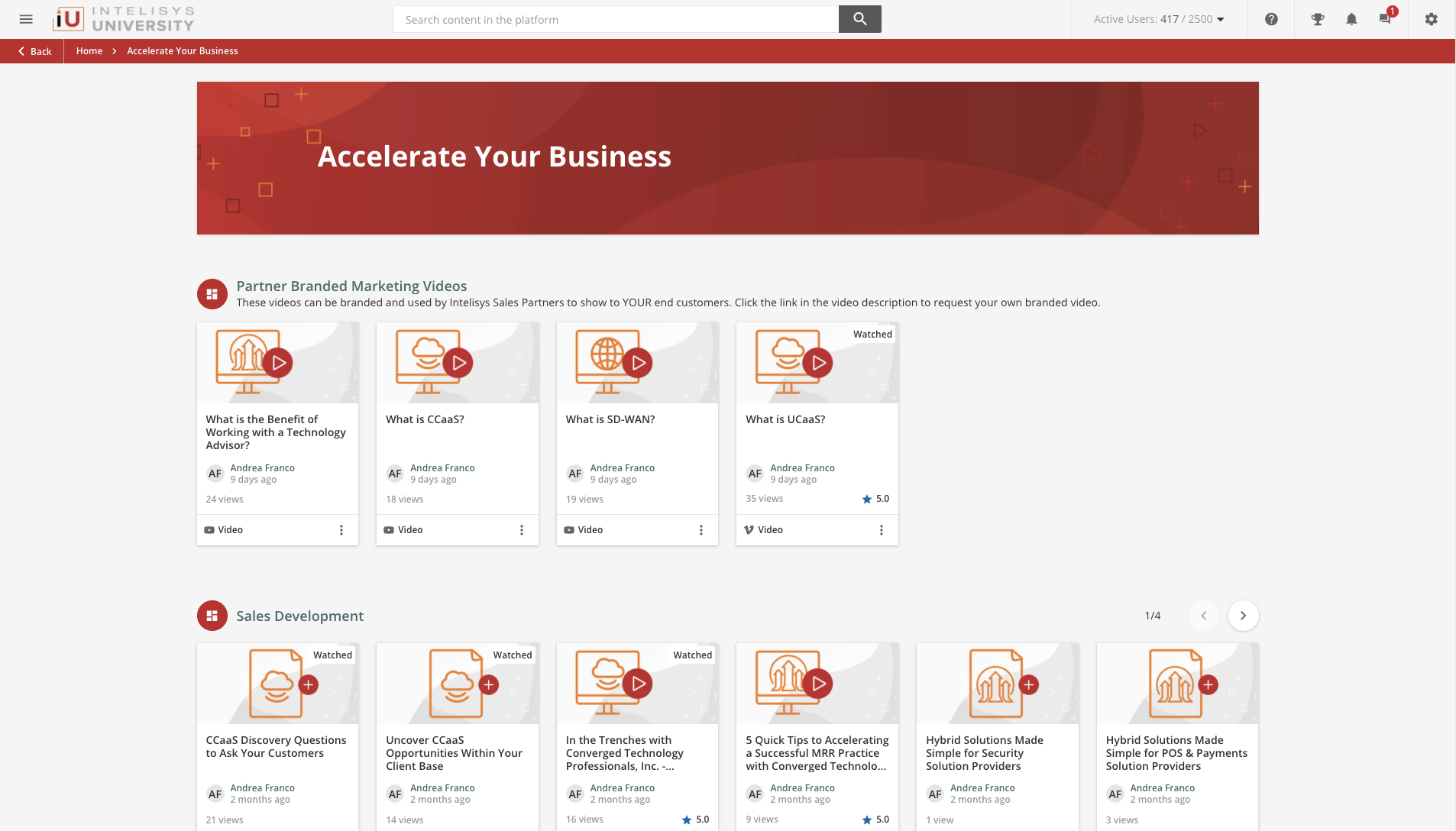
We wanted a really consistent brand experience and very simplified content management so we developed a visual thumbnail system for all types of content, technology types, and learning objects within our experience. This saves us tons of time on creating individualized thumbnails. It also looks great on screen. 

Userlevel 7
Badge +3

We wanted a really consistent brand experience and very simplified content management so we developed a visual thumbnail system for all types of content, technology types, and learning objects within our experience. This saves us tons of time on creating individualized thumbnails. It also looks great on screen. 

👏👏👏 @cshrecengost I love those thumbnail designs. Nice work!

Userlevel 6
Badge +1

@agilleland Yes, that’s a scrolling banner made with the help of comslider:smile:

May I ask how you embedded it onto your page?

I’m assuming you used the page editor, added a widget, which one?

I know the HTML widget does not allow any Javascript so I’m thinking you must have used an iFrame widget?

If not, did you edit the CSS part of your site configuration and added code for the slider there?

I was thinking of using a hidden menu page with widgets that have images so I can upload images to Docebo effectively, then use the URL for those images in my slider on the page. I came unstuck working out how to add the javascript and CSS for the slider.

Having a widget that is a modified version of the image widget that did slider type results would be ace!

Userlevel 7
Badge +3

@agilleland Yes, that’s a scrolling banner made with the help of comslider:smile:

May I ask how you embedded it onto your page?

I’m assuming you used the page editor, added a widget, which one?

I know the HTML widget does not allow any Javascript so I’m thinking you must have used an iFrame widget?


Hey there @jckemv, there’s some really great info about Comslider in the following threads in the community. I’m sure @Salvo@Stephanie Dreiling, and others who have chimed in on those threads would be more than happy to walk you through the process to set up Comslider if you have any questions after reviewing!


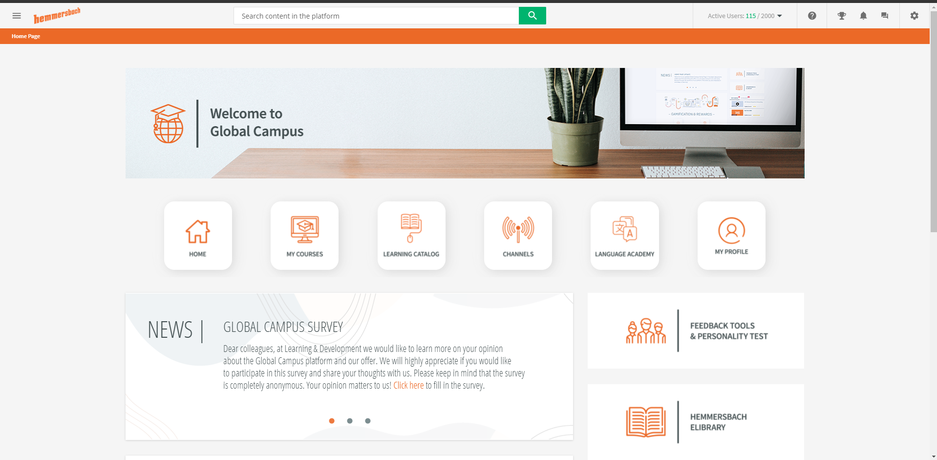
@Salvo - the menu you have across the top of your homepage looks great! How did you do that?

We also use Comslider just like @Salvo (actually he recommended it to us a while ago, so thanks for that! We use it for our news section.

Aside from that, I like to think that we have a pretty clean menu :relaxed:


@abartunek - how do you remove the shading from the icons you have going across the middle? When use the HTML widget it seems to have a grey box around the outside.

Some great contributions here :ok_hand:


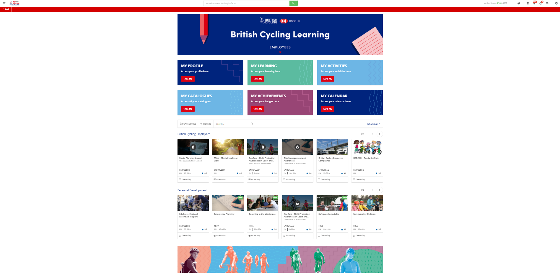
Here is our standard employee homepage with subtle changes to banner/quick links depending on other audiences who access the LMS.


Userlevel 6
Badge +1

Hi everyone,

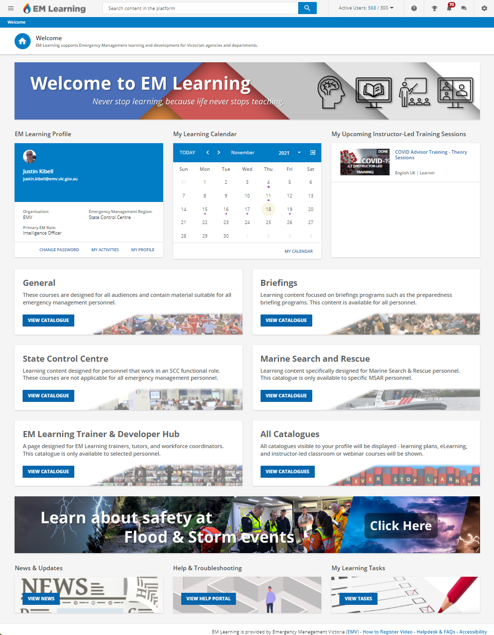
I’m thankful for the help and ideas as I’ve been using a lot of advice from everyone to redesign the landing page for my learners on our LMS.

The Pages and widgets feature is so useful and I have totally redesigned the experience for the end users now. I’m using a lot of hidden pages to help do this.

The home page loads faster not showing the various catalogues we have by default and this design also helps direct the different audiences we have too the content they might need.

The bottom banner cycles using the tricks I’ve learnt in Docebo Community by using a rotating three slide google Slides page in an HTML widget. 


Userlevel 4

We also use Comslider just like @Salvo (actually he recommended it to us a while ago, so thanks for that! We use it for our news section.

Aside from that, I like to think that we have a pretty clean menu :relaxed:


Jumping on this as well! How is the row of 6 boxes created on this page? They look stellar.

Userlevel 3

@kferguson design ideas for future.

@rheaton did you do any custom CSS to have only one row of courses with that pagination? 


Reply