
The Search for a Better Accordion


gstager
Hero III
Forum|alt.badge.img+7

Warning - Long geeky post ahead!!

Lots of questions have come up surrounding accordions.

I’ve toyed around with these and shared a relatively simple example in my animation series.

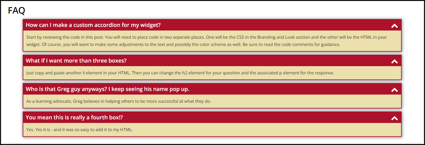
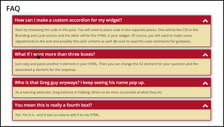
I have since put together an FAQ accordion that I believe looks and functions well - at least in my environment. I have taken the CSS and heavily commented it for your ease of application to your own environments should you wish to make use of it. I’ve also added a short gif and some pictures so you can sort of see it in action.

The code provided is for exactly what you see in this post.

You’ll want to adjust as desired and test as usual for your environments.

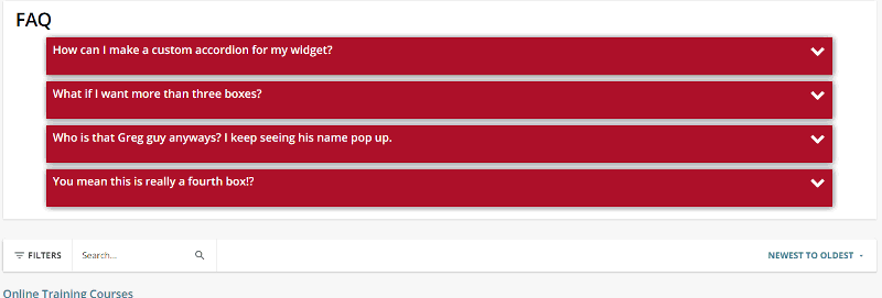
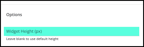
Here is a picture in full, 2/3, and 1/3 size widgets.


Here is the CSS for your Branding and Look section

/** Sticky Accordion **/

/** Removes the little icon and positions your title for the box **/

#accord ul {
  list-style: none;
  padding: 0px;
  margin: 0px;
}

/** Set background color as desired for the overall box and popout border **/
/** Set box-shadow as desired or remove **/
/** Width will be total amount of widget taken up - 90% looked good to me **/

#accord ul li {
  position: relative;
  overflow: hidden;
  padding: 0px;
  margin: auto;
  width: 90%;
  background: #AD122A;
  box-shadow: 1px 1px 10px 1px #888888;
}

/** Set the spacing between each box **/

#accord ul li + li {
  margin-top: 10px;
}

/** Set the spacing between your last box and the bottom of the widget **/

#accord ul li:last-of-type {
  margin-bottom: 20px;
}

/** Positions the chevron at the far right of the box **/
/** Tweak the top and right values as desired **/
/** If you adjust the size of the chevron, you'll want to do top and right **/

#accord ul li i {
  position: absolute;
  transform: translate(-6px, 0);
  margin-top: 15px;
  right: 20px;
}

/** Sets the color and size of the chevron **/
/** A ratio of 1:3 of width to height works well **/

#accord ul li i:before, ul li i:after {
  content: "";
  position: absolute;
  background-color: #ffffff;
  width: 5px;
  height: 15px;
}

/** If you adjust the width and height of your chevron, adjust the pixels **/
/** to keep them lined up or else they will look like an  X **/
/** These will change the chevron when you open and close the boxes **/

#accord ul li i:before {
  transform: translate(-4px, 0) rotate(45deg);
}
#accord ul li i:after {
  transform: translate(4px, 0) rotate(-45deg);
}
#accord ul li input[type=checkbox]:checked ~ i:before {
  transform: translate(4px, 0) rotate(45deg);
}
#accord ul li input[type=checkbox]:checked ~ i:after {
  transform: translate(-4px, 0) rotate(-45deg);
}

/** This removes the checkbox and makes the entire box clickable **/
/** This also sets the cursor to be a pointy hand on hover **/

#accord ul li input[type=checkbox] {
  position: absolute;
  cursor: pointer;
  width: 100%;
  height: 100%;
  z-index: 1;
  opacity: 0;
}

/** Sets the border width of the dropdown - adjust as desired **/
/** Sets the background color of the dropdown area - adjust as desired **/
/** padding should be adjusted based on margin width as desired **/

#accord ul li p {
  margin: 2px;
  background: #ece0ad;
  padding: 10px;
}

/** This corrects the breadcrumb bar chevron malfunction caused by accordion **/

doc-layout-breadcrumbs .hierarchical-breadcrumbs ui-icon {
  margin-right:10px;
}

/** Sets the title text color when the box is closed **/
/** Adjust this value as desired **/

#accord ul li input[type=checkbox]:checked ~ h2 {
  color: #ffffff;
}

/** Sets the title text color when the box is open **/
/** Sets positioning of the text in the box **/
/** Adjust values as desired **/

h2  {
  margin: 5px 10px;
  color:  #ffffff;
}

/** Hides the dropdown text when box is closed **/
/** Transition gives a little time for the fade out - adjust as desired **/

#accord ul li input[type=checkbox]:checked ~ p {
  max-height: 0px;
  transition: .5s;
  opacity: 0;
}

/** This gives a little time for the fade in - adjust as desired **/

#accord ul li input[type=checkbox] ~ p {
  transition: .5s;
}

/** This styles the main title of the accordion - FAQ in this example **/
/** Adjust as desired **/

h1  {
  margin: 5px 20px;
  color:  #000000;
}


Here is the HTML for your widget.

<div id="accord">
  <h1>FAQ</h1>
  <ul><li>
      <input type="checkbox" checked="checked" value="" /><i></i>
      <h2>How can I make a custom accordion for my widget?</h2>
      <p>Start by reviewing the code in this post. You will need to place code in two separate places. One will be the CSS in the Branding and Look section and the other will be the HTML in your widget. Of course, you will want to make some adjustments to the text and possibly the color scheme as well. Be sure to read the code comments for guidance.</p>
    </li>
    <li>
      <input type="checkbox" checked="checked" value="" /><i></i>
      <h2>What if I want more than three boxes?</h2>
      <p>Just copy and paste another li element in your HTML. Then you can change the h2 element for your question and the associated p element for the response.</p>
    </li>
    <li>
      <input type="checkbox" checked="checked" value="" /><i></i>
      <h2>Who is that Greg guy anyways? I keep seeing his name pop up.</h2>
      <p>As a learning advocate, Greg believes in helping others to be more successful at what they do.</p>
    </li>
    <li>
      <input type="checkbox" checked="checked" value="" /><i></i>
      <h2>You mean this is really a fourth box!?</h2>
      <p>Yes. Yes it is - and it was so easy to add it to my HTML.</p>
    </li>
  </ul>
</div>

Hopefully this is useful for someone.

Have a great day!

Did this post help you find an answer to your question?

73 replies

Adam Ballhaussen
Guide III
Forum|alt.badge.img+4

@gstager you’re a hero. Thank you for sharing with the community!


lrnlab
Hero III
Forum|alt.badge.img+8
  • Hero III
  • 4889 replies
  • May 31, 2022

Love your posts @gstager thank you.


gstager
Hero III
Forum|alt.badge.img+7
  • Author
  • Hero III
  • 896 replies
  • May 31, 2022

Thanks, @Adam Ballhaussen and @lrnlab - I appreciate it.


Neil Patterson
Guide I
Forum|alt.badge.img+2

Love, love, love this!! Thanks Greg.  You are a superstar 🙏🏻


sigamoline
Helper II
Forum|alt.badge.img+1
  • Helper II
  • 69 replies
  • June 1, 2022

Thanks for sharing this @gstager!


Forum|alt.badge.img+1
  • Helper II
  • 69 replies
  • June 1, 2022

Thanks for sharing @gstager  - very helpful 


dklinger
Hero III
Forum|alt.badge.img+8
  • Hero III
  • 1682 replies
  • June 1, 2022

Wow

This is really great @gstager - thank you sir.


Allan
Novice II
Forum|alt.badge.img
  • Novice II
  • 64 replies
  • June 15, 2022

Looks incredible @gstager! Poking at this to see if its possible to have clickable links within the dropdown text.


Edit: if anyone wants to have links within the dropdown content, find the following part of the code provided by gstager  and add a few lines:

Look for this in the provided code:

#accord ul li p {
  margin: 2px;
  background: #f5f8ff;
  padding: 10px;
}

Adjustment that allows for links within the dropdown text:

#accord ul li p {
  margin: 2px;
  background: #f5f8ff;
  padding: 10px;
  position: relative;
  z-index: 2;
}


Allan
Novice II
Forum|alt.badge.img
  • Novice II
  • 64 replies
  • June 15, 2022

To add detail to the adjustment above (sadly I can’t edit):

The expanded content (text revealed when clicking the dropdown menu header) is no longer clickable as a whole, however you can insert links within (which are clickable). The headings remain clickable.

Useful if you want to insert links in your accordion content  to resources, courses or anything else.


gstager
Hero III
Forum|alt.badge.img+7
  • Author
  • Hero III
  • 896 replies
  • June 15, 2022

Thanks @Allan 

Looks like you’ve already dug into it!

Good tweak - I hadn’t even explored that as I was just focused on the accordion aspect.


Wow, this is amazing! Thanks so much, Greg! 😀 This is exactly what I was looking for when we build our own FAQs section! 


A really cheeky ask but does anyone have any idea how this could possibly work with translated content?


check
  • Newcomer
  • 3 replies
  • July 14, 2022

@gstager this is EXACTLY what I was looking for! Thanks so much for linking me to this post. 

Quick question: Would you have any tips to make the accordion change colors on hover-over? I’m only moderately okay-ish at CSS. 


Bfarkas
Hero III
Forum|alt.badge.img+5
  • Hero III
  • 3582 replies
  • July 14, 2022

Curious, how are you getting around the default widget width on page load being different than when various accordions are opened/closed?


gstager
Hero III
Forum|alt.badge.img+7
  • Author
  • Hero III
  • 896 replies
  • July 15, 2022
Bfarkas wrote:

Curious, how are you getting around the default widget width on page load being different than when various accordions are opened/closed?

I’m not sure I follow the question.

The screenshots above were using different size widgets but the accordion width fully consumed the 90% width I set in the code which left a little white space on each side.

In each case the default widget width was Full, 2/3, or 1/3 for the samples.

What am I missing?


Bfarkas
Hero III
Forum|alt.badge.img+5
  • Hero III
  • 3582 replies
  • July 15, 2022
gstager wrote:
Bfarkas wrote:

Curious, how are you getting around the default widget width on page load being different than when various accordions are opened/closed?

I’m not sure I follow the question.

The screenshots above were using different size widgets but the accordion width fully consumed the 90% width I set in the code which left a little white space on each side.

In each case the default widget width was Full, 2/3, or 1/3 for the samples.

What am I missing?

Your not missing anything, I was thinking height and wrote width. Height was my question 🙃


gstager
Hero III
Forum|alt.badge.img+7
  • Author
  • Hero III
  • 896 replies
  • July 15, 2022

Just be sure to leave the height blank and then the widget is allowed to be responsive. Otherwise if you expand the accordions beyond a specified height - you’ll have to scroll.

I prefer a full width widget for that reason. You can avoid the temporary look of uneven widget heights on the page between side-by-side widgets


Bfarkas
Hero III
Forum|alt.badge.img+5
  • Hero III
  • 3582 replies
  • July 15, 2022

Right, so the problem is the widget if that line is blank loads a default height on page load, not a constantly responsive height, so the scroll comes into play once open accordians  move outside of the page loaded height, end up doing things to mitigate and make that feel designed in, did not see anything related to that here so thought maybe you found a work around, times like this is when I miss scripts the most. 


gstager
Hero III
Forum|alt.badge.img+7
  • Author
  • Hero III
  • 896 replies
  • July 15, 2022

I guess I have not encountered this issue yet. The widget has been quite cooperative on the responsive front. Have you played with this and encountered an issue?

Or really, that is more the question… as in… I see that problem with other things but not with this - so how did you overcome that?

The answer there is that I didn’t do anything special since I never encountered the behavior. It just worked.

Now if we could just get Docebo to stop stripping out certain HTML we could do some more cool things.


pmo
Docebian
Forum|alt.badge.img+3
  • Docebian
  • 276 replies
  • August 3, 2022

@gstager This post is incredible! What a boss!


gstager
Hero III
Forum|alt.badge.img+7
  • Author
  • Hero III
  • 896 replies
  • August 4, 2022

Versioning Update

For anyone who has made use of this accordion - I have made a few updates for performance.
Here are the changes if you wish to make the update.

  • added #accord selector for the h1 and h2 tags to avoid conflict with rest of platform
  • removed use of :before and :after to create chevrons due to a platform glitch
  • replaced :before and :after chevrons with font-awesome fa fa-chevron-down in HTML
  • adjusted styling to account for change to chevron
  • suggested 95% width for full and 2/3 widgets and 90% for 1/3 - default at 95%
  • added HTML for using a coded title vs using the Docebo widget title - see comments
  • added HTML comment instructions for adding more boxes

I am attaching a PDF rather than posting the code in order to keep post length shorter. Let me know if there are any issues.


lrodman
Guide II
Forum|alt.badge.img+6
  • Guide II
  • 908 replies
  • August 8, 2022

Seems to do this to my hamburger menu


gstager
Hero III
Forum|alt.badge.img+7
  • Author
  • Hero III
  • 896 replies
  • August 8, 2022
lrodman wrote:

Seems to do this to my hamburger menu

Yes, that is the :before and :after glitch I was referring to in my most recent post.

Use the code found in the accordion.pdf attachment that I recently posted. That should correct the issue.


sigamoline
Helper II
Forum|alt.badge.img+1
  • Helper II
  • 69 replies
  • August 8, 2022

@lrodman My hamburger menu looks like that as well.


gstager
Hero III
Forum|alt.badge.img+7
  • Author
  • Hero III
  • 896 replies
  • August 8, 2022
sigamoline wrote:

@lrodman My hamburger menu looks like that as well.


It was something subtle that I didn’t notice for some time. I posted some updated code in a pdf that will take care of that.


Bfarkas
Hero III
Forum|alt.badge.img+5
  • Hero III
  • 3582 replies
  • August 8, 2022

Seems like a good time to mention, when bringing things into a large third party platform like docebo, I tend to make the selector names very weird to not be even possible to have a conflict with the platform. Have been known to throw a random -1845 onto things for example just to keep it unique. 


Reply


Cookie policy

We use cookies to enhance and personalize your experience. If you accept you agree to our full cookie policy. Learn more about our cookies.

 
Cookie settings